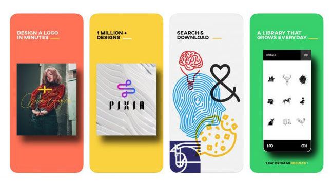
Your logo design is essential for conducting a business in the competitive world. Your company has to confront a lot of established as well as new enterprises in your given niche. While a sound marketing plan is essential, your visual communication skills are equally crucial for your business. With the help of visuals like logos, business card, and other graphic designs, etc., companies can instantly connect with the audience.
However, running a business is not easy in this highly competitive world of today. The reports say that 80% of small businesses close down in the first year of operation, and the rest in a few years. Only a few of them can stay firm in their niche markets.
But who are the businesses that fail to survive, and who are the ones that taste success? It is seen that those entrepreneurs who made extra attempts to create a strong visual brand identity in the market became successful.
Others were failures as they did not give importance to branding. So, making good visual communication with the people is necessary to run a successful business. This is the reason that modern entrepreneurs lay so much emphasis on creating unique visuals.
There is a wide range of visuals that a business thinks of creating. These include a company’s logo, brochure, business card, website design, mobile apps, packaging, leaflet design, and a host of other designs. But a logo is the most important of all such designs.
This is because a logo is everywhere as a core brand identity of your company. Your logo is on your products or services, websites, brochures, graphic design services, and all your marketing materials. The logo will help your customers identify your company’s products.
The logo is an essential part of doing business in the market where many competitors seek the attention of the customers. A logo becomes an effective marketing tool to take a company’s products and services to the people and targeted customers. But such advantages are accessible only when a logo design follows some proven logo design concepts.
Here Are The 15 Basic Principles That Professional Logo Designers Need To Consider While Creating Logos
01. Know More About Your Target Audience
One of the basic principles of design is first to know your target customer of the products or services you offer. When designing a logo for a client, ask some questions that help define the customers, and you should pinpoint the client’s niche market or yours.
Find out who is the ideal customer looking for the solutions your products or services offer. To know that, marketers have many tricks. For example, you can survey to know who are the people interested in your offerings in the market.
You should be enquiring about the different backgrounds of that ideal customer. So, know about the social, economic, educational, and cultural backgrounds of the audience.
An advantage of researching an audience is that you can target it with the correct design elements. For instance, if your ideal customer is a teenager, you can include some fun and quirky elements in your logo.
An insight into your audience will save you from going directionless in your logo design and create a message with the right design elements.
02. Compare Your Competitors’ Logos
Your client’s niche has dozens of small to big businesses already working hard to please their audiences. It may be that you are sharing the audience with them.
So, your target customer is also the customer for a lot more businesses. They all are your competitors, and you have to drive customers’ attention to your business.
Therefore, your logo, which is your core visual identity, should look different from the competitors’ logos. You should first make a list of the competitors and their logos.
Display all those logos in front of you and analyze their designs and see which color pallets they mostly use and what typography they incorporate.
Also, know how other businesses from the same industries have unique logos. Despite offering similar products or services, they all have different visual identities like logos, websites, business cards, etc.
This comparison can help you create a logo design that looks different. Just avoid using the same colors, fonts, shapes, and icons.
Looking For a Logo Design?
We have helped thousands of business owners from all around the world with their graphic design needs such as a logo design, website design, social media posts, banner design and much more.
Get Your Logo DesignGet A Free Quote
03. Keep The Design Simple
One of the basic requirements and qualities of a great logo design is that it has to be made on a simple concept. The best logos are the ones that give the viewer an immediate and clear sense of “you” – and are clean and uncluttered. In general, less is more and simplicity is more impactful. Remember that logos are used in a variety of ways, on different platforms and in various formats and sizes, so intricate details will be lost.
A strong logo will have few elements, each of which can be identified easily and are integral to what you’re hoping to communicate. If you have elements that don’t contribute to the whole, get rid of them.
So, the first and foremost principle is to avoid complexity and keep the logo design as simple as it can be. The designer must ensure that the audience can understand the business message a company wants to convey through a logo design.
A complex logo with many colors, fonts, and decorative elements can be a huge distraction for the viewers. A simple design does not requires any explanation from the experts and even common viewers can instantly know the message that logo wants to convey.
04. Do Some Sketching Work
If you can do some sketching work, then chances are that you will come up with a unique logo idea. Often, we have some design ideas but we do not know much about them.
So, by sketching those ideas on paper, you can see those logos. You should come up with many preliminary sketches, which are your ideas as well.
Make sure that you create variations of those different ideas. In this way, you can find a few good ideas that will work well for your business.
But finalize one sketch that has the potential to drive attention. Then, take that sketch to the logo maker software and create it with colors and other elements.

05. Use Colors Strategically
Make sure that your logo design is attractive. A clever use of colors can make it look unique. Colors have this amazing ability of evoking our feelings. For example, when we see red, we have some emotions of aggressiveness, love, energy, and passion.
This means that if your business deals in products or services and target customers are from young generation, use red in your logo. Blue is associated with intelligence and friendliness and hence it finds place in social networking sites such as Facebook, Linkedin. Pink symbolizes tenderness and is used usually with anything that is related to women products such as clothes or shoes.
Similarly, yellow is considered as a color of hope and freshness, and green is the color for nature, freshness, and health. Therefore, incorporate the colors that can express the feelings that you want to evoke. These very feelings or emotions will be the message that you want to deliver to your target customers through your logo design.
06. Pick The Right Typography
If your logo has your company name in full or as an acronym or a tagline, it will involve typography. A chief characteristic of typography is that it gives any design a personality, making it one of the essential elements of design.
For example, the Coca-Cola logo is in classic lettering style, which gives it a trustworthy personality. The use of serif fonts will give a logo design a strong and formal ambience.
For this reason, most legal business logos are in serif fonts. Sans serif fonts look friendly and non-formal.
So, one of the principles of logo design is to convey your brand personality using a typeface. Also, avoid the use of multiple fonts as that will make your design directionless.
You can also use custom fonts, which you will have specially created for your logo and other visual identities. However, custom fonts are not easy to have as you need to hire a font designer for this purpose.
But you have access to hundreds of unique fonts when you use an online logo maker. Such a design tool and template comes loaded with fonts, and you can then pick one to create your logo. This route to create a logo is particularly suited well for new businesses with a limited budget.
07. Make It Scalable And Versatile
Your business will use the logo on a varied surfaces. These surfaces may be as little as a stamp or a promotional product like a pen. If your details of your logo are not visible clearly when printed on a small space, then redesign the logo.
You may be having a complicated logo design. It would be advisable to remove any undesirable elements. If there are many colors and lines, or typefaces, remove any additional elements.
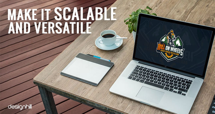
Similarly, if your logo appears on a big surface of a billboard, as part of your billboard design, then the logo should not lose its sense of proportion. This means that the logo should not be stretch on one side.
To make the logo design scalable, draw it with the help of design grids. This method works well to maintain a good balance amongst various elements of the logo. Your logo will be used in a number of ways and in multiple contexts.
Here Are Just A Few:
- On designing t-shirts, baseball caps and, alas, fanny packs
- On pens, keychains and water bottles
- On very horizontal and extremely vertical banners
- On both black and white backgrounds (make sure your designer creates your logo in black and in white to satisfy these needs if necessary)
- Very large and very, very small
- Alongside other company logos printed t-shirt, like those for specific products and services.
08. It Should Look Great In Black And White
Remember that you will be advertising your business in newspapers, magazines, leaflets, etc ads. On such ads, usually, the publishers go for colorless printing of advertisements. In that case, your logo design must hold its impact on the viewers. Your logo appears impressive in colors. But if on newspaper ads, if it is less impressive, you should redesign the logo.
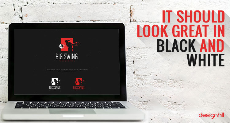
Similarly, you will also be sending your documents through fax to your clients. The logo should make a good impression on a faxed document as well in its colorless version. Similarly, leaflet design is usually in black and white as a less costly means of advertisement. Make sure that the logo in your leaflet campaign looks good.
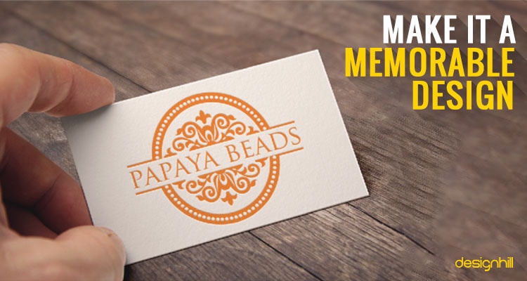
09. Make It A Memorable Design
One of the qualities of global companies’ logos is that they all are memorable piece of work. Your logo should also be a design that people can have in their memories for a long time. If that does not happen, the logo may fail in winning loyalty of your customers.
A simple trick to create memorable logos is to first have a unique concept. A unique design concept is the one that no one has ever used before. For example, Nike’s swoosh logo design is unique as it just a simple swoosh that no other sports company used before and after.
Pepsi, Coca-Cola, and McDonald’s are great example of memorable logo designs. Such company’s logos have become part of modern social culture. To come up with a memorable design for your logo, you can only rely on expert graphic designers.
Recommended Reading:
- Logo Design Tips For Effective Communication
- 17 Logo Designs You Will Actually Remember
- The Value Of Logo Design For Your Business
10. It Should Be A Timeless Design
Would you like to create a new logo every second year? That is not possible for small businesses. Frequent changes in your original logo design is also not advisable for many reasons. If you redesign a logo so often, you are leaving your customers confused and directionless.
A logo should be modern in that it should be contemporary, yet not so nuanced with “hot” components that when the trend has run its course you’ll be left with something that feels outdated. Because then your company will also appear outdated to your prospects. But make sure that your overall approach is modern including specific elements such as colors, and typefaces.
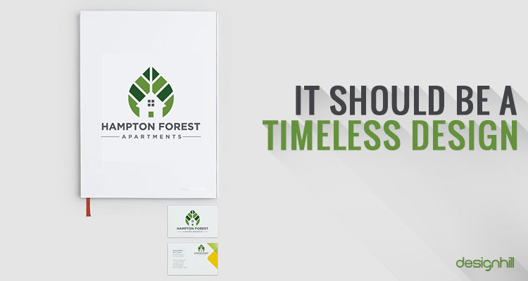
So, do not rely on design trends too much. Take some subtle traits from the contemporary designs but do not heavily rely on them. If you do, then your client will require tweaking of the logo design now and then when there are some addition of products or services to the business.
It would be better to stick to the basic and come out with a timeless logo that your client can use for next one to two decades at least.
11. Build Some Motion
Building some motion is amongst the wise tips to create a logo. A great example of a logo having an element of motion is that of the Twitter logo.
The bird in the logo looks like it is flying or fluttering aro, and its beak is upward which also adds to the bird’s overall movement. Such logos express the dynamism of a business.
There are no fixed rules to depict motion in a logo. Sometimes, even a few loosely drawn lines can add an element of speed to a design. You can find your own way to make your logo design give an illusion of movement.
However, adding an element of motion is not essential. A static logo also is a great design provided you created it carefully. But the movement in the design can be an idea that you should explore as an option.
12. Ensure A Sense Of Balance
A sign of a great logo is that it appears as a well-balanced design. Every element of color, font, icon, image, etc complements each other, and none of them is out of proportion in the design. When you create your own logo, check it for balance so that it looks good to the eyes.
But creative designers tend to break the rules of design balance. You can also do so if you know the rules and have the right experience. Even when breaking those rules, the overall design should not go out of context.
13. Choose Your Design Style Carefully
Make sure that your logo design style matches your brand’s core personality. A design style is locally-oriented at a particular time, such as Victorian style and art deco style. It can also be a subculture such as a pop-culture and urban street art’s constructed letterforms.
Many design styles are frequently in circulation amongst the designers. But you should pick the one that best expresses your brand values and personality.
For instance, choose a classic style if you intend to showcase your brand as trustworthy. The classic style evokes the images of a bygone era, which people fondly remember.
Similarly, your logo’s vintage or retro style will take viewers to some happy memories from the past. For instance, a logo in hand-lettering with warm hues can evoke a feeling of nostalgia.
Or, choose a minimalistic design style for your logo simply. You will use minimum design elements to create a logo. Most such logos use negative space to explore the limited space best and convey a message.
It may be that your brand personality tilts more toward fun and entertainment. In that case, your logo design style could be funny and quirky, which suits the businesses having a young audience.
Businesses like sports, entertainment, music, and movies like to design their promotional visuals in this style.
You can also opt for a handcrafted logo style to give your logo a distinctive look. Such a design style often borrows from other techniques such as funny, minimalist, and vintage to create a new look to the logo.
However, know that not all of these styles will work for all the brands. So, you should choose the style that speaks to your audience about your brand values.
14. Make Your Logo Free Of Cliches
Cliches are the worst enemy of creativity. People do not respond to the things that they have seen or heard of many times before. It means that if you repeat some design ideas in your logo, they will simply ignore looking at it again. They may think adversely about your brand.
Note that designers, especially those starting new, are more prone to falling into the trap of cliches. Decades of logo designing and styles have given rise to design cliches that you should avoid.
A disadvantage of cliches is that they create a wrong and cheap impression of your business in the minds of your target audience. So, while you want to impress your audience, your design may ruin the effort.
So, try to avoid the cliches as much as possible to make your logo design look unique. That is the key to driving potential customers’ attention toward your new business.
15. Avoid Being Too Trendy
A trendy design is the one that pleases the current likes or dislikes of an audience today. But what if the same audience changes its preference about colors, fonts, design styles, etc after a few years?
Then, redesigning the logo will detach your target audience from your logo emotionally, and they may not take frequent redesigning of the logo kindly.
Therefore, go for a logo design that you do not have to tweak or redesign every few years. So, avoid a trendy design and opt for a logo that looks professional.
Know that your logo is your core identity, which will appear across all company platforms, products, or services. A logo, therefore, should be a design that can last for many decades, and only minor tweaking of design is enough when required.
We hope that these fundamentals of logo design will help you create a unique logo for your business. If you need a unique logo, a leading crowdsourcing marketplace Designhill can help. This is an affordable site for small businesses which need various graphic designs at a low price.
