Home design and interior colour trends have seen a shift in recent years as interior design responds to the changing collective mood and our renewed priorities. After a chaotic couple of years, many of us feel an overwhelming desire to live more simply and authentically. There has been a conscious stripping away of the unnecessary both in terms of what we surround ourselves with and how we spend our time, to create space for more meaningful connections.
In response, the Dulux Colour Forecast 2023 is a curation of three distinct colour palettes that reflect our desire to bond with the environment, or communities and the people we love. Led by Andrea Lucena-Orr, Dulux Colour and Communication Manager together with Dulux Colour Forecaster and Stylist Bree Leech, the 2023 colour forecast is based on year-round research into the latest global and local trends that are predicted to influence Australian design and how we live. We take a look into these three colour palettes and how to integrate them into your home.
“The colour palettes that you can expect to see in 2023 are predominantly warm and nurturing, with nature continuing to be a key driver of trends. Brighter hues continue, however they are deeper than last year.” says Andrea Lucena-Orr.
Balance
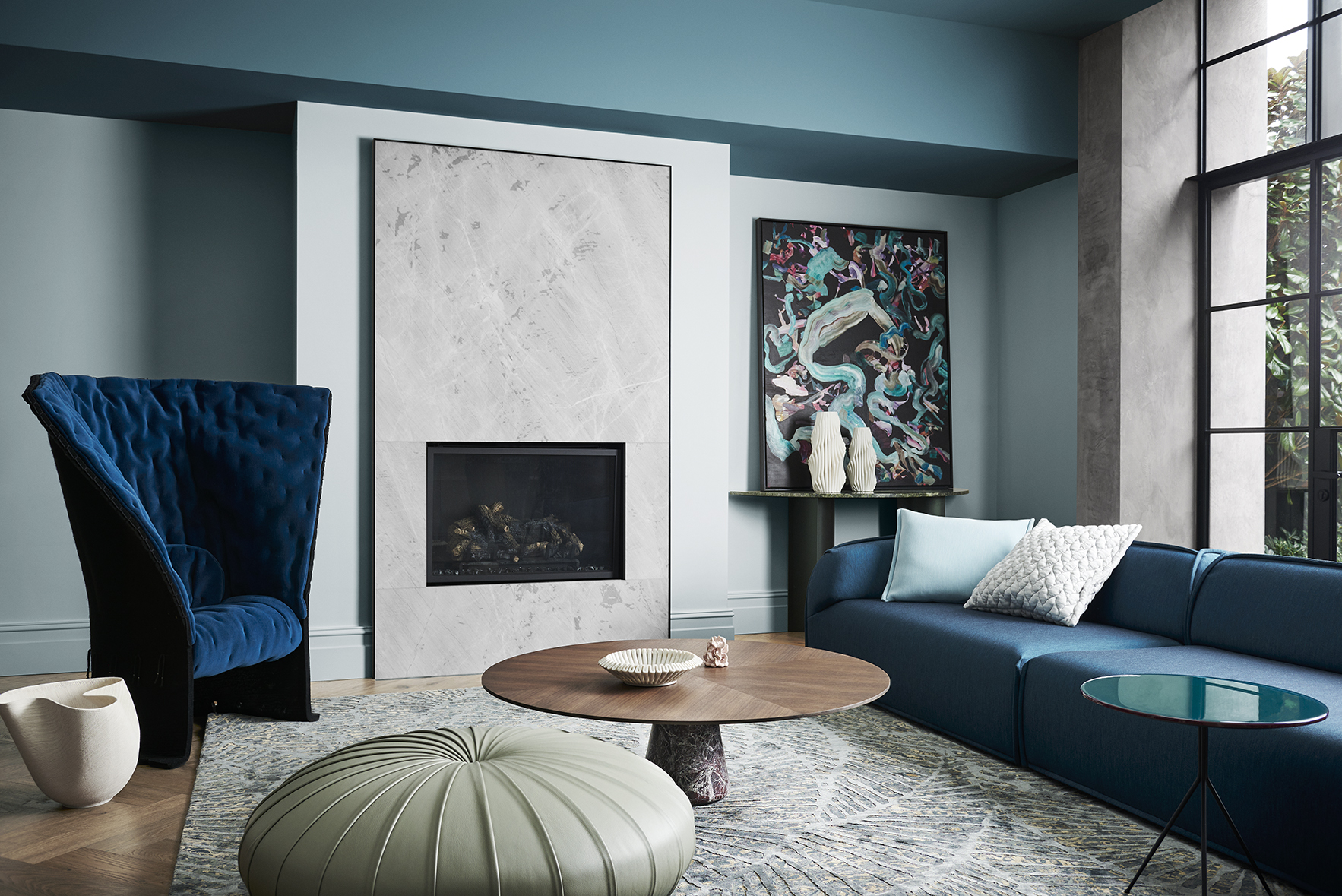
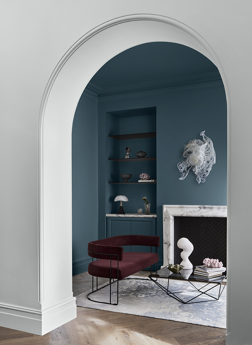
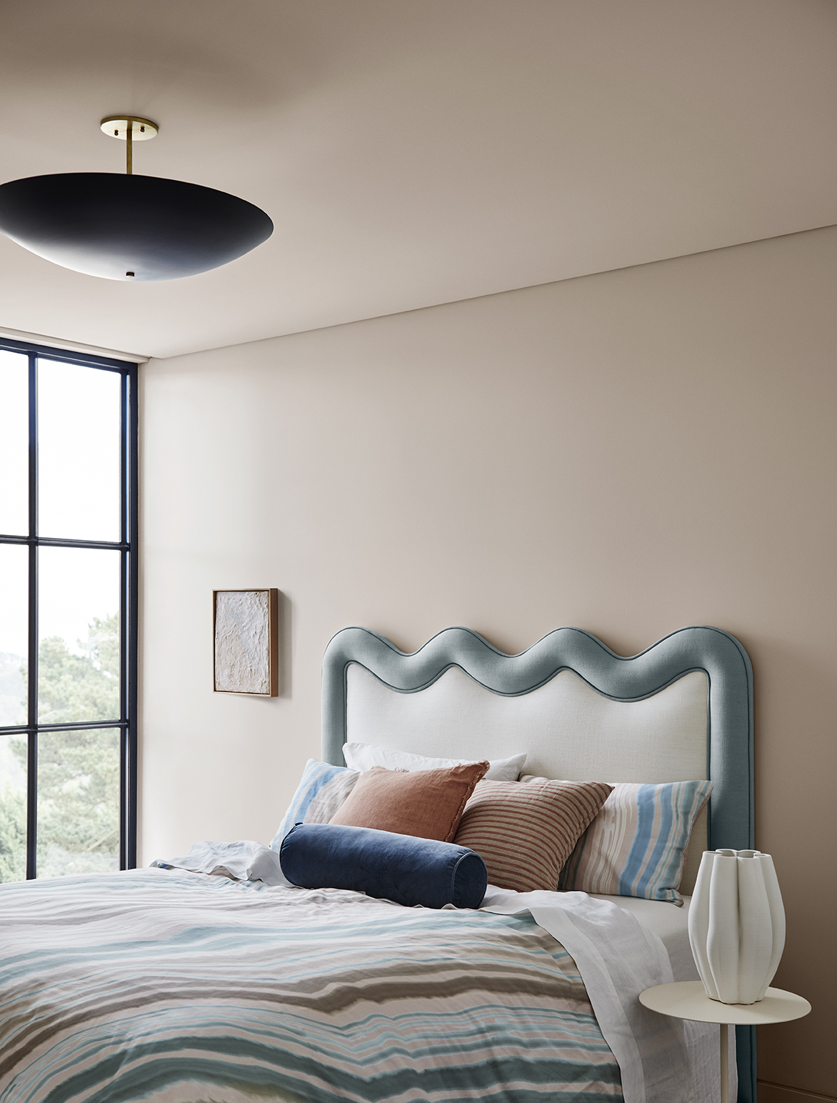
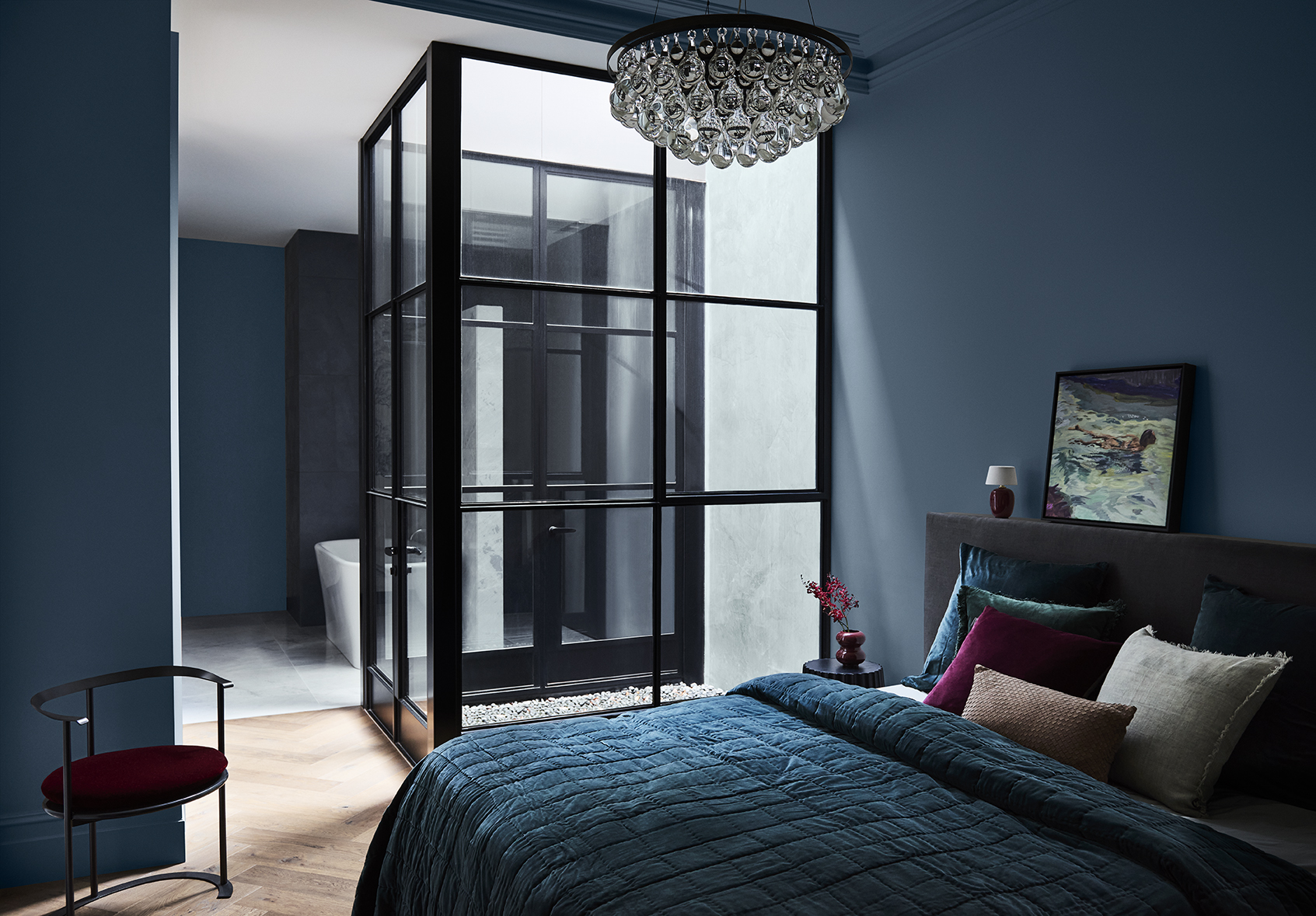
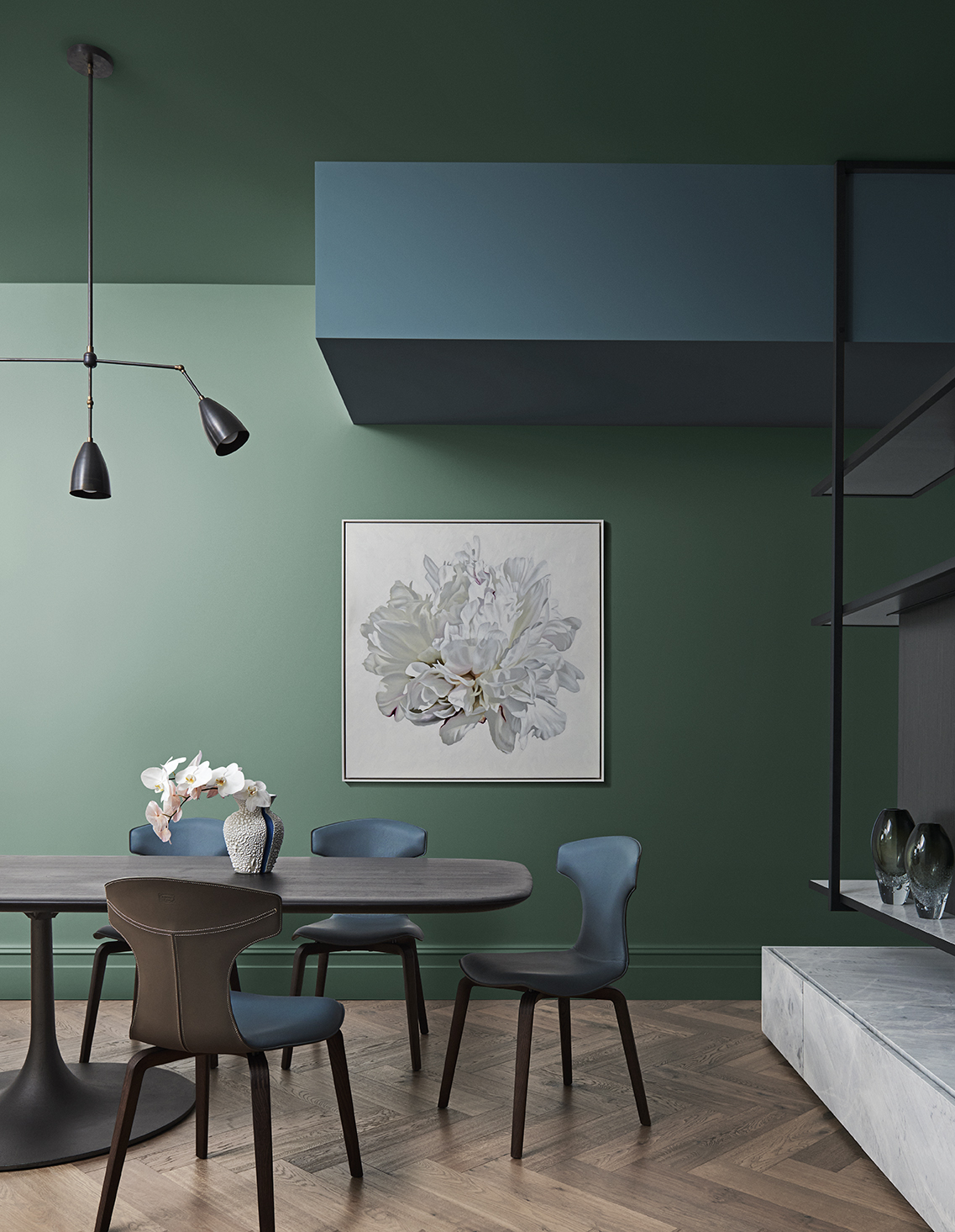
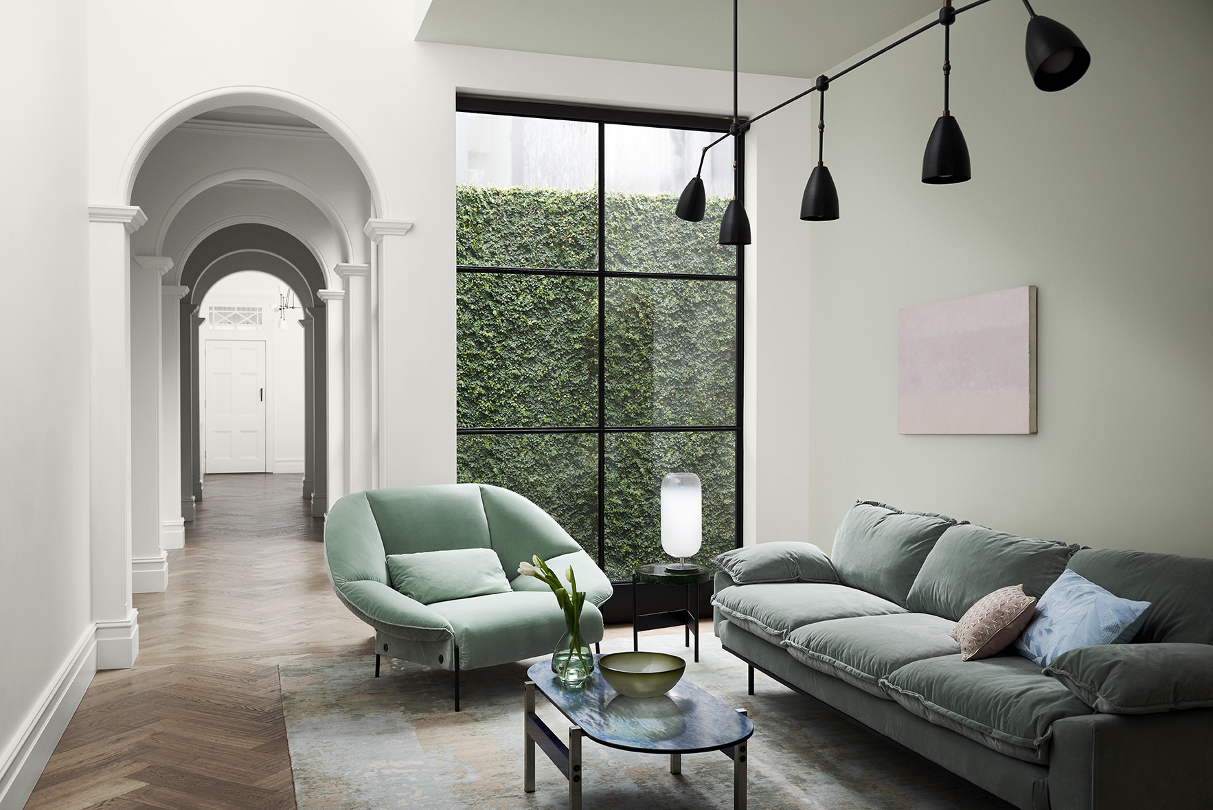
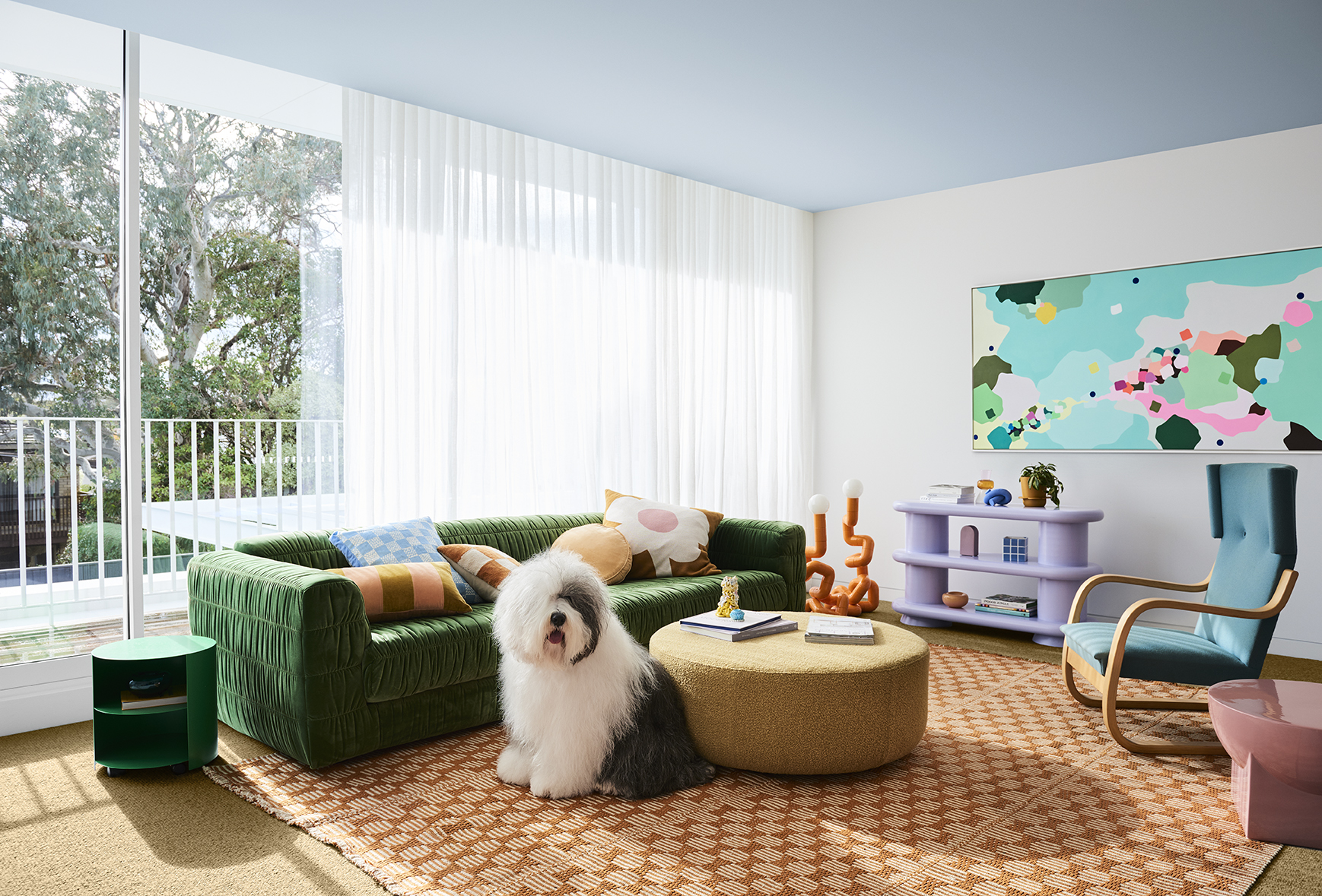
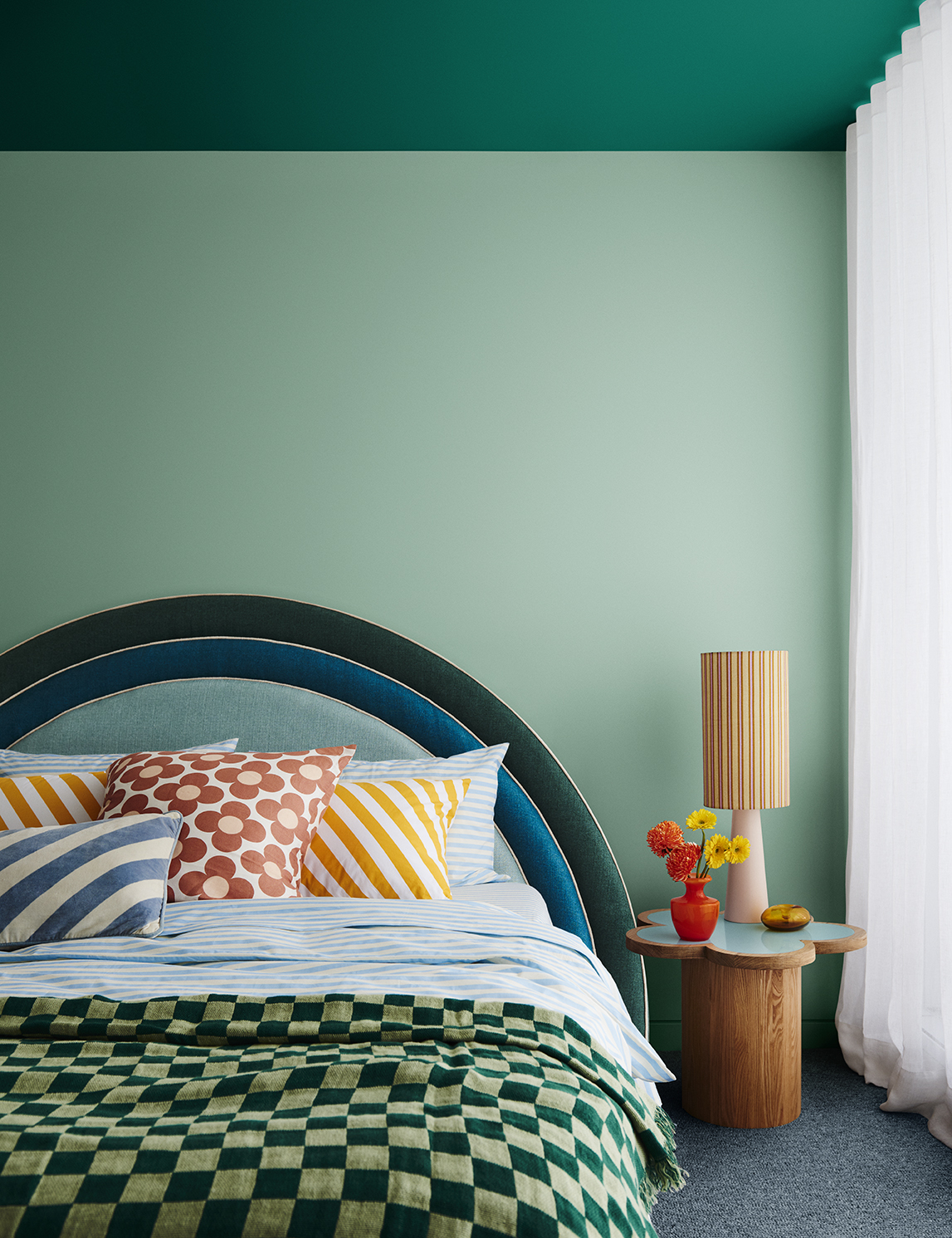
Not everyone is yearning for adventure in a post-Covid world – many of us seek comfort through structure and routine. Dulux Balance palette is a refined and reassuring palette of serene marine blues, gentle greens, weathered pastels and accents of deep garnet that evokes the beauty and fluidity of our oceans and shoreline. Interiors are pared-back and considered, with the focus on immersive colour that runs from walls to ceilings, and exquisite detailing, such as the sweeping curve of a bedhead or the sliver brass border around a fireplace. These can help to create living spaces that feel both ordered and classic in their intent.
COMPLEMENTARY INTERIORS
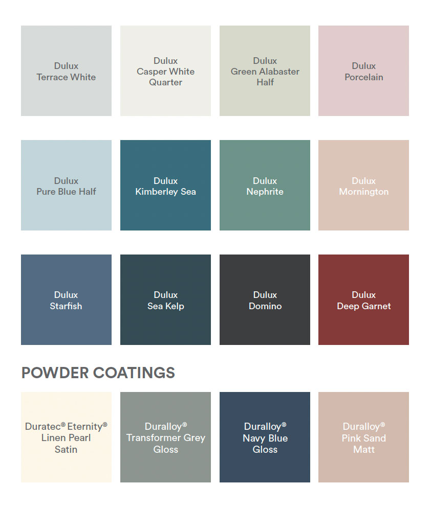
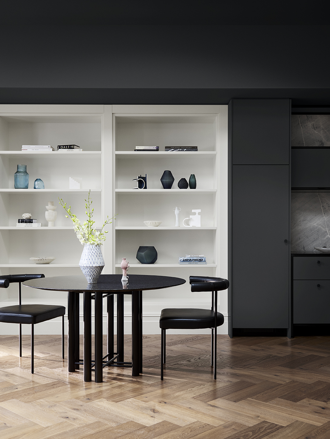
Lavish, touch-me textures, such as velvet and silk in upholstery and bedlinen add a sense of luxury to living spaces and bedrooms, while accents of charcoal in lighting and architectural features add a contemporary edge. The key colours from this palette include the blues in Dulux Kimberley Sea, Starfish and Sea Kelp with a balance of warmth in Deep Garnet which respond to the importance of this oceanscape theme.
Connect
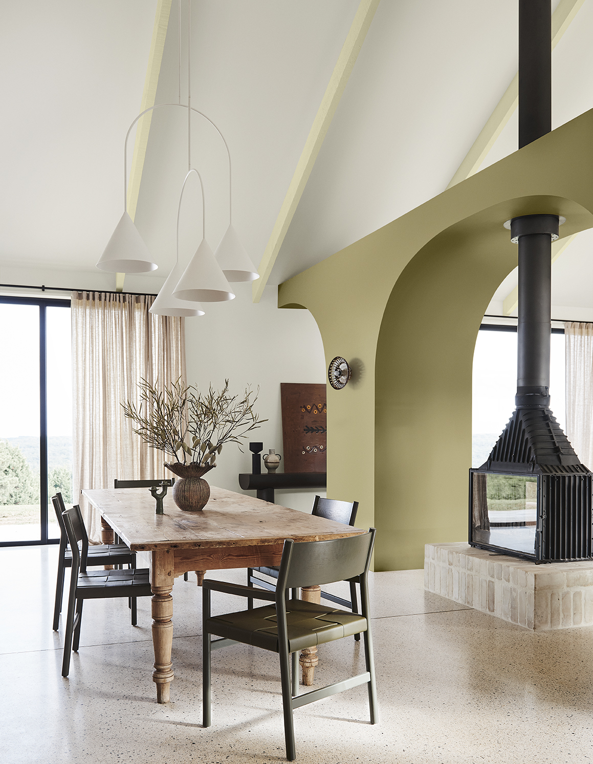
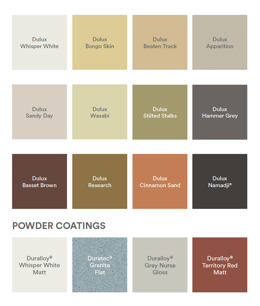
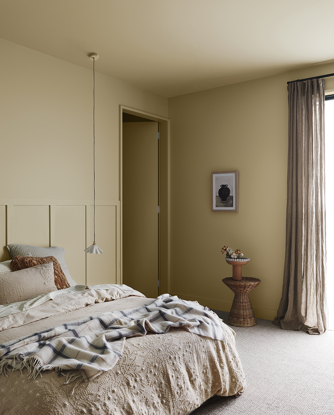
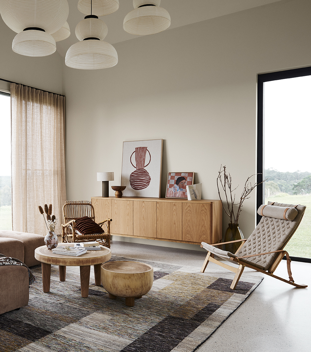
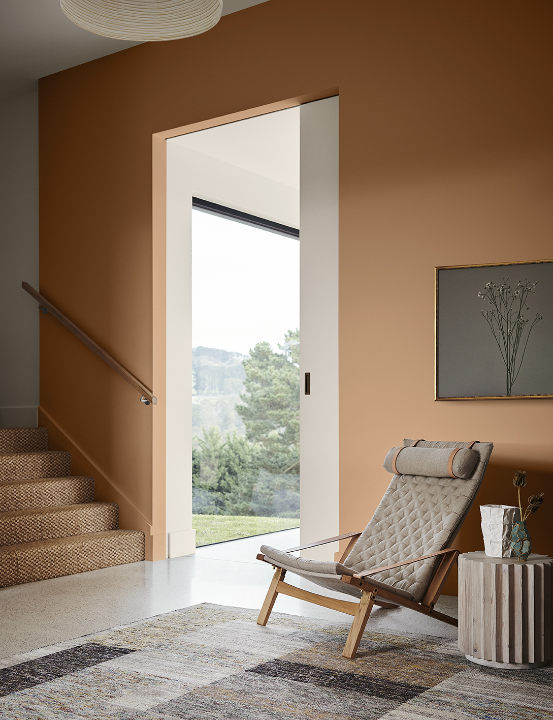
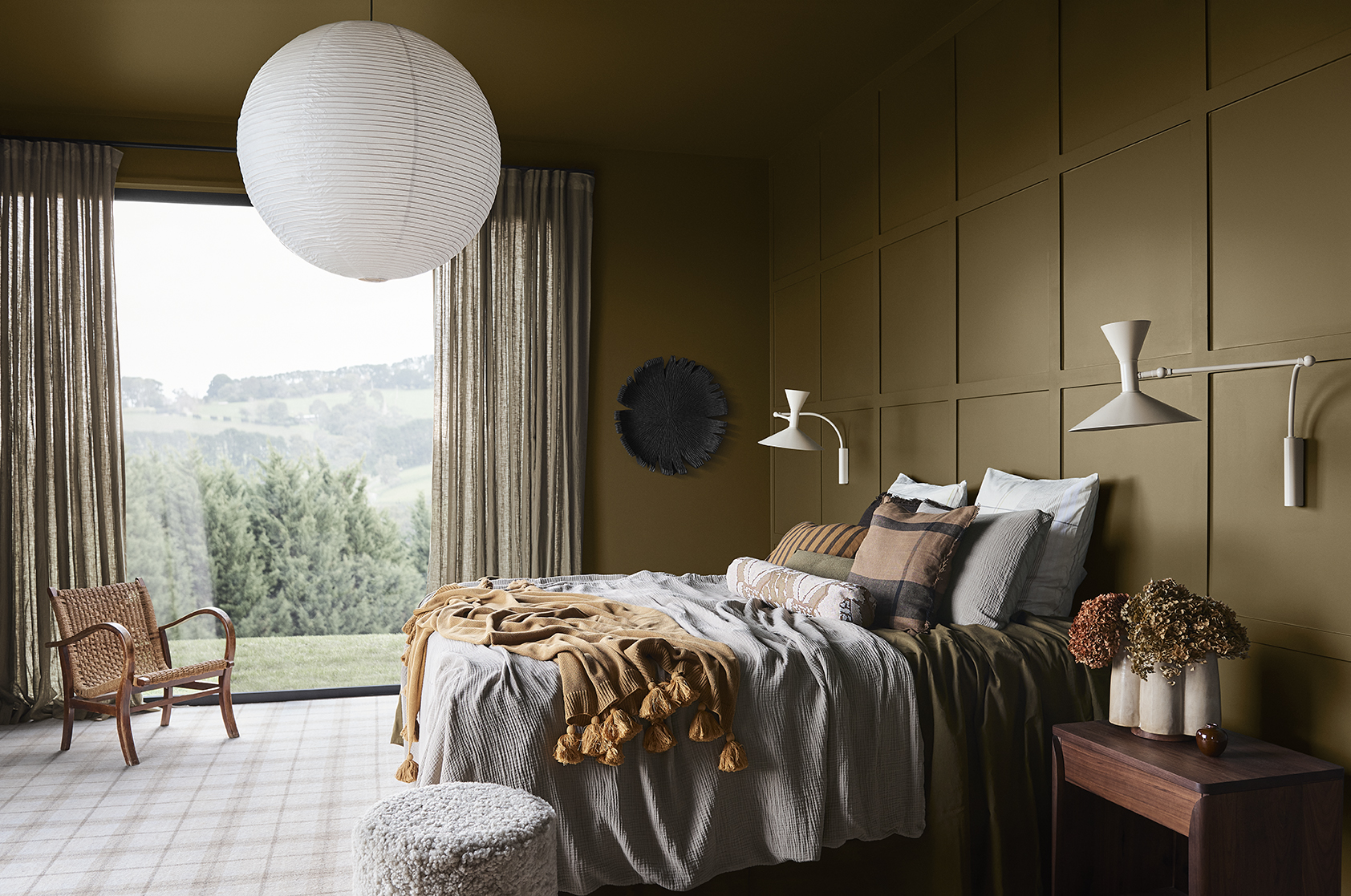
The Dulux Connect palette reflects our desire for a simpler lifestyle, grounded in nature. Natural and quietly stable hues, such as moss, wasabi, sandstone, muddied yellow-green and rich, purple-brown bring warmth and intimacy to interiors and commercial spaces, and set a relaxed and welcoming tone that draws people in.
COMPLEMENTARY INTERIORS
Furniture is crafted from raw timber, leather and rattan, with gently curved lines that add to the cosy, sanctuary-like vibe, whilst fabrics are natural and highly textural; woven linen, cotton, hemp and fine woollen knits. Vintage and thrifted furniture sit comfortably alongside bespoke, contemporary lighting made from recycled materials, whilst handcrafted ceramics in organic shapes speak to our continued appreciation for the handmade and unique. Rather than being hidden away, the marks of time are celebrated for their imperfect beauty; think charred timber wall panelling, worn leather sofas, faded tartan rugs and naturally weathered brass tapware.
Highlights from this palette include the greens, such as Dulux Stilted Stalks and Wasabi and the neutral Dulux Apparition, which will play a dominant role in the year ahead.
Revive
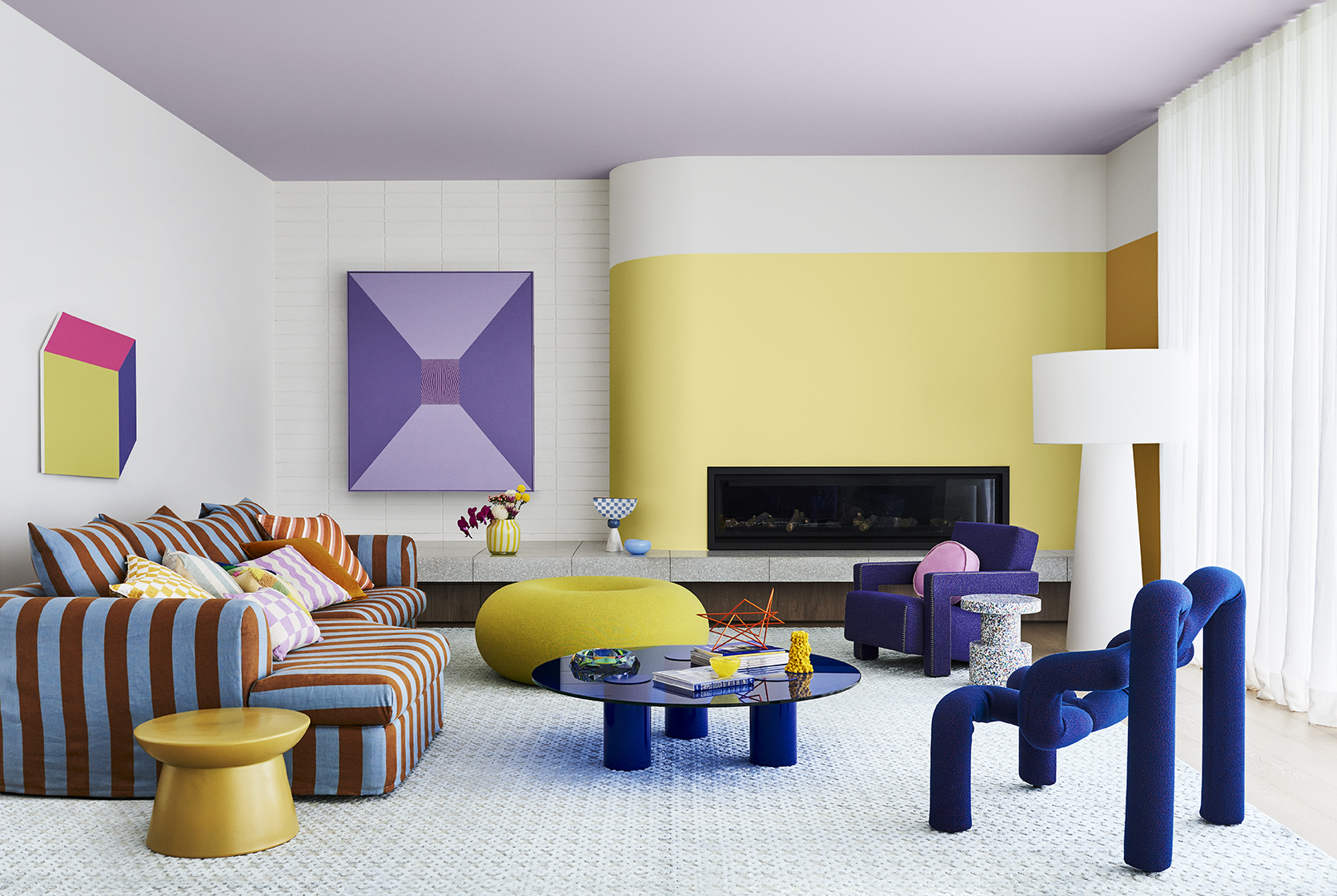
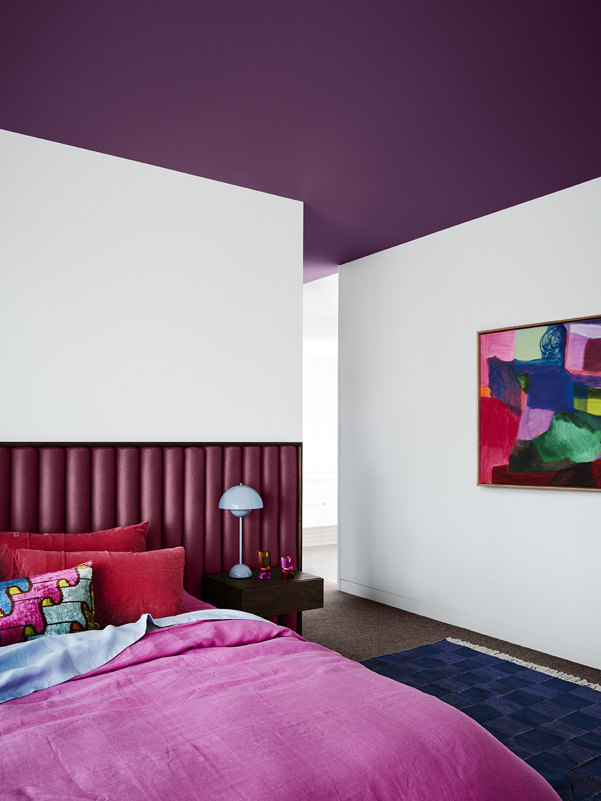
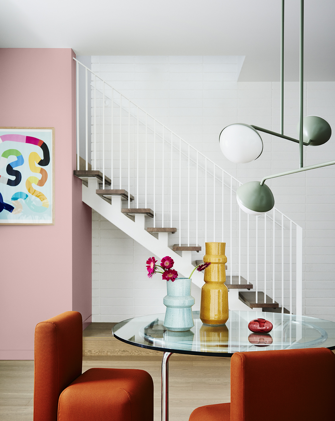
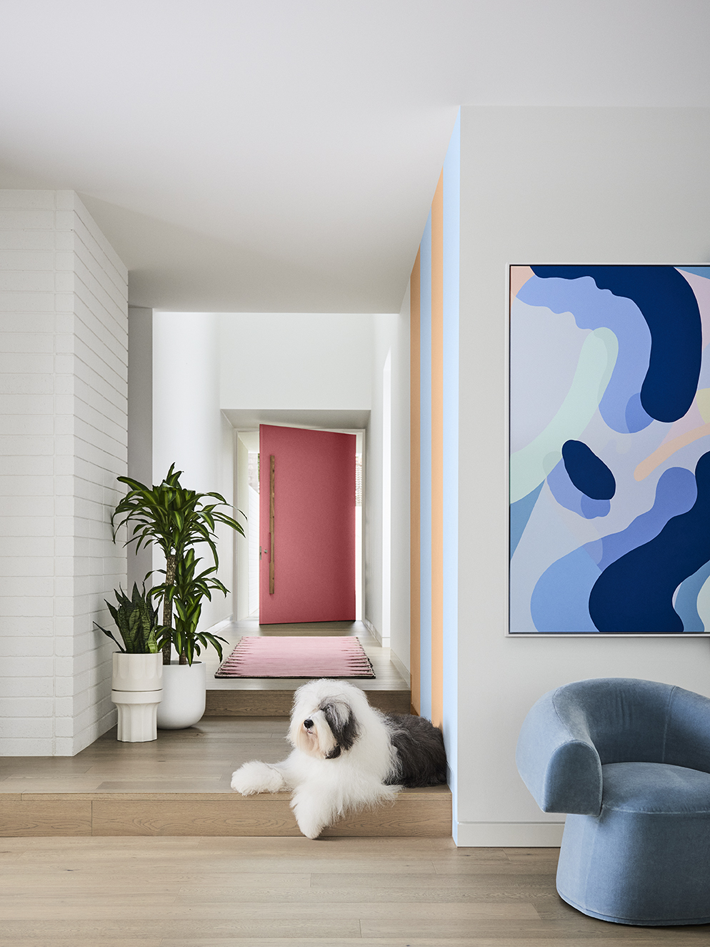
Whilst the colours in the Dulux Revive palette are a little deeper than last year’s brighter colours, it draws from a same philosophy; it’s out with the so-called ‘design rules’ and in with personal expression. Mustardy yellows, breezy blues, rose pink, lavender and striking emerald are splashed across everything from walls to furniture to create spaces that instantly make you smile.
COMPLEMENTARY INTERIORS
Chubby furniture, exaggerated florals, striped patterns and colours galore. Mixing nostalgic elements, such as 80s-style colour blocking and mid-century-style furniture with futuristic features, like digital and pixel-patterned art, this is a look best described as ‘retro futurism’. It’s also one that speaks directly to the digital generation, with a focus on creating Instagrammable moments – think one-of-a-kind accent walls (yes, they’re back), oversized, statement sofas made with modern quilting techniques, and carefully curated backdrops for video calls. The past, present and future, moulded into one.
Standouts from this palette include emerald green, a popular hue in 2022, which will play a bigger role in the year ahead and we’ll see used in new and unexpected ways, such as fluted paneling on a kitchen island, and paper-bag orange, which helps ground Revive’s kaleidoscope of saturated hues, whilst speaking to the natural aesthetic that dominates this year.
Andrea’s Most Coveted Colour…
“The colour I’m most excited about is from the Revive palette. Dulux Pharaoh’s Gem has been influenced by fashion but we can already see the appeal for interior spaces. Such a fabulous colour to use in the interior, it’s so uplifting and vibrant and you can’t help but feel happy around this colour.”
How to Integrate Colour into Your Home. Andrea Lucena-Orr’s Top 3 Tips
• To introduce colour, try painting the skirting boards or architraves in your living room, the edge of a door, the back of a bookshelf, a bedhead in your child’s room, or breathe new life into an old lamp base , chair or front door with a coat of paint. You’ll find that colour really makes a house a home – once you get started with paint colours, you’ll never look back!
• Before you start painting, it’s crucial when selecting colours for walls or soft furnishings that you consider other fixtures and fittings in your space that you can’t change easily – it might be carpet, tiles, laminate or stone, and/or curtains and blinds that you will need to ensure work with the new colour(s) chosen.
• For colour surety, simply order A4 stickers or Sample Pots from dulux.com.au in your chosen colour(s) for your space – view these colours in your home’s natural light conditions. Alternatively, Dulux has an online colour advice team and a Colour Design Service if you want a design professional to assist in curating your space.
Images provided by Dulux
Styling: Bree Leech
Photographer: Lisa Cohen
