“We’re all about blood cancer. So people with blood cancer can be about everything else.”
When an organization is laser focused on its mission and impact, sometimes its branding can fall by the way side and get lost in the sauce. This was the case for the Leukemia & Lymphoma Society, who recently reckoned with its murky messaging and partnered with global branding agency JKR to fix it. Renamed Blood Cancer United as part of the brand overhaul, the organization unveiled its first national advertising campaign in more than a decade in late August, launching its new name and brand identity just ahead of Blood Cancer Awareness Month which kicked off on September 1.
The campaign centers a bold goal: by 2040, Blood Cancer United will enable people with blood cancer to gain more than one million years of life.
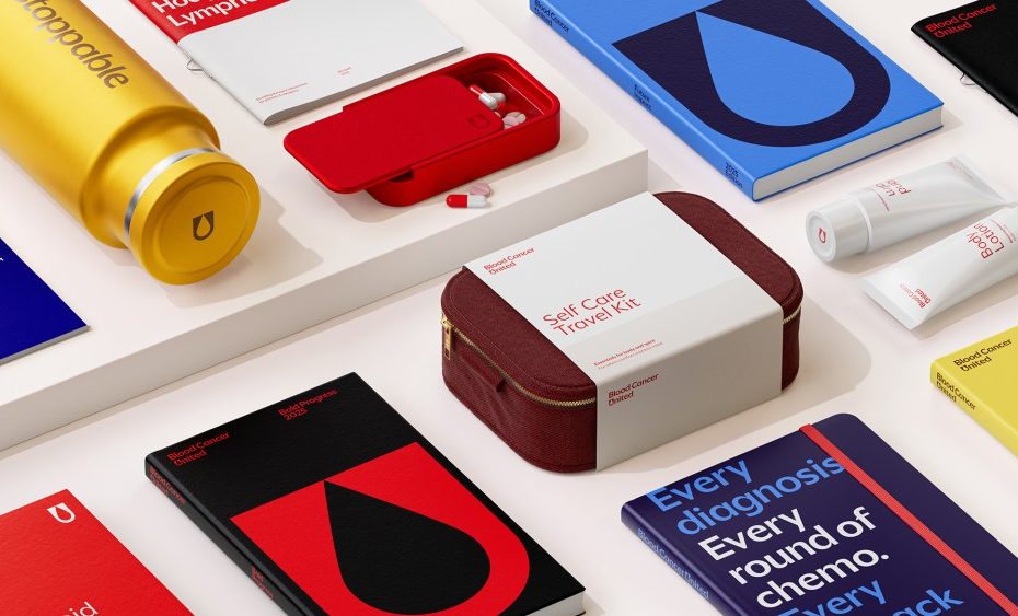
Blood Cancer United teamed up with JKR to create a new brand system for the organization that better represents the its longstanding mission to cure blood cancer and improve the quality of life of patients and their families.
“We started with a simple aim to refresh our brand to be more cohesive and consistent. But through our partnership with JKR, we realized the challenge ran deeper: our name didn’t reflect the full scope of who we are or speak to the entire blood cancer community,” said Lynn Godfrey, SVP, Chief Experience Officer at Blood Cancer United. “Changing that was essential. Blood Cancer United is a bold, welcoming name that unites all 100+ types of blood cancer and makes it easier for people to find, understand, and connect with the resources they need.”
Despite its 76-year-long legacy, LLS brand awareness stayed below five percent, and loyalty remained tied more to individual campaigns than to the organization itself. A rebrand was long overdue to solve this problem. They spent over five years conducting extensive qualitative and quantitative research, speaking with thousands of stakeholders and benchmarking against other nonprofits, uncovering fragmented touch points and inconsistent brand expression. JKR then worked closely with the LLS team to shape the strategy, first by changing the name to better reflect the full scope of its work and unify its community.
“Brand is the thread that connects every part of an organization together and shows what it stands for,” said Tosh Hall, Global Chief Creative Officer at JKR. “For Blood Cancer United, that meant creating a brand united for all. That spirit now runs through everything, from the name to the design systems to the behaviors, building unity for the work it does and, most importantly, speaking to everyone touched by blood cancer.”
The name “The Leukemia & Lymphoma Society” was clunky, hard to pronounce, and exclusive. Many types of blood cancer were left out, and the word “society” felt distant and unwelcoming. Meanwhile “Blood Cancer United” brings everyone together under one banner. Plus it’s easy to say, easy to recognize, and inclusive of every type of blood cancer.
The same spirit of unity in the new moniker runs through the entire identity. It features a new blood drop emblem shaped from the “U” in “United” to symbolize commitment to every type of blood cancer. It also includes the brand’s first-ever unified voice: clear, compassionate, and rooted in real stories that create meaningful connections. This unified identity stretches across every platform, from digital channels like the website, social, and email, to physical touch points like programs.
Now, Blood Cancer United has a look and feel worthy of the important work its pioneered for decades, and is set up to carry on for generations to come.
The post JKR Gives Blood Cancer United a Unified Rebrand appeared first on PRINT Magazine.
