The credit system in the United States has long leaned away from the very people it was designed to serve. For more than 100 million working Americans, fair credit remains out of reach, locked behind outdated metrics that punish past missteps instead of recognizing potential. Now, with a new name and brand identity crafted by London-based agency Ragged Edge, fintech company Tilt is signaling that the odds are about to change.
Formerly known as Empower, Tilt isn’t tinkering at the edges; its underwriting model considers over 250 non-traditional signals of financial health, from steady paychecks to responsible bill management, in an effort to extend access to those left behind by traditional lenders. But the rebrand goes beyond a functional fix; it’s a declaration that Tilt is here to credit people for what they’re capable of, not what they’ve been penalized for.
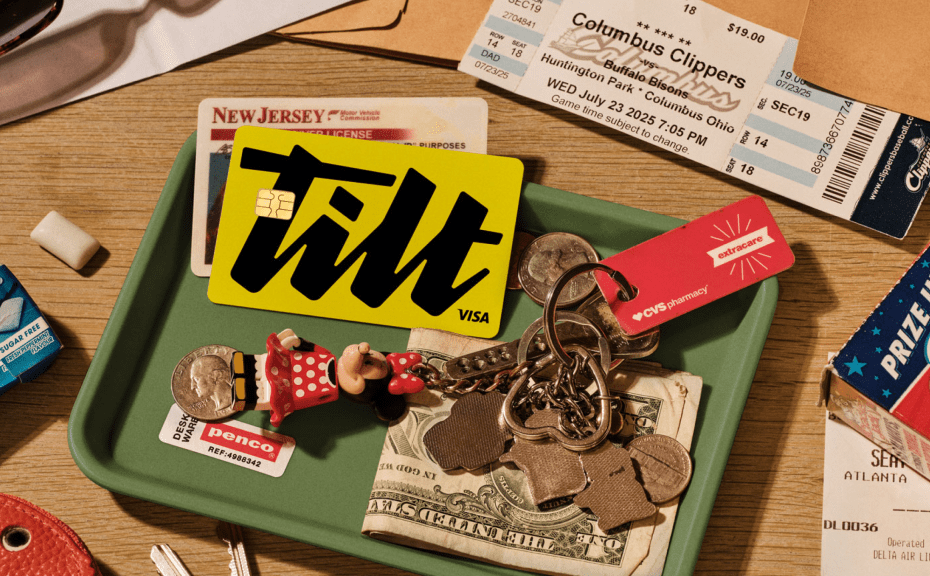
Ragged Edge’s solution was to double down on Tilt’s mission through design that feels anything but generic fintech. The name itself carries the metaphor: a turn toward fairness, a nudge in favor of the underdog. The identity is stripped back to stark black and white, but sparked alive with jolts of chartreuse, a classic confidence paired with optimism. The signature-style logo evokes a personal commitment rather than a corporate seal, while customized typography literally leans forward, infusing urgency into the brand voice.
Painterly illustrations by Pearl Chuaynarong add grit and humanity. Brushstrokes embrace imperfection, a subtle yet powerful counterpoint to the sanitized, pastel friendliness and blue formality that dominate financial services. This tactile texture grounds Tilt in the reality of working people’s lives — messy, resilient, unfinished.
Many fintechs lean into friendly banter, trying to soften finance with emojis and empty warmth. Tilt instead opts for something more radical: conviction. “Tilt customers don’t need another friend,” Ragged Edge’s Fia Townshend explains. “They need help kicking down doors.” The voice is soulful, intelligent, and uncompromising, a steady hand that believes in the people it serves.
The positioning is already paying off. The click-through rates of Meta campaigns featuring the new identity have soared, proving that a brand built with belief can cut through both clutter and skepticism.
What’s remarkable here is not simply a name change or a design refresh; rather, it’s the reframing of an entire category. Credit brands have historically branded themselves around authority, reliability, and security, but Tilt instead projects grit, warmth, and urgency. It’s branding as activism, design as a lever for systemic change.
Tilt needed a brand with teeth. One that could challenge outdated systems and credit people for their potential.
Matt Smith, executive creative director at Ragged Edge
In a sector where sameness is the norm, Tilt is proving that a brand built on conviction — and expressed through design with edge and soul — can do more than look different. It can start to tip the scales.
The post Tilt’s Rebrand by Ragged Edge Democratizes the Future of Credit appeared first on PRINT Magazine.