On August 19, a not-very-prominent story titled “Africa Is Big, and It Wants the World’s Maps to Show It” appeared in The New York Times. “Africa is roughly three times as large as Europe, but you wouldn’t know it looking at the world’s most popular map, the 16th-century Mercator map,” wrote Times reporter Saikou Jammeh from Dakar, Senegal. Mr. Jammeh quoted Malika Haddadi, deputy chair of the African Union, who said, “The Mercator projection fosters a false impression that Africa is ‘marginal.’” That’s because the African continent, which takes up 20 percent of the world’s total land area, appears significantly smaller on maps based on the 1569 Mercator projection, which disproportionately enlarges land masses farther from the Equator, specifically Europe and the United States.
I was an African studies minor who worked my way through UCLA, typing articles for African Arts magazine. But you don’t need to have studied African history to recognize that Africa has been continually and terribly marginalized through movies, cartoons, comics, books — especially children’s books and textbooks. The only mentions of Africa in my high school world history textbook were of the 1880-1902 Boer Wars, during which the first white settlers, Afrikaans-speaking inhabitants of what is now South Africa, fought the British, who ultimately prevailed to control of the territories and the diamond mines. Until studying African history and art, I, like most Americans at the time, had no knowledge of colonialism, the “scramble for Africa,” and the “Lost Cities,” the powerful civilizations that once defined West Africa before the slave trade decimated them.
The Mercator projection fosters a false impression that Africa is ‘marginal.’
Malika Haddadi, deputy chair of the African Union
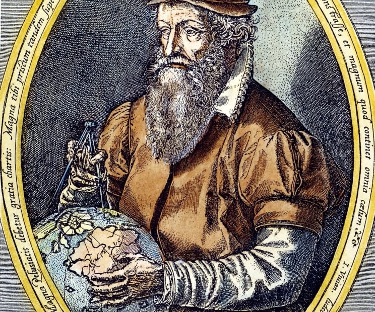
The maps hanging in my high school classroom, as well as in American and European classrooms, books, offices, and libraries were, and still are, based on Gerardus Mercator’s 450+-year-old projection. With its straight longitude and latitude lines intersecting at right angles, the Mercator projection was designed by the Flemish master globe-maker and scholar who had figured out how to translate the content on the surface of a globe to a flat surface that could guide explorers and mariners on their way. Although the shapes and relative sizes of the continents were distorted, it was quite a feat (and had Columbus lived another 77 years, he might have made it from Spain to India)! In any event, the problem with Mercator’s map was that the shapes and relative sizes of the continents were distorted.
Gerardus Mercator, 1512-1594
Among geography nerds, distortion has long been a continuing issue. But among Africanists — individuals who champion African self-determination and identity — it’s a travesty; the Mercator projection has been seen as a deliberate deceit, a way to minimize the importance of Africa and to perpetuate false stereotypes of backwardness and inferiority.
Currently, we may be entering a new era. The late Renaissance and subsequent period of colonization may finally be over. Like many people — even though I love globes and maps — I gave the relative size of continents little or no thought until last month, when the work of three cartographers made the news with their Equal Earth Map. Here’s a short video explanation.
The cartographers, Bojan Šavrič of Esri Inc., a mapmaking company in Redlands, CA; Tom Patterson of the U.S. National Park Service in Harpers Ferry, WV; and Bernhard Jenny, Faculty of Information Technology, Monash University in Melbourne, Australia, described their work in a 2019 paper published in the International Journal of Geographical Information Science: “We searched for alternative equal-area maps… but could not find any that met all our aesthetic criteria. Hence the idea was born to create a new projection that would have more eye appeal compared to existing equal-area projections and to give it the catchy name Equal Earth.” The ten-page paper is filled with drawings of alternative maps and mathematical equations that attempt to “flatten the sphere,” but clearly the designers kept their eye on the prize: acceptance, what the public would find attractive, buy, and use.
One of the Equal Earth Maps that can be downloaded, free, from equal-earth.com
The Equal Earth maps are available as free downloads, in various formats and languages. Those who crave more detailed information about the “world map for everyone” may enjoy watching this presentation by Tom Patterson.
The differences between the two projections as depicted by Weiyi Cai, Senior Editor, Visuals, The New York Times
Acceptance is happening. The Correct The Map campaign, led by the organizations Africa No Filter and Speak Up Africa and backed by the African Union, is gathering steam worldwide. Information about the campaign, spreading through news organizations, calls for individuals to sign the petition, and for schools, media, and institutions worldwide to switch to the Equal Earth projection. As Africa No Filter’s executive director, Moky Makura, puts it, “This is not just a geography issue, but a narrative issue about pride, identity, and rewriting the narratives that have long diminished Africa’s global role.”
Kevin Nathaniel Hylton, a New York City-based peace activist, musician, and teacher, says he’s signing up. “The Mercator Projection fostered a false impression of the size of the African continent,” he says. “I think it did and does still have an extraordinary and subliminal effect on students who grow up seeing it, which can lead them to think Africa is not as diverse and expansive as it is.” Hylton, who specializes in the rhythms and instruments of Africa, especially the mbira, or thumb piano of Zimbabwe, and the shekere, a percussion instrument originating with the Yoruba people, often uses images of the African continent in posts promoting his Afro Roots events. “When viewing the Mercator projection, people can’t begin to imagine how small the European countries that colonized major parts of Africa are and how vast Africa’s resources are,” he says. “It will take an immense revolt in academia and the major media to unblock the falsely downsized lens through which Africa is viewed and described.” He says he wholeheartedly supports “Correct the Map,” but calls it “just one aspect of the revolt in its beginning stages.” Next, he advises: a total revision of the global studies textbooks used in American schools, which “totally disregard African philosophies and view the world from a completely different viewpoint than someone living the experience in Africa.”
What about the viewpoint of someone — a design leader who has lived the experience in Africa? Jacques Lange, partner and creative director of Bluprint Design in Pretoria, South Africa, is a world-traveled former president of the International Council of Design (ICoD), and mastermind behind the Mandela Poster Project. “I have personally always had a love for maps and have used them on many occasions as part of my design solutions,” he says, emphasizing that he “becomes extremely annoyed when designers mess up or distort the beautiful shape of the African continent purely based on ignorance or lack of interest or respect,” noting that he takes pains to teach students to pay respect to maps, flags, language, and cultures, especially those not part of their personal lived lives. “I am pretty sure the majority of people in the world have very little understanding of global geography purely because of ignorance.”
Visualizing global geography through maps is one of the first ways children learn about the world, and a quick search for “world maps” on Adobe’s Behance platform highlights the problem.
“Vector World Map of Animals for Children” by PixDesign King, a graphic designer and agriculturist in Bangladesh, is cute, but it shows Africa as about the same size as the USA.
The map on the African Union’s home page demonstrates that China, India, much of Europe, and the entire USA (3.5 million square miles) can fit inside Africa (30.37 million square miles). For many more visualizations, visit reuters.com.
“Maps are crucial teaching tools because students need to be able to visualize the relative size of continents to each other as well as the relationships of the countries within them, especially as borders and national alliances change,” says Phyllis Opochinsky, for more than 20 years an award-winning history teacher in public high schools in the Bronx, NY. Opochinsky’s list of sins committed against Africa and African nations is a long one, beginning with inaccurate, racist, negative depictions in children’s books: Tarzan!, Babar the Elephant!, Curious George!, Little Black Sambo! — even though the latter was supposed to be South Indian (same difference, right?). “The Dark Continent” perception continues throughout many Americans’ adulthood, which she describes as a vague, general impression of Africa as one monolithic chunk of land consisting solely of desert and jungle, rather than the 54 countries with many languages and cultures that make up the United Nations Africa Group.
While working on this story, I revisited my copy of Dark Star Safari by that most prolific of travel writers, Paul Theroux, who’d been a Peace Corps volunteer in Malawi from 1963 to ’65. He specializes in beautifully written, cheeky negativity, and true to form, he found little not to criticize about his 2016 journey from Cairo to Cape Town. On just about every page, you’ll find words like ramshackle, dreadful, horror, dusty, dirty, destroyed, filthy, economic failure. He’s most disparaging of the (ineffective) NGOs’ white Range Rovers and the safari-park companies’ luxury tents. But about the school in Malawi where he volunteered as a teacher, oh boy: abandoned, scorched, battered, books stolen by students, education budget stolen by government officials.
Research materials
The stated purpose of organizations like Africa No Filter is to change the narrative: “Through research, grant-making, community building and advocacy, we support storytellers to help shift the stereotypical narratives about Africa one story at a time.” In addition to basing graphics on the Equal Earth map, sites like Teaching for Change and articles like “I Didn’t Know There Were Cities in Africa” can help designers and writers visually craft stories that, for example: use names of specific countries instead of just ‘Africa;’ that don’t perpetuate stereotypes of hungry and poor Africans; that use the word ‘house’ not ‘hut,’ and the word ‘people’ or the name of a specific ethnic group instead of ‘tribe;’ and that avoid Lion King-like wild animal motifs because most Africans work in a variety of jobs and professions and live in cities nowhere near game parks.
One step at a time. The “immense revolt” Kevin Nathaniel Hylton envisions may be happening. It hit our collective consciousness just one month ago with that little story about the campaign for a new map. And look, in last Sunday’s paper, a map highlighting four places where Times journalists are located, its outlines clearly based on the Equal Earth projection.
Header image: from the new Equal Earth wall map (free to download; in the public domain).
The post A New World Map Begins to Repair 450 Years of African Marginalization appeared first on PRINT Magazine.