Sabri Akın founded Oniki, his Istanbul-based multimedia design firm, after COVID. One of his most important clients is Soyak, which has created a legacy in construction and industrial ventures, delivering projects across residential, commercial and industrial sectors. Over the years, the group has expanded its operations and has begun investing in renewable energy, exploring geothermal, wind and solar power.
This shift, says Akın, presented a new challenge: How could Soyak position itself as an innovative energy-driven group while leveraging decades of experience and reputation? To answer that question, Oniki worked with Soyak to redefine its brand strategy and corporate identity. I asked Akın to share more about the process of developing a new look for a long-lived company.
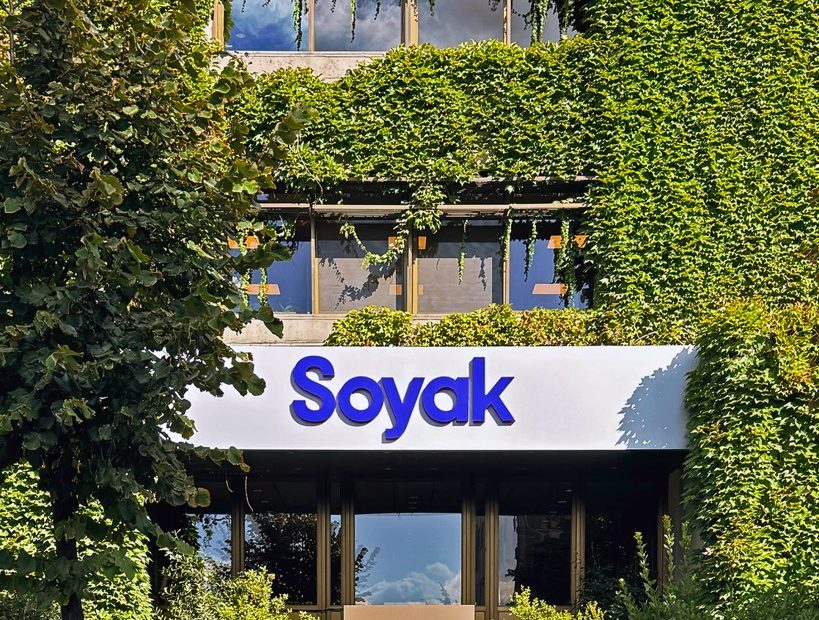
Tell us more about Soyak. Is it privately or state run?
Soyak is a privately owned holding company. Its independence and long history have given it credibility and a strong reputation within Turkey.
It has a very Western design aesthetic. Has corporate America been an influence on design in Turkey?
I think it’s important to see graphic design as a global discipline. What often gets labeled in the U.S. as a “corporate American” style is really a continuation of European Modernist teachings and traditions that shaped Turkish design long before. Our relationship with European graphic design culture actually dates back to the 18th century, before the United States was even founded, with the introduction of the first Ottoman printing press in 1727. By the late 19th century, European-style illustrated magazines and satirical weeklies were already mainstream in Istanbul; in 1928, the alphabet reform made the Latin alphabet the everyday standard, and by the 1950s–’70s, Turkish design schools were teaching Bauhaus-influenced methods.
This history also includes important contributions from global design pioneers from the U.S. For example, Chermayeff & Geismar designed the Koç Holding logo in 1971, which became one of the most recognizable corporate symbols in Turkey. Over the following decades, they and other international firms went on to design identities for dozens of major Turkish corporations and cultural institutions, further embedding Modernist approaches into the country’s visual culture.
However, in this context, Soyak’s new identity is not about echoing aesthetics, but about carrying forward contemporary global design practice into a solution tailored to our client’s own needs.
Did Soyak suggest directions or were you free to follow your instincts?
Soyak came to Oniki with a clear sense of their business challenge: They wanted to reposition themselves as an energy-driven group while maintaining credibility from their long-standing legacy in construction and industry. In terms of visual direction, they gave us considerable freedom.
The process was not about instinct alone; it was rooted in strategy. We began with a structured brand strategy phase, defining Soyak’s positioning, values and key narratives. This gave us a shared framework with the client before moving into design.
Within that framework, we translated the strategic goals into a bold yet elegant identity system, one that signals change while still respecting their heritage. The partnership worked because Soyak trusted us to push beyond the familiar corporate or energy-sector look and feel, while we trusted their insight into the holding’s history and ambitions.
Ultimately, what did Soyak want to achieve?
The aim was to signal transformation, innovation and sustainability while still honoring its established reputation. The new brand identity therefore needed to do two things at once:
Leverage Soyak’s heritage to provide credibility and continuity.
Project a bold, modern image that could support its expansion into energy and its commitment to a sustainable future.
Is your work with them ongoing?
Oniki’s collaboration with Soyak was project-based. We defined the brand strategy and delivered the full identity system and guidelines, which are now being implemented internally by their teams. While our role concluded with the handover, the system was designed to be comprehensive and adaptable so that Soyak can continue to apply it consistently across their communications.
What would you add to the Soyak visual language that you did not or could not achieve?
We’re very happy with the outcome, as it responded to Soyak’s strategic needs in full. At the same time, we recognize that every brand is a living system, one that can grow and adapt in new directions over time.
Creative Direction: Sabri Akın
Brand Strategy and Copywriting: Sabri Akın, Batuhan Akın
Design and Art Direction: Sabri Akın, Defne Özak
Motion Design: Mahmut Kalyoncu
Website Design: Deniz Gündoğan
The post The Daily Heller: Renewed Design Energy for Turkey’s Energy Corporation appeared first on PRINT Magazine.