A beautiful drive up on a warm end-of-summer evening brought me to Macallan Villa—a stunning retreat perched in the Hollywood Hills above LA. Inside, I sat with The Macallan’s creative director, Jaume Ferràs, and his in-house team to talk through their latest launch. Macallan’s Sherry Oak Whisky collection features artwork by graphic designer and artist David Carson.
The moment I set foot in the luxurious brand home, it was clear this brand doesn’t just tell its story through bottles. The Macallan Villa carries the same narrative into physical space. Built with oak, adorned with copper, and surrounded by Albariza soil (known for nurturing Spanish Palomino grapes), the villa felt like stepping into a living expression of the brand: Scottish precision woven with Spanish warmth and a dash of California ease. Nature, heritage, and culture come together. The details were explained by Jessica Tamilio, brand director at The Macallan USA & Canada.
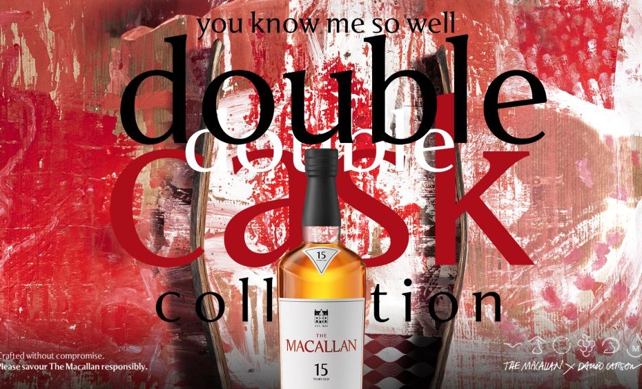
Carson’s work with The Macallan actually goes back to 2018, when he was given a deceptively ambitious challenge: make one of the world’s most intricate whisky stories accessible to both seasoned connoisseurs and curious newcomers. Known for his ability to create ecosystems that feel effortless, Carson translated The Macallan’s deep narrative—heritage, wood, and decades of maturation—into design elements that invite recognition without overwhelming. His signature style is seen throughout the packaging that creates a system that is still feels like The Macallan brand.
The way Whisky is brought to life doesn’t begin in the glass. It begins in the forest. Sustainably sourced oak is harvested, then air-dried for years before it’s ever shaped into casks. European oak rests up to 2.5 years under the Spanish sun, while American oak is seasoned differently, creating distinct characters in the final flavor. Only then does the distilled barley spirit flow into these vessels, to rest for at least 15 years. The youngest expression currently available? Twenty years. That patience and restraint is what makes every aroma and every sip feel so layered.
Beauty is secondary to story.
Jaume Ferràs, creative director
If whisky is about time, the design is about translation. Each bottle carries subtle cues—a designer’s dream of Easter eggs hiding across packaging and labels. White color hints at American oak while deep reds reference the European variety; amber reflects the whisky’s natural color. Nothing is used simply for beauty’s sake. As Jaume Ferràs, creative director at Macallan put it, “Beauty is secondary to story.” And I could see how every line, shade, and typographic detail was chosen to carry the narrative of the casks, the maturation, and the provenance of flavor.
No detail was spared in the publicity package (influencers, watch out!). What struck me most were the cocktail charms—tiny, playful tokens designed to carry The Macallan’s heritage into everyday rituals. A salmon, a horse, a peacock. Each one symbolizes a different aspect of the brand’s story, from Scottish rivers to Spanish seasoning traditions. The peacock, designed by Carson, pulls inspiration from the whisky’s natural color—a touch of whimsy that turns heritage into something tactile and memorable.
That’s what impressed me most: the balance. The Macallan is steeped in history, yet still approachable. It’s deliberate without being rigid, playful without losing gravitas. Every choice, whether in packaging, architecture, or keepsake charms, feels like a step closer to understanding the brand’s story.
And as Jaume reminded me before I left, “The story comes first. Everything else follows.”
The post Whisky, Wood, and Wonder: The Macallan’s Story in Symbols appeared first on PRINT Magazine.