When a brand as ubiquitous as Lay’s announces its largest refresh in nearly a century, you brace for something seismic — a radical overhaul, perhaps, or a striking departure from the familiar yellow bag that has become shorthand for snack-time joy across the globe. Yet, in true PepsiCo fashion, the evolution of Lay’s is more refined than revolutionary. This isn’t a brand trying to reinvent itself; it’s a brand polishing its story by cleaning up its logo, dialing up the warmth, and reminding the world of something that’s always been true: these chips come from real potatoes and real people.
From a design perspective, the refresh is a textbook example of modern heritage branding, a thoughtful balance between nostalgia and relevance. The new logo feels cleaner, its iconic sun given “Lay’s Rays,” which emanate optimism and tactility. The packaging leans into its agricultural roots with wood-grain textures and honest photography, bringing an authenticity that grounds the joy the brand has always promised. It’s a system that doesn’t scream for attention, but hums with confidence.
It’s a reminder that good design is about clarity, not shock value; about reconnecting with truth, not chasing novelty.
What stands out most to me, however, is not the aesthetic refinement but the global consideration behind it. The design system — built with what PepsiCo’s Carl Gerhards calls a “glocal approach” — ensures Lay’s feels unmistakably itself from Mumbai to Madrid, while allowing regional flavor stories to shine. It’s proof that even the world’s most recognizable brands can still find fresh ways to connect with local culture without losing their universal smile.
No, this refresh won’t redefine snack packaging, but it doesn’t have to. It’s a reminder that good design is about clarity, not shock value; about reconnecting with truth, not chasing novelty. And in that way, Lay’s manages to do what it’s always done best: keep things simple, joyful, and undeniably human.
To learn more about the thinking, craft, and collaboration behind this century-in-the-making refresh, I spoke with Carl Gerhards, senior design director at PepsiCo. We discussed how the Lay’s team found that delicate balance between farm-grown authenticity and universal joy, and what it takes to redesign an icon for a global stage. (Conversation lightly edited for length and clarity.)
The Lay’s brand has always been tied to joy and everyday moments, yet this refresh leans heavily into its agricultural roots. How did your design team balance communicating “farm-grown authenticity” and preserving the playful, universal spirit that has made Lay’s a cultural icon?
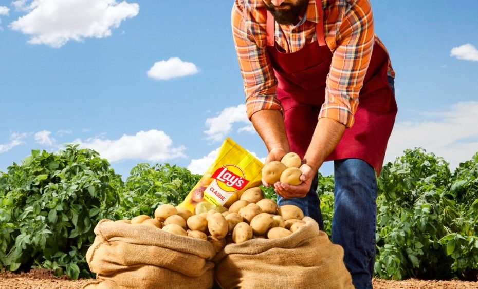
Lay’s has always started with real potatoes and has been deeply rooted in farming and agriculture. But we needed our bag to tell that story. You can see references to our agricultural heritage in the rich farm imagery. We did photo shoots on the ground at a farm in New Mexico with a real Lay’s farmer, naturally lit by the sun. The wood grain textures on the bag nod to farm crates that house Lay’s potatoes. One of our biggest changes was the enhanced food photography that showcases the natural quality of Lay’s potatoes, shown just as they are when they’re farmed. And it’s all paired with the iconic yellow sun in the logo, complete with rays that provide warmth and optimism to the visual identity.
And speaking to the joy you mentioned, we wanted to continue to showcase the brand’s joy and the connections it creates. Joy comes from the sun, quality food, being outside with family and friends, and enjoying life. The new design brings this to life in a way that feels inherently joyful.
This redesign is a love letter to the real potatoes and real people behind every chip, while making sure the brand still radiates the universal joy our fans have come to expect with each bag of Lay’s.
The new packaging emphasizes that Lay’s chips come from real potatoes — something 42% of consumers didn’t realize. From a branding perspective, that’s a fascinating gap. What does it reveal to you about the challenges of communicating “obvious truths,” and how did that insight shape the visual storytelling?
It’s a great point, and sometimes what’s most fundamental to a brand can be the most overlooked. We’ve always made Lay’s with real, farm-grown potatoes, but realized maybe we weren’t telling that story clearly enough. Many of our varieties didn’t even feature a potato on the packaging. That insight really drove our approach: we wanted to make the “obvious truth” feel vivid and unmistakable. That’s why the new design puts actual potatoes front and center, captured with macro photography that celebrates their beauty. Other visual nods include ingredient-inspired color palettes and farm-inspired visual touches, like wood-slat backdrops.
Additionally, while the yellow sun has always been a part of our logo, we made it more obvious with the addition of “Lay’s Rays.” Our goal was to visually bridge the gap, so there’s no question about what’s inside each bag and where it comes from.
Rolling out a brand refresh of this scale across global markets is no small feat. What systems or design frameworks did you create to ensure both consistency and cultural flexibility, so that the identity feels distinctly Lay’s everywhere, but also resonates locally?
This was a global team effort from the start. We used our “glocal approach,” meaning the design was built to be globally strategic and locally relevant. We developed a flexible design system anchored in the distinct brand elements, like the Lay’s Rays, the red ribbon quality seal, the foundational color palette, and the iconic bag outline. These are constants across markets, ensuring global recognition and consistency. But we worked closely with regional design teams, infusing local authenticity through ingredient photography and flavor cues that reflect each market’s unique food culture. On-pack messaging is tailored to regional tastes. We also invested in and elevated our food photography across the entire flavor ecosystem, so the quality ingredients in each global variety are more pronounced. The result is a unified global identity that’s unmistakably Lay’s, but still feels locally relevant wherever you pick up a bag.
Additionally, throughout the process, we always use a 360-degree approach to branding. We design against multiple touchpoints to pressure-test our ideas and see if they have enough flexibility to tell the stories we need across such a big brand.
A logo refresh is often seen as symbolic, but it’s rarely just a surface change. Can you walk us through a specific design decision in the new identity that carries deeper meaning for how Lay’s wants to be seen in this new era?
One design detail I’m especially proud of is the “Lay’s Rays” radiating from the logo. These beams of light aren’t just decorative – they’re a nod to the sun that grows our potatoes and to the joy of sharing Lay’s outdoors with friends and family. We even created them using potato stamping. It’s a traditional printing method that roots the design in our craft and food story. And it provides a compelling natural texture.
Many heritage brands wrestle with how to honor the past while still looking forward. As Lay’s enters its second century, what role did design play in future-proofing the brand? How do you envision the brand evolving with new platforms, packaging innovations, or consumer expectations?
Absolutely. Our design team’s job is to celebrate the brand’s legacy while also making sure we’re ready for what’s next for Lay’s. For example, in the logo, we kept our most iconic elements, like the yellow sun and red ribbon, but we modernized it with cleaner, uplifted lines, a new signature font and a refined color palette.
This brand has a strong sense of personality, inspired by real potatoes, real connections, and real joy. This served as a strong north star for how we select colors and textures, photograph food and people, and how we produced elements like Lay’s Rays. This sense of personality will allow the brand identity to continue adapting to new communication methods, campaigns and culture over time.
The post Lay’s Rays and the Art of Subtle Reinvention appeared first on PRINT Magazine.