Any filmmaker with their priorities in order knows that the opening title sequence of their film is of the utmost importance. I’ve waxed romantic on the power of opening titles on many occasions here at PRINT, and I will continue to do so with reckless abandon. After recently tapping Lola Landekic, the editor-in-chief of the website Art of the Title, to share her favorite opening titles in TV and film in 2023, I learned that the creation of the animated title card featured in Saltburn was a particularly impressive endeavor.
In addition to Landekic’s praise, the director of Saltburn, Emerald Fennell, shared an inside scoop about the title card via Twitter/X in conjunction with the film’s release.
Hand drawn? Gilded? Stop motion? This title card pushed all my buttons— and I had to learn more! So, I reached out to the graphic designer and illustrator behind the title card, Katie Buckley, to hear more about the meticulous process that Fennell alluded to in her post. Buckley generously responded to my questions below, illuminating the journey she and her assistant, India Paparestis-Stacey, took to bring the Saltburn title card to life.
Buckley’s title card is featured at minute 1:40 in the video above.
(Interview edited for length and clarity.)
Can you describe what process(es) you used to create the beautiful effect of the opening title card? I know illustration, gilding, and stop motion were all involved.
The process for the animation was hand drawn, hand painted, then gilded. I did, however, send Emerald some pencil stop animation of each thorn growth to check she was happy with the feel of it.
here were over 300 cells for the piece of animation. We needed to check that the gold leaf read as gold because gold is notoriously not great unless it’s real. A lot of time goes into digitally creating the gold sparkle; without that, gold can look very “grey.”
Is this process something you’ve done before, or did you develop it, especially for this project?
Saltburn was my first title card and animation project. I was lucky that Emerald believed in my style enough to let me into the world of the title. So, yes, this was specially developed for this project; I relied on my instinct rather than knowledge.
Emerald asked me to do the Saltburn titles because, I quote, ‘I’d like it to feel like the crazy lady in the attic, scratching at the rafters.’ How could I resist that brief?
Katie Buckley
How did the concept for this title card develop? Did you work closely with Emerald to land on the idea, or was it something you conceived and pitched to her?
Emerald asked me to do the Saltburn titles because, I quote, “I’d like it to feel like the crazy lady in the attic, scratching at the rafters.” How could I resist that brief?
To start with, Emerald had said she didn’t want any animation— just 25 title cards, hand drawn and painted. She had mentioned that she liked the Hammer House of Horror (1980) “feel” to the lettering.
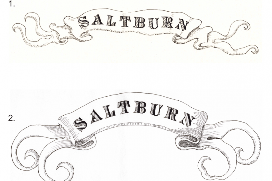
Emerald had said she would like “Saltburn” to be in a banner; here are the first sketches that we talked about regarding what she wanted:
After seeing the banners, Emerald thought she would like the Saltburn titles animated and asked if I was prepared to do it. I said yes, but I was honest. I hadn’t done animation before, so I would always keep her up to date in case she wanted to go to someone with more experience. I was so lucky that Emerald had complete faith in me because there were moments when I had to take a few huge gulps! (So did she, I’m sure!) There were doubting voices, but I kept saying that none of us knew exactly what Emerald wanted, so let’s buckle up for the ride.
At first, I played with creating a font that Emerald liked. We went through a few different samples of fonts below. The third one is the font that Emerald decided on as soon as she saw it.
[Spoiler alert below]
The whole concept developed quite organically. Emerald had said she wanted the lush green foliage to turn into thorns and be black and threatening. It felt right that the blood red seeped into the black and that the gold was the final creeping vein as the want of riches killed off the whole cast. One of the mood boards had the saying, “Everyone wants to eat the rich because they are so delicious.”
While creating something so time-consuming and meticulous, do you find yourself getting impatient and going a bit mad, or do you relish the lengthy process and enjoy it? and enjoy it?
I felt the pressure of being hunched over tracing, drawing, painting, and gilding for sometimes 15-hour days with very little time. I never felt impatient, but I definitely thought I was going mad. I sent Emerald a photo of my studio one day just to show her that I was the crazy lady in the attic; it was completely covered in gold leaf (it does go everywhere; I still find bits of gold leaf in my garden today), paint, and screwed-up bits of trace and paper.
I can honestly say I have never been so invested in a project.
Katie Buckley
How did it feel once you finally finished the title card? What was it like seeing it in use in the movie?
I can honestly say I have never been so invested in a project. I am so proud of the work my assistant, India, and I did on this. It was thrilling to see the final film and to be part of the coolest film … ever! And to top it all, it’s probably the only film I’ve ever worked on that both my 17-year-old daughter and 82-year-old mother completely loved.
