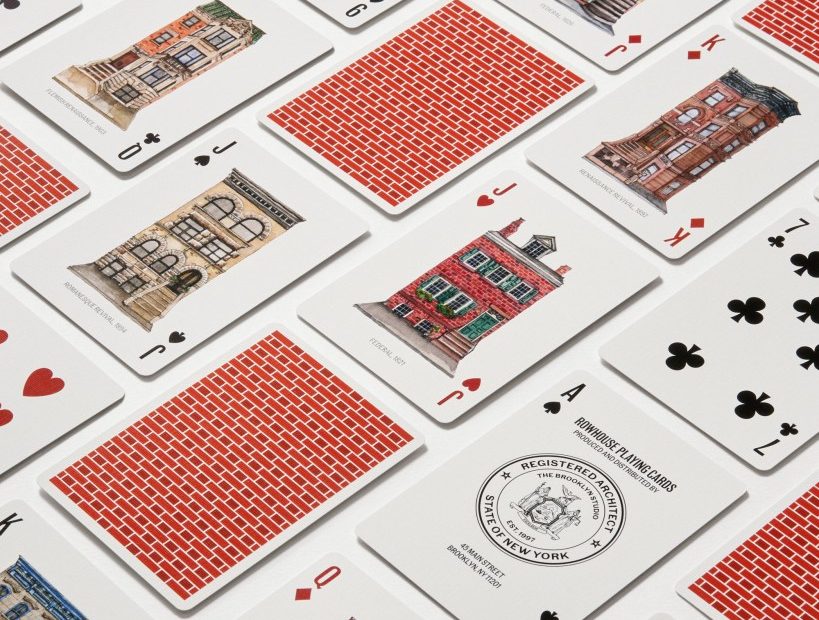
You can’t get any more iconic than the New York City rowhouse. No one understands this better than the DUMBO-based architecture and interior design firm The Brooklyn Studio. With its mission to preserve precious architectural history and create functional and beautiful environments for modern life, The Brooklyn Studio describes the rowhouse as a “fundamental building block of the city, the essence of New York’s architectural vernacular.”
Recently, the firm created a custom set of playing cards in collaboration with the Historic Districts Council (HDC) and renowned type designer Tobias Frere-Jones. The Rowhouse Playing Card deck celebrates the beauty and utility of these 19th and early-20th-century architectural gems across Manhattan, Queens, Brooklyn, and The Bronx.
The cards feature The Brooklyn Studio’s favorite rowhouses in various architectural styles, from Flemish Renaissance to Federalist, rendered in watercolor by artist Diane Hu.
The Brooklyn Studio chose Community Gothic —specifically, an unreleased weight, Extra Condensed Medium – from Frere-Jones Type for the typography. Inspired by 19th-century printing, Community Gothic’s gritty forms and somewhat irregular curves embody the imperfections of small jobbing presses of the time. Community Gothic was a perfect anchor for the Rowhouse deck artwork. Christopher Devine, a consultant who oversaw the design of the playing cards, said. “There is a remarkable parallel between Community Gothic and New York City rowhouses. Today, we tend to romanticize rowhouses, but their design and construction were rooted in utility. Community Gothic was created in a similar spirit: it celebrates the ordinary, utilitarian letterforms that characterized nineteenth-century print culture.”
“In addition to philosophical and historical parallels,” Devine said. “Community Gothic and Hu’s illustrations share some noteworthy aesthetic similarities. The typeface’s letterforms are characterized by slightly irregular, asymmetrical outlines, which mirror the playful irreverence of Diane’s watercolors. From the day Community Gothic was released in late 2022, I had been waiting for the perfect opportunity to specify this typeface. As soon as Diane signed onto the playing card project, it was clear that the time had come.”
With the illustrations and typeface in place, one crucial design element remained. “Pairing Community Gothic with a set of crisply drawn suits would be, to paraphrase Adrian Frutiger, like wearing jeans and a tailcoat, “ said Devine.
So, Devine approached renowned type designer Tobias Frere-Jones to design custom suits. “Tobias grew up in Brooklyn and is something of a resident expert on nineteenth-century New York City. He responded right away, said that he’d love to be involved, and we had a call the following day. Beyond some general details, I did not provide any specific artistic direction; I trusted his instincts wholeheartedly.”
Rounding out the design is a card back featuring a delightfully asymmetrical Flemish bond pattern evoking a 19th-century bricklaying technique, created using hyphens and en-dashes from the Community Gothic family.
Part of the proceeds from Rowhouse Playing Cards go to the HDC to help them continue their work advocating for New York’s historic neighborhoods. Learn more and shop on The Brooklyn Studio’s website.
Find out more about Frere-Jones’ 2022 release of Community Gothic in this article on their website by Elizabeth Goodspeed, and here, in our Type Tuesday feature from early 2023.
Christopher Devine also designed a LEGO set for The Brooklyn Studio, featuring Brooklyn highlights such as the Carroll Street Bridge, Park Slope rowhouses, and Grand Army Plaza. Like the Rowhouse Playing Card deck, part of the proceeds support HDC’s mission.
Photographs by Ethan Herrington.
