Designed by Daniel Iglesias, Galnoy emerged from two simple objectives. Iglesias wanted to create a versatile display font that would shine in various contexts. He also set out to unify the elegance and exuberance of the Gothic and Art Nouveau styles.
Iglesias started with the classic forms inherent in iconic “Old Style” fonts such as Bembo and Garamond and experimented with adding elements more typically found in Gothic and Art Nouveau styles: exaggerated ornamentation, organic flourishes, flamboyant capitals.
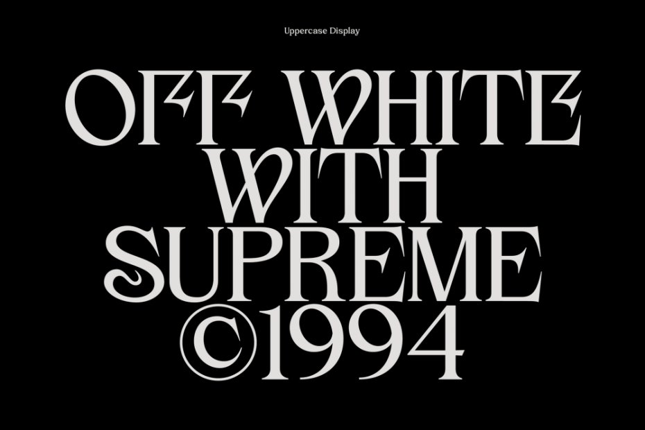
Through his three-year experimentation, Iglesias developed ultra-display alternatives for uppercase letters. By reducing the contrast between strokes and playing with the height of the verticals, he could also achieve legibility at smaller sizes.
Iglesias specializes in motion, web, and editorial design at Mubien, a studio in Santander, Spain. He also moonlights as a professor of motion graphics at a local university. Type design is his side hustle, which he enjoys because it engages both his technical and creative sides. “I delve into constructing the entire visual language surrounding the font, from its foundations to each application within the font story.”
His mission for any typeface project has always been straightforward licensing and fair pricing for small and medium-sized businesses.
Read more about Galnoy on Behance. And, try out a weight for free.
All images and videos courtesy of Daniel Iglesias.