What happens when a 19th-century Scotch Roman and an early British grotesque share the same DNA? Sita from Order Type Foundry (OTF) answers with a superfamily that feels historically grounded yet unmistakably contemporary.
Developed as part of type designer Edouard Berard’s diploma project in the Master’s in Type Design at ECAL/University of Art and Design Lausanne, Sita grew out of deep research into British and Scottish typographic history. The resulting type family traces a lineage through the work of Alexander Wilson, William Miller, and the influential Miller & Richard Foundry, whose transitional Scotch Romans shaped 19th-century print culture.
Alexander Wilson Example
Miller & Richard Foundry
A Serif with a Calligraphic Pulse
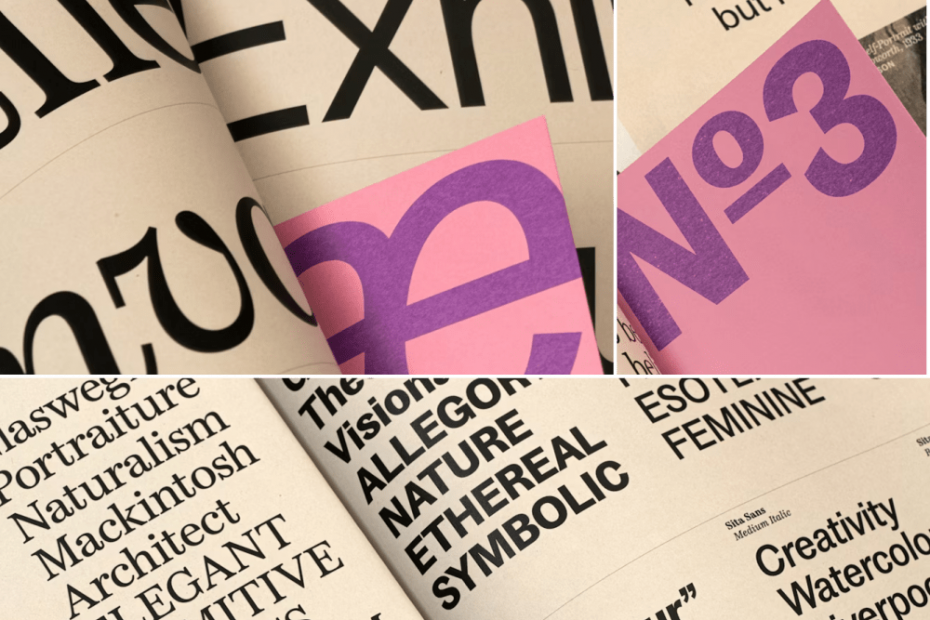
Sita Serif is a contemporary interpretation of Miller & Richard’s Double Pica Roman No. 2 (1822), a Scotch Roman that balances calligraphic warmth with structural precision. While the serif style stays faithful to its historical source, subtle refinements enhance readability for today’s text settings.
Certain letterforms—like the a and n—retain a soft, calligraphic liveliness inspired by Wilson’s earlier Pica Roman. At the same time, Sita Serif leans into a high-contrast model that delivers display elegance, carefully moderated through the relationship between x-height, ascenders, and descenders to maintain text efficiency. The result: a face that performs as gracefully in paragraphs as it does at larger sizes.
A Sans Built from the Same Bones
Rather than treating serif and sans as distant relatives, Sita Sans is constructed directly from the serif’s underlying framework. Proportions and metrics are shared, creating a level of harmony when the two styles are set side by side.
Its personality, however, draws from early British grotesques—particularly the tapered terminals of Stephenson & Blake’s Grotesque No. 88 (1919) and the letterforms of Miller & Richard’s Sans Serif No. 4 (1912). These references lend the sans a subtle flare and charm, avoiding the neutrality of later modernist sans serifs while still feeling clean and contemporary.
A Superfamily That Respects Difference
Many superfamilies aim to blur stylistic boundaries. Sita takes another path. The serif and sans are designed as equal partners—distinct in voice, yet unified by construction. Careful attention to weight, spacing, contrast, and x-height ensures the two styles can move fluidly between display and text roles, in both digital and print contexts.
The Sita Collection comprises Sita Serif and Sita Sans in four weights, each with corresponding italics. While the collection respects and references a rich history of type design, the family doesn’t replicate the past—it translates it, offering designers a system where historical character and modern performance are set in the same line.
The post Sita Collection from OTF: Heritage Forms & Contemporary Function appeared first on PRINT Magazine.