Sometimes, great typefaces begin when someone can’t walk past a well-drawn street sign without stopping for a closer look. Calenza owes its existence to exactly that kind of typographic curiosity.
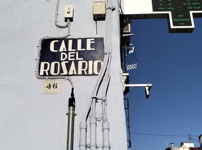
Wandering through Valencia’s historic center, Olivier Gourvat, founder of Mostardesign Type Foundry, an independent French type foundry founded in 2009, became fascinated by the city’s blue ceramic street signs, first installed after a 1902 competition to make street names more legible. More than a century later, they still manage something many contemporary wayfinding systems struggle to achieve: they’re distinctive without sacrificing readability, expressive without becoming precious.
The new typeface, Calenza, however, isn’t a nostalgia project masquerading as a revival. Rather than tracing the plaques letter for letter, the designer spent years asking what made them work in the first place. The deeper the research went, the messier things became. There wasn’t one alphabet hiding on Valencia’s walls—there were dozens of variations, subtle inconsistencies introduced by the artisans who modeled each ceramic letter by hand. The challenge wasn’t digitizing history; it was identifying the design logic hiding beneath it.
The project’s most interesting lesson comes from its treatment of width. When faced with especially long street names, Valencia’s signmakers rarely shrank the letters. Instead, they squeezed them. The result was a series of naturally condensed forms that maintained visual presence while accommodating more characters. Sometimes the compression worked brilliantly. Sometimes it pushed legibility a little too far. Calenza wisely learns from both successes and compromises, building Condensed and Compressed styles that feel earned rather than obligatory. In an era when every new type family seems contractually obligated to ship with every conceivable width and variable axis, it’s refreshing to see alternate styles emerge from an actual design problem instead of a marketing checklist.
The family also resists sanding off all the interesting edges. Particularly eccentric letters that appeared only once or twice across the city’s signage weren’t discarded in the name of consistency—they became Calenza Poster, a companion style that preserves the quirks without overwhelming the core family. It’s a smart reminder that not every irregularity needs to be “fixed.” Sometimes the exceptions are the point.
Calenza’s greatest strength is that it treats history as a design partner rather than a mood board. It doesn’t fetishize the past or simply recreate it for vintage effect. Instead, it asks what these century-old solutions can still teach us about proportion, space, and legibility—and it turns out they have quite a bit to say.
The next time you find yourself wandering an unfamiliar city, take a closer look at the street signs. You might not come home with the perfect vacation photo, but you just might stumble across your next typeface.
The post Type Tuesday: Calenza Proves the Best Type Museums Are City Streets appeared first on PRINT Magazine.