Polish-born Tamara de Lempicka (1898—1980) is best known for her streamline Art Deco portraits of aristocrats and the wealthy, and her highly stylized paintings of nudes. She created icons of moderne beauty and style, and her work continues to be the emblematic depiction of flappers and high-speed cars. Her high-tone life carries enough weight for a full-fledged musical to be produced with the Lempicka name—and now Lempicka is soon hitting Broadway. To help add realism to the stage set, Ross MacDonald, whose design props have popped up in many films and productions, was commissioned to make a simulacrum of Die Dame, the era’s most ravishing fashion magazine. Here he talks about this and other Broadway creations, and the challenges that come with perfection.
Your props for vintage periods are so real I can almost smell the mold. Can you remind the reader for whom you’ve done your flawless props?
I’ve been doing work for Broadway prop master Ray Wetmore for the last few years. I did newspapers and courtroom papers for To Kill A Mockingbird; jewelry cases, a newspaper and magazine for Diana, the Musical; magazines, sheet music and a leather portfolio for Funny Girl; large “stunt” menus and a book with edible pages for Sondheim’s last musical Here We Are; a book with a tearaway page for Music Man; the notebooks for The Notebook, and a few more.
For me, the most incredible simulacra is the copy of the German fashion magazine Die Dame. I have a small run of the originals, and you’ve done such a realistic job.
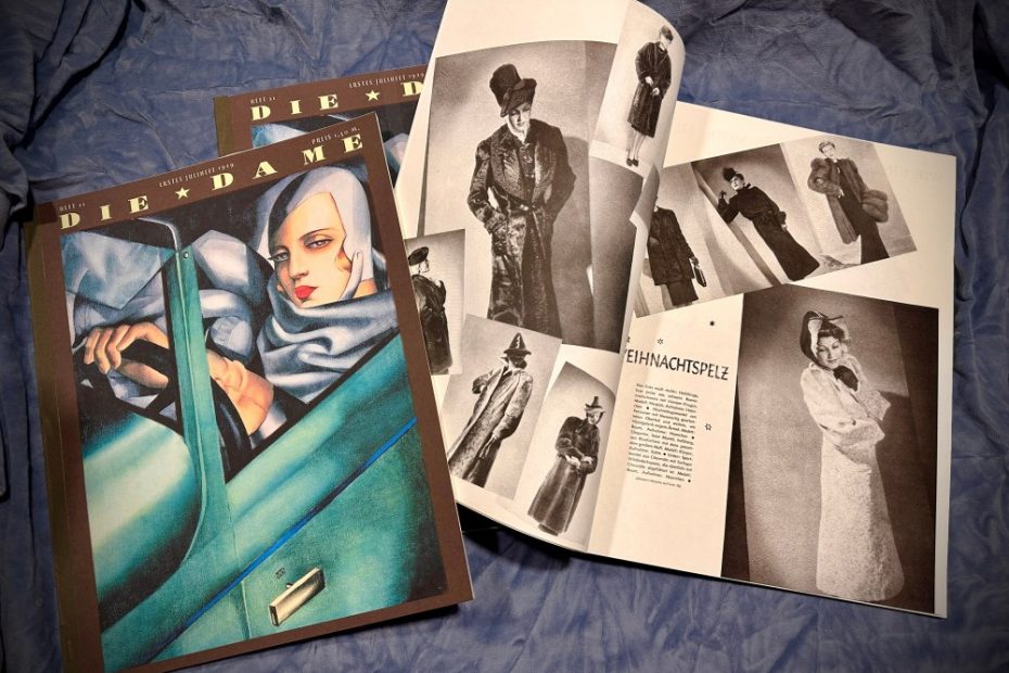
Ray asked me to help out with [the Broadway production of] Lempicka, making copies of the 1929 Die Dame magazine with Tamara Lempicka’s iconic “Self-Portrait With the Green Bugatti” cover. Copies of the magazine from that era are nearly impossible to find, especially that iconic cover. Given that I had a couple weeks to work on this, I had to work with what I could find. The only images of the actual cover I could find were pretty low res, so I redrew the cover masthead type, and cleaned up the best image of her painting that I could find.
I asked Ray if we were going to see the interior pages of the magazine at all, or just the cover. He said we might glimpse them in passing, but requested that the pages be muted in color to not distract from the cover. I could have slapped together some generic pages that would have worked for the stage, where—unlike film—close-ups are not part of the equation. But by now I was getting kind of obsessed with Die Dame. I searched obsessively for ’20s and ’30s era copies of the magazine, and finally located a 1939 copy—10 years after the period of our mag, and well after the departure of legendary art director Ernst Dryden, who commissioned Tamara Lempicka. The fashions were more 1930s than ’20s. But who could resist?
1939 was well into the Nazi era. I would have thought a dowdy layout would be preferred?
The 1939 magazine was still beautiful—the articles were mostly in black and white, although there’s a stunning fold-out with gold and a couple of hits of pink and blue. But most of the full-page ads were in color with silver and gold ink. I scanned in the best of the pages and printed them on French Paper Construction Whitewash, which was a good match for the color of the original paper. Sadly, it appears that French Paper has discontinued it, as well as a lot of my other favorite papers. Props for Broadway shows have to survive eight shows a week plus rehearsals, and this show is a musical, meaning it might be in scenes that involve some vigorous flailing. So I’ve learned the hard way to make these props bomb proof. The usual perfect binding of most magazines wouldn’t hold up, so I also added some heavy duty staples. My 1939 copy was bound the same way, so the margins on the pages had extra space near the spines to accommodate the staples. I also printed the cover on heavier yardstick than the original.
Since my 1939 copy was designed after Dryden left, there weren’t any illustrations by him inside, sadly, but for the back cover of the prop version I used a 1920s ad he designed.