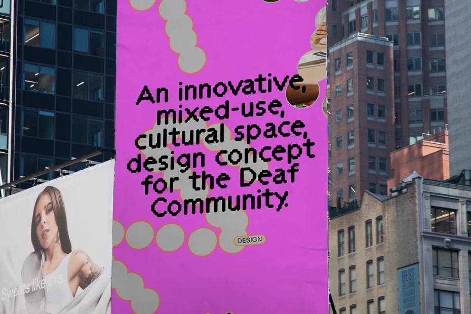
Templo took a highly original approach to branding a new cultural space for the deaf community, taking inspiration from the community itself.
Glance at a typical logo and one question typically comes to a designer’s mind: “What font are they using?” Then maybe a supplementary question: “Is it a font I know, or a custom typeface?” Yet when it comes to the visual identity crafted by Templo for DeafCity Hub, things work very differently.
Here, the letters sit inside a chain of wobbly, bead-like circles. And they’re actually based on the shapes and gestures made by hands when communicating in British Sign Language. In other words, the shape wasn’t simply drawn or designed on a screen. It was captured from real hand movements.
Authentic from the ground up
Templo, which describes itself as a cause-led branding and communications agency, used motion-tracking technology to capture hand movements inspired by British Sign Language. They then used those movements to create the visual language of the new identity.
The instinct then might have been to smooth out said shapes and to streamline the design into something that looked slick and professional. But Templo’s designers knew better than that. They knew that slightly off-key wonkiness was key to creating something that felt real and authentic.
In a way, their approach was similar to a typical logo design process, just in reverse. Usually, designers create something on screen, from pixels, that looks slick and geometrically precise, but maybe lacks soul. And so it’s tweaked, and tweaked some more, until it feels a little more grounded and expressive.
In this case, though, Templo started with something that was literally expressive–human hands signing a phrase—and built the lettering for the logo, along with other elements of the visual identity, from that. And really, how much more authentic can you get?
As Amanprit Arnold, founder of DeafCity Hub & Disability Urbanism, puts it: “Movement, 3D spatial language, and visual rhythm are at the heart
of deaf culture and communication. This bright, joyful motion identity […] brings our authentically co-designed co- working and cultural space to life across every touchpoint.”
Another thing that jumps out is the colour. DeafCity Hub brings together a hot pink and a bright orange. Chosen specifically to stand out against other deaf-led brands, it’s a noisy, slightly crass combination you don’t often see in identities for charitable organisations.
And that, to me, is why it works so well. I didn’t realise how used I’d become to worthy causes using soft, muted colours. But seeing the opposite—a vibrant palette that would feel at home on a flyer for a nightclub—I think maybe others should take a leaf out of this book.
Key takeaway
The takeaway here isn’t to go buy motion-capture software and copy what Templo have done for DeafCity Hub. Instead, we can all be inspired by what they’ve done more broadly: to approach something as standard as logo design and reinvent it on the fly. And in the process, to craft something for the client that stands out, in all the right ways.
That might, admittedly, cause a few production headaches along the way. After all, while many logos can just be typed, this identity is built around captured hand movements rather than a conventional typeface. So how does that work in practice, when the brand needs to appear on everything from a billboard to a sticker or social post?
Even this potential niggle, though, means the brand is making a statement. Basing the logo on signed communication rather than conventional typography puts the deaf community’s own way of communicating at the centre of the brand. Because the best answer to “how can we make this feel authentic” is sometimes just to stop designing and start listening.