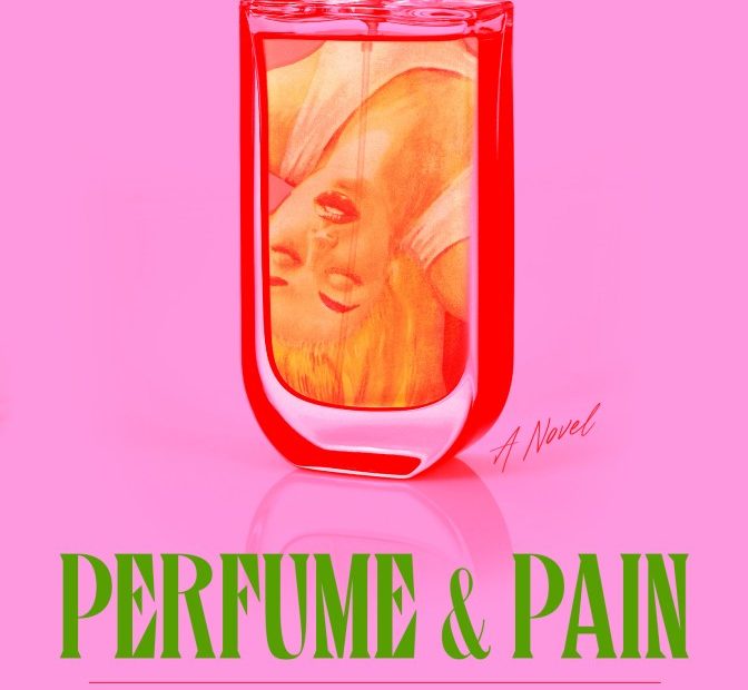
When we saw Math Monahan’s electrifying throwback cover for Perfume & Pain, we instantly wanted to know more about it. So, we asked him—something we’ll be doing with different book cover designers going forward.
Dig into Monahan’s insights below—as well as the book’s synopsis, which reinforces how perfectly he captures the vibe of the novel—and then get lost in the rest of this month’s kaleidoscopic covers.
Official description: Having recently moved both herself and her formidable perfume bottle collection into a tiny bungalow in Los Angeles, mid-list author Astrid Dahl finds herself back in the Zoom writer’s group she cofounded, Sapphic Scribes, after an incident that leaves her and her career lightly canceled. But she temporarily forgets all that by throwing herself into a few sexy distractions—like Ivy, a grad student researching 1950s lesbian pulp who smells like metallic orchids, or her new neighbor, Penelope, who smells like patchouli.
Penelope, a painter living off Urban Outfitters settlement money, immediately ingratiates herself in Astrid’s life, bonding with her best friends and family, just as Astrid and Ivy begin to date in person. Astrid feels judged and threatened by Penelope, a responsible older vegan, but also finds her irresistibly sexy. When Astrid receives an unexpected call from her agent with the news that actress and influencer Kat Gold wants to adapt her previous novel for TV, Astrid finally has a chance to resurrect her waning career. But the pressure causes Astrid’s worst vice to rear its head—the Patricia Highsmith, a blend of Adderall, alcohol, and cigarettes—and results in blackouts and a disturbing series of events.
Unapologetically feminine yet ribald, steamy yet hilarious, Anna Dorn has crafted an exquisite homage to the lesbian pulp of yore, reclaiming it for our internet and celebrity-obsessed world. With notes of Southern California citrus and sultry smokiness, Perfume and Pain is a satirical romp through Hollywood and lesbian melodrama.
How did you arrive at the final design, and what’s going on within it?
After reading the manuscript, I knew I wanted the cover to offer something sexy with a twinge of toxic (Astrid makes so many bad decisions). Both the story and the author called for a nod to classic lesbian pulp art for the cover, since it plays such a big role in the book.
Where did you source that image that’s seen inside the bottle?
Obviously we wanted to nod to the pulp classic of the same title, especially since they talk about it throughout the novel. Finding a pulp image that works was easy, finding one that we could license was another. While it’s not the most exciting part of the job, it is something you always have in the back of your mind: Do I risk it and use something I found, hoping we can find the source/license if it’s approved? Or do I wade through the hordes of licensable imagery hoping to be excited?
How did you select the type treatment?
Type can emphasize or oppose. In this design I wanted it to oppose the softness and simpleness of the imagery with something sharp and, again, hint at classic pulp.
What about that amazing electric color palette?
The color palette MADE this design. It fulfilled everything I wanted the design to do. I worked directly with the printer to make sure we got it right—fluorescent inks, hot reds, and that toxic green.
What other comps did you explore before arriving at the final design?
Ecstasy, toxicity, softness, danger. [Ed. note: See three of the other designs below.]
How often do projects cross your desk like this where you know you’re going to have a ball?
I’m fortunate enough to be working in-house at Simon & Schuster, so the projects that land on my desk are VARIED, ranging from literary to commercial, historical nonfiction to brand new technology. I’m grateful to be able to flex those design muscles by working on all of it. However, every once in a while a title shows up that I know I’m going to savor. Push everything else off the desk! But it’s not just the book that’s required for this potion to work. You need to have the right author and editor in the mix. Anna Dorn and her editor, Olivia Taylor Smith, are both amazing and both people I haven’t worked with before. Based on Dorn’s writing and Smith’s pitch, I knew this was going to be fun! The final decision was quick. No revisions. A dream.
Left: Cover design by June Park and Rodrigo Corral. Right: Cover design by Kishan Rajani.
Cover designs by Chip Kidd
Cover designs by Matt Broughton
