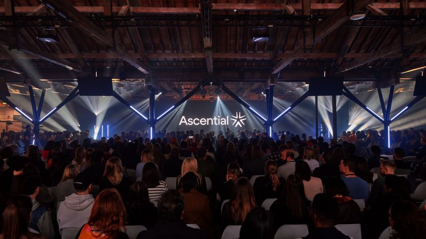
The organiser of events for the marketing and fintech industries has a new dynamic identity, conveying the power of convergence.
Unless you check the FTSE 250, you might not have heard of Ascential, the British business-to-business media company specialising in exhibitions, festivals and information services. But you’ve probably heard of some of its events, such as Cannes Lions, the world’s largest ad industry gathering, and Money20/20, the world’s largest fintech event.
Following the recent sale of its digital commerce and product design businesses, Ascential has become more streamlined and focused on events serving the marketing and fintech industries.
In light of this transformation, Ascential needed new branding to represent this new, focused offering. So it teamed up with DesignStudio, the global brand agency with studios in London, New York, Shanghai and Sydney whose clients include Airbnb, Premier League, Panasonic, British Airways, Logitech, AT&T and Riot Games.
The brief
DesignStudio, which we last profiled on the occasion of its 10th anniversary, was tasked with creating a new brand identity that represents Ascential’s new events-led model while differentiating it from competitors.
The agency built the new brand positioning around the core idea of the “power of convening” at Ascential’s marquee events. “We built the new Ascential brand – including strategy, visual and verbal identity – around the idea of the power of convening at its events,” explains design director David Moloney. “This concept of coming together became our lens for the entire brand. ‘Be at the heart of what’s next’ forms the foundation of the new strategic proposition.”
Graphic elements
The centrepiece of the rebrand is Ascential’s new logo, formed from five variable arrowheads converging to create a dynamic symbol, representing the meeting point of its events. The custom wordmark features a softened crossbar, angled terminals and curved connection points that pair elegantly with the symbol.
The colour palette, meanwhile, draws inspiration from Ascential’s editorial roots, centred around a classic charcoal and off-white pairing. The lead brand colour, Ascential Yellow, acts as a spotlight highlighting UI, typography, and data to tell stories. The bold brand colours of Ascential’s major sub-brands, like Cannes Lions, are also woven throughout to signal their continued importance.
From the core logo concept, DesignStudio developed a full pattern design system that can flex from bold and directional compositions to radial, expressive ones. The patterns seamlessly integrate with imagery, typography, and custom illustrations across brand communications.
This pattern design system comes to expressive life in motion, with four interactive behaviours for use in films and digital spaces.
Typography and illustration
On the typographic front, DesignStudio selected two custom type families to reinforce the new brand positioning. The serif Rando font delivers “human warmth”, while the Yellix sans-serif is built for digital brand experiences with a contemporary touch.
Finally, a series of bespoke illustrations depicting scenes from Ascential’s events, as well as conceptual ideas and insights, convey abstract concepts that photography cannot capture in a warm, playful style.
“We embarked on a journey with DesignStudio to reimagine our brand for our next chapter,” says Dina Elrayyes, VP content and creative director at Ascential. “Our new brand identity delivered on all fronts, fully realising the ambitious creative vision we set out to achieve.”
