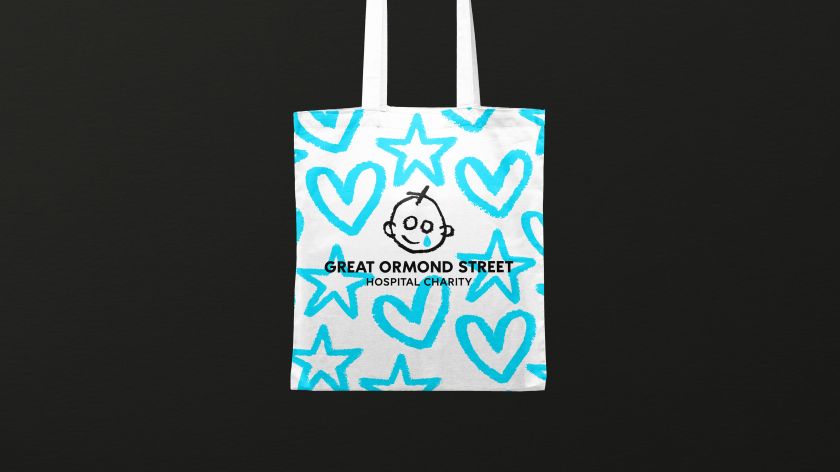
Working in collaboration with Stuart Gough, Pentagram, JKR, and Impero, the charity launches its refreshed brand and positioning today. Its focus is on being “more accessible, inclusive, and digitally enabled.”
Great Ormond Street Hospital Charity (GOSH) has unveiled a new identity to build on its mission to transform the lives of seriously ill children and “protect their childhoods from the impact of serious illness”.
It partnered with independent creative director Stuart Gough and a team led by Ashley Johnson and Ruth Jamieson at Pentagram to launch the refreshed look, which is built on a brand strategy developed by creative agency Impero. Global branding agency Jones Knowles Ritchie (JKR) brought the brand to life through motion.
The project began through extensive consultation and collaboration. Around 3,500 stakeholders, ranging from patients, families, and staff at GOSH to the charity’s employees, high-value donors, corporate partners, and members of the public, were involved, so the refreshed brand resonated with everyone. As JKR puts it, “By adding the voices of children and families at Great Ormond Street Hospital, the new brand puts children’s lived experiences front and centre – from the joy and play that happens every day at the hospital to the harsher realities for families facing the unimaginable”.
So what has changed? The identity draws on the iconic logo’s heritage, created in 1987 for the Wishing Well Appeal and inspired by a patient’s drawing. The updated logo retains its charm and authenticity but introduces elements for a “distinct, digitally native identity system”, and a fresh blue becomes the central colour. “We saw an opportunity to create a design system that leveraged the love and character of the original sketch,” says Stuart Gough. “The concept throughout the identity is to embrace the energy of a child’s drawing; the charm and mistakes that this can bring – when harnessed carefully, it can make a distinct and positive identity system that is recognisable through its entire personality, not just the logo.”
Accompanying photography features spontaneous, unposed moments of GOSH patients using natural light to highlight textures and subtle details. There’s a new tone of voice, too, along with a core brand language. Together, they emphasise everyone who contributes to the charity’s impact, “reflecting its commitment to ensuring no childhood is lost to serious illness and a child-centred approach”.
“It’s always been important to Great Ormond Street Hospital Charity to tell the real stories of the children and families welcomed by GOSH each year,” says Ashley Johnson of Pentagram. “Together, we’ve built on these foundations, translating the strategic platform into a fresher and more confident verbal identity that can advocate, challenge, champion, change things and bring new and existing supporters closer to the vital work they do for seriously ill children.”
Ashley adds: “We wanted to tune our ears to the authentic voices of GOSH kids and their families, so you’ll see and hear more playful, child-centred language in the tone of voice. You’ll also notice a braver and more direct authenticity in the copy, unafrai to share some of the challenges and harsher realities faced every day.”
Elsewhere, new animal illustrations, inspired by the ward names at Great Ormond Street Hospital and unique to the charity’s brand identity, represent the efforts of the “doers” who are transforming the lives of seriously ill children under the hospital’s care. When animated, they give a sense of movement and togetherness and represent the fun and playful spirit at the heart of the brand’s renewed focus on childhood. This aspect of the project and the new brand assets helps the charity create a greater impact on digital channels.
“Teaming up with Stuart, Pentagram, and the talented in-house brand team at Great Ormond Street Hospital Charity, we crafted the brand’s first-ever motion identity. This versatile identity, designed with a dynamic tonal range, seamlessly adapts to all channels, complementing the brand’s distinct assets. Motion plays a pivotal role in this project, enhancing emotional connections and storytelling capabilities. With these new motion tools, the charity can now spotlight the needs of the children and families they support with unprecedented impact,” said Tom Gould from JKR.
As things launch today, there’s also a new campaign developed by Gough, Pentagram and the charity’s in-house team. It will be the charity’s first brand campaign to raise awareness of the important work they do. “Throughout this project, we’ve had the honour of meeting remarkable individuals – patients, families, doctors, nurses, porters, researchers, volunteers, fundraisers, play specialists – all dedicated to making a difference. Our task was simply to share their purpose with the world,” adds Gough.
