The global design consultancy shares how it created a visual identity for birth control medication, marking a landmark moment for women in American history.
Despite some recent regression on women’s rights in the United States, for the first time ever, American women can walk into any pharmacy and pick up a birth control pill without a prescription. To prepare for this epic development, Perrigo – the pharmaceutical company behind Opill – needed a visual identity for its new product. It was approved for over-the-counter use only last year, a move it hails as “a giant leap for women’s empowerment”.
It appointed Elmwood to help craft the identity for its daily oral contraceptive, available to millions of women across America. It comes after twenty-one states ban abortion or restrict the procedure earlier in pregnancy than the standard set by Roe v. Wade, which determined reproductive rights for nearly half a century until the Supreme Court overturned the decision in 2022.
“Opill is a groundbreaking product that will reshape the parameters of women’s health,” says Rob Dyer, associate creative director at Elmwood London. “Our strategy was to capture this transition via a meaningful brand language that breaks free from the norms of traditional healthcare design, with branding that is relatable, supportive and fun. Opill’s high visibility and friendly, positive tone challenges long-held codes of the category, driving appeal with a next-generation audience.”
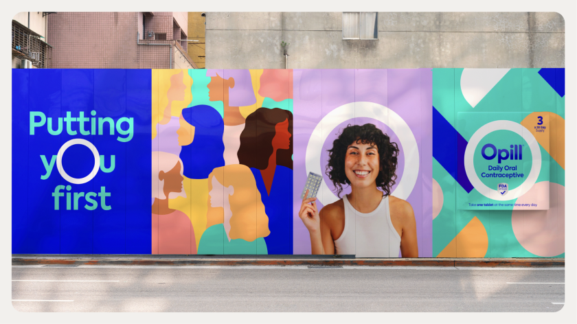
The identity centres around an O-shaped brandmark in a bid to mark its central status as America’s first non-prescription birth control pill, but also to act as a halo – perhaps suggesting it’s a beacon for protection, a motif that alludes to simplicity, convenience and ease of use. Against a backdrop where one-third of American women report barriers to accessing contraception, it certainly feels like a suitable emblem.
The chosen colour palette rebels against industry standards and anything feeling too “medical”, featuring a background of modern teal alongside pops of coral, lilac, orange, blush and yellow that appear in free-form shapes. These surround a striking dark blue typeface referencing classic Rx language – giving Opill further credibility. The idea is that together, the effect is a visual metaphor for the “arcs of the world around us (the free-form shapes), and Opill’s steady presence within that”, as the agency explains.
Meanwhile, Opill’s chunky block letter font was chosen for its open and round typeface, building the sense of a warm and approachable brand. An additional freehand marker script is also used to add some personality and a human touch to Opill’s off-pack comms. Within its new suite of photography and illustration assets, the design language emphasises themes of inclusivity. It’s all designed to build trust.
“Opill’s brand language is powerful because it really cuts through the tropes of daily femininity and rewrites the rules of what design in reproductive healthcare means – and how far it can stretch,” says Rob. “Through multiple rounds of consumer research, we were able to refine this bright yet uncluttered visual world that is distinct from anything before it.
“As a design system, Opill is celebrated in quite an expressive and playful way,” Rob continues. “Yet, at the same time, we have this core feeling of reassurance and safety. We want to convey that this is a brand where you can be yourself. You can access effective contraception on your terms without having to navigate additional barriers.”
This isn’t the first time Elmwood has worked with the company, having previously collaborated with HRA Pharma, now a subsidiary of Perrigo. In this case, it helped with the design strategy for the British contraceptive pill, Hana – the UK’s first contraceptive pill to be sold over the counter at pharmacies, which launched in July 2021 and adopted a similar focus in terms of rewriting how contraceptive brands look and feel – with a playful, accessible and empowering brand ethos.
In the United States, the launch of Opill follows years of campaigning from medical and women’s health groups for birth control to be available over the counter. The American College of Obstetricians and Gynecologists called it “a critically important advancement in the accessibility of reproductive health care” that empowers consumers to choose when and where they access a safe method of contraception.
