Ted Eron, the maker of supermarket icons.
There are two strata of graphic designer: the known and the unknown. The former gets invited to all the conferences, is featured in magazines, annuals, books, and may even have a monograph or two. The latter is not exactly unknown, but rather ignored by the people who use what they’ve made. Anonymity is built into the output of a service profession like ours. Rarely does a designer sign logos or layouts they’ve done, and package designs are not a canvas for personal expression. Paul Rand, Lester Beall, Saul Bass and Milton Glaser insisted on signing or receiving visible credit for their work, and their respective styles were recognizable enough that when a signature was absent, its provenance was obvious.
This was rare—if not unacceptable—for what Joseph B. Eron and Elizabeth Eron Roth call “supermarket art” in the monograph about their father, Ted Eron Designed That (Glitterati Editions).
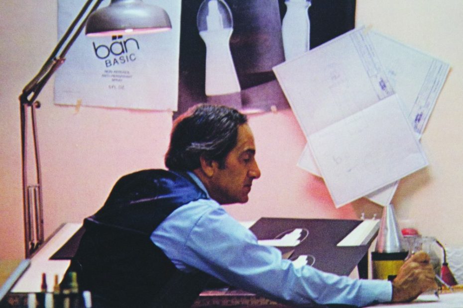
Ted Eron was one of the most prolific of the ubiquitous yet under-represented artists in design history. We’ve all seen, used and consumed the boxes, cans, bottles and tubes that Ted, and his brother Abbott, designed at their eponymous Eron and Eron Industrial Design offices in Engelwood and Cresskill, New Jersey. The office invented the containers for Birds Eye foods, Mum deodorant, Vitalis (hair goop), Excedrin (the no-nonsense gothic type treatment for The Extra Strength Pain Reliever, still on shelves), Ballantine Draft Beer, Baker’s Cocoa (for General Foods), Krylon Spray Paint (a staple for graffiti artists), and Elmer’s Glue. I am excited to learn that Ted also redesigned Reese’s Peanut Butter Cups for Hershey, helping it rise as “America’s fastest-growing candy product” (the design is so iconic it has all the cognitive power of an everyday stop sign). But the most happily surprising package design, which was hailed in a 1960 issue of Modern Package Magazine as “rescuing a business,” was FLAV-R STRAWS, one of my favorite products as a kid. All one had to do to change the flavor of milk to chocolate, vanilla and strawberry was suck on the straw.
Joseph and Elizabeth knew Ted as a commercial artist and art teacher, but were not entirely sure about his legacy until they dug into the artifacts he had saved. The family has a large amount of Ted’s work, and realized there was something historically significant about his output. Ted died in 2003 before his children had a chance to delve deeply into his recollections. By the time “Mad Men” rolled around, granddaughter Allison Sarah Roth began to notice parallels in Ted’s work to what was portrayed on screen. “As the photographer of the book about her grandfather’s life,” writes Joseph in the preface, “Ted would be assured that Allison would zoom in on the things that matter.”
Ted Eron Designed That—which was first published in 2019, but did not do well, in part owing to COVID—is not a scholarly treatise on the role of graphic and industrial design in American capitalism. It takes for granted that our system is based on innovations and conventions that serve a public and reaches that consumer through eye appeal as much, if not more, than function. What comes through is an uncritical, respectful and, consequently, insightful look at a rediscovered career and the impact the field had on the designer’s clients. By extension it addresses in an anecdotal way how marketing, branding, advertising and design together formed economic infrastructure that separated capitalist from non-capitalist systems.
T
Ultimately, Ted Eron Designed That is part family album, part career monograph and in large part a foundation for further design historical exploration.