Last updated on January 8th, 2022
They say, ‘Pictures share a thousand stories,’ but sometimes it takes more than pictures to say a story in an intelligent and entertaining fashion. Information graphics, popularly called infographics, are one such mode of sharing stories. With an exotic melange of pictures, words, and figures, infographics make stories, statistical data or presentations interesting and engaging. What’s more, infographics are tailor-made to be pinned, tweeted and shared!
Here’s A Carefully Curated List Of 5 Best Design Infographics Of 2022 That Every Designer Must Know About
01. What Makes A Good Logo
Conceptualized and designed by Designhill’s ace designer, John Kash, this useful infographic shows what goes into making a great logo. The classy color scheme not only helps make the information look subtle but also provides a lovely aesthetic to the entire presentation.
Whilst some advice in the infographic looks pretty obvious, it’s always useful to have all the info in one place. Hopefully, this infographic will make you understand what it takes to make a great logo design!

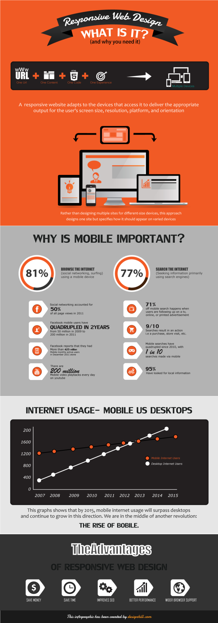
02. Responsive Web Design – What Is It And Why You Need It?
This one’s an interesting take on responsive web design. While Designhill may not be the first company to come up with this idea, it’s why they’ve come up with this information that makes creative graphic designs stand out from the crowd.
It is beautifully designed and brilliantly executed, the infographic charts out the details about responsive web design.
It will help you untie the complex knots of responsive web design in a fun way. Showcasing all the important information, this infographic design is appealing and eye-catching, without being too overwhelming.

03. Fonts & Colors
Yet another interesting infographic that made news was the cool infographic developed by Tasty Placement. This knowledge-packed infographic focuses on the use of fonts and color scheme in a design.
This infographic presented a detailed study of fonts, colors, typefaces and styles used in the logo of some of the world’s leading brands. It is certainly one infographic every graphic designer must explore for a dazzling insight into how fonts and colors make the logo interesting and recognizable.
 [Source: Tasty Placements]
04. Serif vs Sans – The Final Battle
Do you find it difficult when it comes to choosing between Serif and Sans fonts? If you are nodding your head in yes, you are sure to find Serif vs Sans – The Final Battle Infographic one of the most helpful infographics of the year.
It walks you through the finer nuances of which typography is suited for which project. While some of the points mentioned in the infographic are pretty obvious, there are many other points that will make it easy for you to take your pick between Serif and Sans typefaces.
 [Source: Urbanfonts.com]
05. The Life & Career Of An Average Designer
This one’s perhaps the most interesting of the lot! Brilliantly conceptualized and designed by BayerBerg, Life & career of the average designer is yet another infographic that ruled all hearts.
A must explore for both seasoned and novice designers, this information graphic explores the life cycle of an average designer, be it a freelancer or a full-time designer working with a top-notch design agency.
Though the information may not come as a surprise, its lovely design is sure to impress even the most discerning of hearts.
