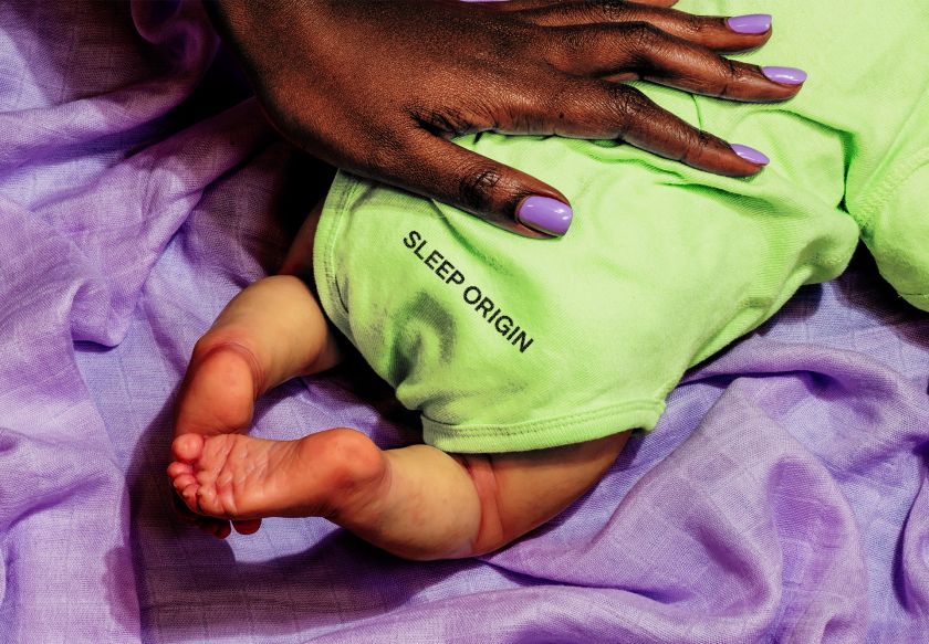
Using flash photography and hyper-realistic baby models, Rethink created a suite of stand-our photography for Sleep Origin.
Texas-based newborn sleep consultancy Sleep Origin has a brand new identity designed by Rethink to help increase visibility by breaking out of sector norms.
Ironically, Sleep Origin was being slept on. Its neutral tones and stock photography meant it was blending in with competitors, so the founder reached out to Rethink after seeing some of their previous work.
The design team felt “total complete joy” when they saw the brief, says senior designer Zoë Boudreau. “This felt like one of those briefs you only get a few times in your career, as Sleep Origin was very open to branding that felt unexpected and new,” she adds.
Ultimately, Sleep Origin wanted to expand its online presence with a website, social account, and new educational tools, but its previous identity didn’t support these ambitions. “We saw an opportunity to help them stand out – it was time to refresh,” says Boudreau.
Research into the category revealed that all brands were virtually the same, with neutral tones, soft pastels, and stock photography. “All the trappings of a brand that would put parents to sleep, not babies,” says Rethink executive creative director Hans Thiessen.
“We saw an opportunity to create a truly distinct brand identity by leaning into the joyful energy of parenthood and the excitement of learning new things, not just snooziness,” he says.
Sleep Origin’s new logo—a swaddled baby icon—was designed to toggle into sleep mode. Thiessen describes it as “one of those logos that immediately felt so simple yet powerful—the perfect solution”.
Animation was key in elevating the brand, especially with the logo. “It allows for the brand world to layer on another piece of narrative that a static brand wouldn’t be able to do,” says Thiessen. Motion designers Mike Labrow and Jesse Shaw collaborated with Rethink on these elements.
The brand’s new toggle-styled business cards are also directly related to the logo. “Lenticular printing is pretty amazing at bringing motion to a flat surface,” says Thiessen, explaining how the process uses embossed plastic sheets to produce different images as the card is rotated.
“It felt like a no-brainer – something that would be extremely memorable for parents,” he adds.
For the illustrations, Rethink opted for a style that would feel warm, fuzzy, and approachable to new parents while also helping to educate them on sleep.
Each colour in the palette was chosen to reflect a different element of bedtime, from drool blue and blanket white to sunset orange and black night. “Typographically, we went with Nuckle from Heavyweight Digital Type Foundry, giving the whole identity system a nice balance in both warmth and clarity,” says Boudreau.
Rethink opted for a more vibrant and punchy style to differentiate from the sea of soft, zen baby photography typically seen in this space. The use of flash photography was inspired by the idea of having to use a flash to capture these moments at night.
Boudreau says: “Photographing newborn babies can be a challenge and hard on the little ones – especially when you need them to be sleeping, so we opted to use hyper-realistic baby dolls instead. They were so real that we almost forgot we didn’t have to whisper around them!”
Sleep Origin’s previous identity
