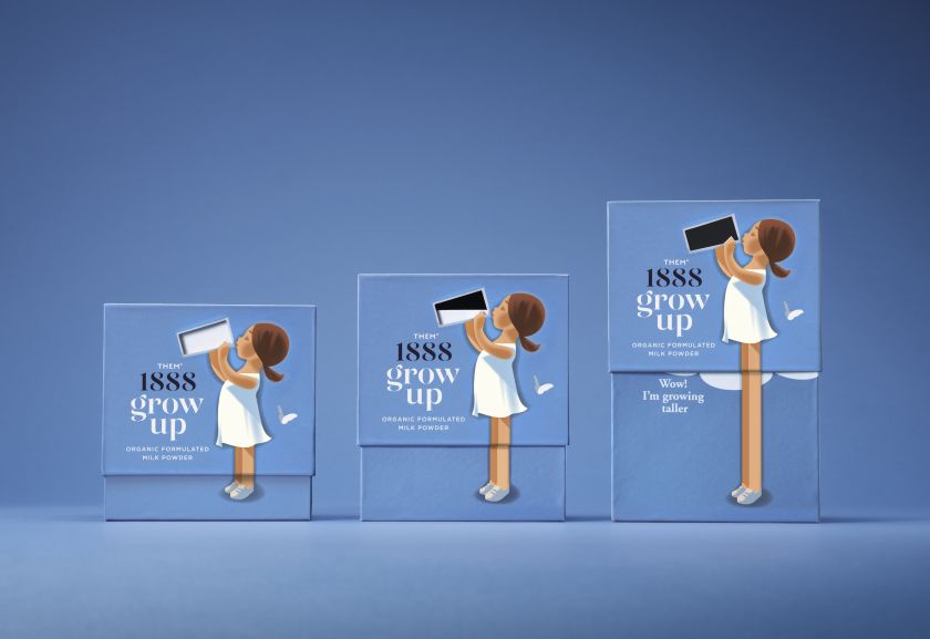
From soft, retro-inspired illustrations to packaging that demonstrates the product’s effects, Them 1888’s new milk powder brand is set to stand out among competitors.
Milk powder isn’t exactly a staple product in Western countries – and I don’t mean baby formula; I mean a powder alternative to the pints of milk we have in our fridge. But it is becoming increasingly popular in Asian markets, not just as a drink but also to enhance certain dairy products, like cheese and cream, or as an ingredient in baked goods.
Danish brand Them 1888 has set out to satisfy this demand with a fresh look for its powdered milk product Grow Up, designed by the Danish agency Simply. The brand is named after the dairy’s hometown, Them, a small town in central Denmark with a population of 2,431, while 1888 references the year of its opening.
As the milk powder business was new for the dairy company, Them 1888 was given its own name and logo, thereby minimising the risk of confusion with the existing production of ordinary milk and cheese products. The raw material – milk from local organic cows – is collected in the area around the dairy in central Jutland, Denmark.
“We knew the Them business already, but we were not aware of their milk powder plans for Southeast Asia,” says Simply co-founder and strategy director Rikke Laumann. “Building a brand or a sub-brand from scratch is what we do; we love being part of the process from day one, and this was a clean sheet of paper.”
The design team also welcomed the opportunity to tell the story with Asian customers in mind without having to look much at other customer groups or a biased audience. Laumann adds: “The fact that this is an organic and honest agricultural product was a good starting point.”
Typically, milk powder brands in Asia are much more explicit and have a somewhat clinical look and feel. Them 1888 gave Simply a good picture of the competition in the area, and the studio went through many competitors’ websites and packaging.
With so many almost identical packaging on the market – metal cans with blue, white and gold coloured elements – Laumann felt that “to do yet another brand with these stylistic ingredients seemed too defensive and unambitious”.
Not only this, but Them 1888’s Grow Up milk powder is produced from Danish Milk, giving it a unique selling point and a chance for a different approach. Laumann says: “Instead of looking like one of the established brands, he wanted ‘Grow Up’ to be different both in style and format.
“Also, our client had the idea that the properties of milk would be a stronger selling point than the generic ‘Milk powder’ designation.”
Them 1888 also chose to use sachets in a box, rather than loose powder in a can, giving them another point of difference to play with from a design perspective. Its difference in shape is one thing, but the packaging was also designed to position it as a more elevated and premium product.
Laumann says, “‘Grow Up’ should not look like an East Asian brand – it should look like a brand you would be able to find in a Danish supermarket. We think this is the most trustworthy way to enter the market as a Danish dairy.”
The box also has this active, entertaining milk-drinking element as its distinctive feature. When you raise the lid of the box, the glass is emptied of milk, and the child grows taller, an effect that is both difficult to replicate and self-explanatory for children.
Obviously, any packaging that is more complex in its design also comes with additional costs, which doesn’t always sit well with clients. To make the packaging idea for Grow Up work, the box must consist of two different parts in a certain cardboard thickness, meaning higher production costs.
Fortunately, Them 1888 really believed in the added value of the idea and expression and was willing to accept the additional costs to get something unique, according to Laumann. He adds: “Them 1888 also suggested we should do two versions of the same product, featuring two different drawings: a girl and a boy.
“What more could you ask for as a branding and design agency?”
Simply identified that most of Grow Up’s competitors use photos, graphics and metallic colours, so they went the opposite way, opting for illustrations, softer colours and neat graphics.
“Denmark has a number of food brands that are primarily known for their slightly vintage illustration, with several of them originating from the 50s and have not changed since,” says Simpy co-founder and creative director Thomas Kjær. “There is something classically Danish about this illustration style and the use of a few muted colours, and we believe that honest products present themselves as being best and most trustworthy in this way.”
This retro vibe also matches the age and heritage of the parent company, bringing consistency across the whole portfolio.
Since blue, white, and gold seem to be the license to operate in this category, the studio opted for a blue background colour to help customers understand that this is milk. However, Kjær says they disregarded the “not particularly Scandinavian gold” and “slightly altered the blue colour to give a more retro expression”.
The typography was chosen as it was seen to be a good match to the illustration style.
Another key asset is the butterfly graphic, which indicates that the child is outside. Kjær explains how it “sends a signal of a nature in balance” and nods to the fact that the product is organic.
