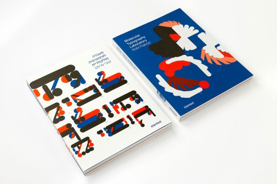
It’s called Molecular Typography—and it’s experimental work by Kobi Franco, a leader in the master’s design program at Shenkar College in Tel Aviv. His extensive research has been collected into a deceivingly stylish book titled Molecular Typography Laboratory (Slanted), which explores the speculative premise that the characters of the Hebrew and Latin alphabets possess a molecular structure. Over 150 distinct experiments were conducted on the topic, categorized into 11 primary themes in the book: Foundations, Language, Gender, Formula, Weight, Gravity, 3D, Generative Research, Color, Word Play, and Type and Image.
Since I failed my chemistry and physical science courses in school, I asked Franco to give me a detailed remedial accounting of his fascinating work in short bits that I could understand. Thank you, Kobi, for your patience.
Please explain your experiments—and tell me how you would define Molecular Typography.
I first encountered the [term] “molecular typography” while randomly surfing the internet. The search led me to a short video titled “Understanding Molecular Typography,” which documented a lecture by the American designer and artist Woody Leslie. Leslie presents a book by the philologist and scholar H.F. Henderson, which argues that the letters of the Latin alphabet are based on a molecular structure, meaning each letter is composed of a combination of several atoms. Henderson suggests that future research in other languages would yield additional atoms or new insights, potentially catalyzing a revolution in this field. “Understanding Molecular Typography” was later revealed to be an artistic project, a figment of Leslie’s imagination. Nevertheless, I became enchanted by the speculative process of thinking about a Hebrew alphabet composed of similar yet different “atoms.” I embarked on a journey—an experimental, pseudo-scientific study based on the assumption that the Hebrew letters indeed had a molecular structure. I sought to explore how this assumption could be applied to the Hebrew alphabet, Hebrew words, and the Hebrew language.
The molecular principles are straightforward: a limited number of atoms, or basic shapes, connect to one another through electromagnetic attraction, forming all the letters of the alphabet. Leslie based his study on the Futura typeface (1927), designed by Paul Renner, and broke it down into seven atoms. In my laboratory, I chose to work with the Va’ad typeface (2005), which I developed based on letters designed by Ze’ev Raban (1890–1970), one of the pioneers of Israeli art in the mid-20th century. The Va’ad typeface was deconstructed into six variously sized atoms, designed on the basis of a square grid and tagged with the Latin letters: square=D, horizontal rectangle=E, short vertical rectangle=J, long vertical rectangle=I, parallelogram tilted to the right=K, and parallelogram tilted to the left=V. Each letter in the Latin and Hebrew alphabets is composed of combinations of two to 11 atoms. The combinations of atoms that make up the letters are arranged as though composing a chemical formula. In this way, the first Hebrew letter, Aleph—composed of four squares, a short vertical rectangle, a parallelogram tilted to the right, and a parallelogram tilted to the left—is represented by the formula D4JKV. Each atom is surrounded by a fixed electric charge that causes an electromagnetic interaction. The combination of atoms into letters parallels the combination of letters into words. The atoms are 3D units, and their combination forms letters or 3D signs.
The work that comes from your experiments addresses the legibility, accessibility and emotional qualities of type. Would you say this is an accurate description?
Yes, that is indeed an accurate description. The Molecular Typography Laboratory is a speculative research project that explores experimental typography along the axes of function versus aesthetics and content versus form. It includes a series of tests—a system of “games” for which I determine the rules, set the game board, and decide on the players. The tests present the results of each game. Using a method that combines several basic shapes, the Hebrew and Latin alphabets were constructed, resulting in the design of a typeface. The project presents visual, conceptual and potential structural applications for this typeface.
In his essay “Word-Covenant,” Ori Drumer, cultural critic and psychotherapist, says: “In Franco’s laboratory, letters function as an extension of the researcher’s body. The artist’s book and the accompanying research project provoke further thought, curiosity and imagination, and their exploration is accompanied by a desire to decipher and name the letter images functioning as body parts. Franco presents a unique visual language, a spectacle of complex relations with the letters, which he puts to various uses. Removed from their familiar context, in which they function as signs, the letters are subjected to unusual typographic processes, so that they become images charged with meaning. For Franco, the letters are not only morphological signs, while the laboratory undermines the arbitrary character of the sign. Franco plays with the conventional linguistic mechanism that arbitrarily ties together sign, signifier and signified, undoing the connection between letter and representation to create a personal interpretation and a new structural logic that is highly personal. The result is a private, symbolic typography, which nevertheless has meaning and content in the actual world.”
Your work, as I understand it, is at the nexus of type and poetry. How would you describe your process?
It can definitely be said that poetry, or the use of poetry, appears quite frequently in the project. My research has been deeply influenced by the creative activity and self-imposed writing constraints formulated by the members of the OuLiPo group—a circle of mostly French writers, poets and mathematicians founded in 1960. The group’s purpose was to create new literary structures and models by imposing various constraints or algorithms. “Necessity is the mother of invention,” or, in the words of group member Georges Perec, it functions as “a machine for stories.” Existing literary forms, such as the lipogram and palindrome, as well as new forms invented by the group, were largely based on mathematical equations. This reliance on constraint initially appeared to be a spectacular tool, but in fact, it stemmed from the belief that linguistic constraints liberate consciousness and give rise to new and original ideas.
The use of linguistic templates such as the anagram, palindrome and pangram accelerates a form’s capacity to add to verbal content, camouflage it, and act as crude visual matter. My own tests have examined the formal, aesthetic and symmetrical appearance of letters and words, in the spirit of post-structuralist interpretation, which views the text as a weave of interrelated signs in an expanding network of meanings. Derrida himself noted the etymological connection between “text” and “texture,” conceiving of a text whose materiality resembles that of a cloth. Another source of inspiration was the Symbolist poets of the 19th century, including Arthur Rimbaud, who sought to apply rules to madness and ascribe colors to letters, and Stéphane Mallarmé, whose poem A Throw of Dice Will Never Abolish Chance (1897) promoted the use of unique typography and a visual approach to writing, followed by poets and artists such as Guillaume Apollinaire.
In her essay “The Nexus between Typography and Poetics,” Dr. Batsheva Goldman-Ida, a curator and scholar, says: “A playful spirit is felt throughout Franco’s project, in which the stringent rules provide a framework for artistic expression … [it] also enables the reader to view the typography as an artform in the sense of Gaston Bachelard, who speaks of the ‘wholly unexpected nature of the new image’ at the cusp of the moment, ‘in a state of emergence, in which life becomes manifest through its vivacity.’ Bachelard adds: ‘The poetic image is an emergence from language, it is always a little above the language of signification.’ In this respect, Franco’s project is a work of poetry.”
This is heady stuff. Tell me, what boundaries are you attempting to cross?
I have been teaching graphic and typographic design for over two decades. Over the years, I have increasingly focused on typographic research, specifically developing courses that examine the boundaries of the discipline—from its commercial and practical aspects to its experimental and research-oriented side. In my course Experimental Typography, I ask students to invent a method for various tests of the alphabet system. In subsequent stages, students are required to refine this method for different media and disciplines, essentially creating an imaginary world in which their system of rules has foundation and justification.
I developed this same methodology in my laboratory. As mentioned, when I began working on the project, I started from very basic foundations. Each letter received a formula based on the atoms that constitute it. However, this principle can be creatively refined in countless directions. As I continued to invent tests, the molecular world grew. Very quickly, I realized that I was creating a world that is truly boundless. I didn’t know that I would suddenly realize that if the atoms are based on a square grid, it would be possible to quantify and measure the number of squares in each letter. And if the grid is 3D, I could “weigh” each letter and essentially develop a system of molecular gematria, a traditional Jewish system of assigning numerical values to letters (numerology), where there is a “weight” for each letter, word or paragraph. I was then able to develop a gematria calculator capable of producing a list of synonyms with the same formula and weight. If I had not continued to let my imagination soar and realized that I could create anything I could think of, I would not have reached the understanding that, although atoms attract each other with electro-magnetic force, in the molecular world, I could cancel this force and create a situation in which, contrary to the laws of nature, minus could connect with minus and plus with plus. At this stage, I identified two Hebrew alphabet systems: binary and nonbinary, and essentially concluded that every word in the Hebrew language exists on a gender spectrum between binary and nonbinary.
The rhizomatic character of the study, which branched out as it expanded from one test to the next, enabled me to leap from one theme to another, employing a strategy that could continue operating as long as I was interested in pursuing it.
Code plays a large role in your work. How so?
Code and programming are indeed prominently reflected in the research. As noted, every letter in the Hebrew and Latin alphabets is composed of combinations of two to 11 atoms, which are arranged like a chemical formula. A digital catalyst developed in the laboratory creates different 3D variations for the formula pertaining to each letter of the alphabet. The result is a generative system of letters characterized by the identical features of a visual DNA. The catalyst also enables a perspectival, 3D view of each letter and of different combinations derived from the formula.
The 2D tests led to a system that independently rotates the atoms composing each letter. The rotations were examined according to three parameters: the angle of rotation, its centering, and the number of repetitions (the replications of the rotated atom). As a result, the visual form of each letter is deconstructed into fragments. The larger the angle of rotation, the more it impacts the letter’s legibility and our ability to identify it. Additional tests isolated the atoms in the formula, enlarging each according to different proportions. Later, I examined the transformation of a given atom’s size during use. With the typing of each character, certain atoms grew by 5%, a generative change that led to the chipping of the letter and impacted its legibility. The website I created for the project allows, unlike the book, the inclusion of videos and generative tests. In the future, I plan to add interactive interfaces to the website.
In his essay “From Word to Code,” Prof. Arch. Eran Neuman, dean of the Faculty of the Arts, Tel Aviv University, says: “… the moment a letter is encoded, it can be given various visual expressions. In this sense, the letters are no different than animal species or humans, who share a similar genetic code despite their diverse appearances. The letters in Franco’s typeface all share basic building blocks, yet each possesses a different form, and diverse visual expressions of the same letter are similarly based on the same code. … Franco’s move from visual typefaces to code-based typefaces thus also reflects the current post-humanist age, in which the perception of ideas exceeds the limits of the gaze, of hearing or of touch, whose sensory input is required in making contact with the world. His typography, which goes beyond the design of typefaces, partakes of a digital universe in which texts are not written only by means of letters, and in which the meaning of different concepts is elucidated by deciphering a code.”
How will the typefaces that have been designed under the umbrella of Molecular Typography be used in a pragmatic manner?
The project is indeed based on the design of an alphabetic system, initially in Hebrew and later in Latin. However, as noted, the design of the letters emerged from formal constraints. The typefaces were not designed as reading typefaces or even as display typefaces. While aesthetic decisions were, of course, made, they were confined to the use of the six “atoms” alone, resulting in a highly raw and elemental letterform system. The Hebrew typeface, which was designed first, follows horizontal proportions. When I decided to create a Latin version, I was compelled to rotate the letterforms into a vertical orientation. As a result, the two languages are designed with distinct proportions and do not conform to the conventional definition of a bilingual typeface. Additionally, I have not yet attempted to design a lowercase version of the Latin alphabet. In the project, I use the typefaces in various ways, primarily leveraging the architectural potential of each letter to deconstruct and reconstruct them into an infinite number of appearances based on the same atomic formula. However, I do not foresee any pragmatic use for these typefaces beyond this project.
The post The Daily Heller: Did You Know That Letters Are Composed of Atoms? appeared first on PRINT Magazine.