Françoise Mouly has been The New Yorker‘s cover editor for 32 years, during which time she’s introduced hundreds of illustrators to the magazine’s readers. In this 100th-anniversary year of the founding of the publication, it seemed a good time to celebrate the art that goes into this prized piece of editorial real estate. As co-curators, Mouly and Rodolphe Lachat collaborated with L’Alliance: The French Institute NY’s director Tatyana Franck and programming manager Clementine Guinch to produce Covering The New Yorker, on view until March 30.
The sketches and printed works hang as if they are family members in the home of the thousands of subscribers who anxiously await each weekly issue. Although the gallery space is tight, it is so well-designed that the visitor never feels cramped; there is a lot to see and much to read. After spending a very satisfying Saturday afternoon at L’Alliance NY, I asked Mouly to tell us about the scope and highlights of the show.
Header photograph from the Jan. 21 opening (back row, left to right): Jenny Kroik, Barry Blitt, Richard Siri, Ed Steed, Mark Ulriksen, Art Spiegelman, Kadir Nelson, Ed Sorel, Peter de Sève, Gracie Lynn Haynes, Victoria Tentler-Krylov, John Cuneo. Front row: Françoise Mouly, Tatyana Franck, Rodolphe Lachat, Gayle Kabaker. Photo credit: Rebecca Greenfield. Installation photos courtesy L’Alliance: The French Institute.
How did the exhibition come to be held at the French Institute?
The idea emerged through conversations with Rodolph Lachat, editor of my book Blown Covers at Abrams. I had visited L’Alliance recently for their Sempé exhibit and was struck by Tatiana’s extraordinary energy in animating the space. I had also attended their animation festival featuring Lorenzo Mattotti, a frequent New Yorker cover artist. With the magazine’s centennial approaching, L’Alliance proved the perfect venue—they were eager to explore The New Yorker‘s history and to highlight my career as the Franco-American art editor over the past 32 years.
With the exception of early New Yorker artists Rea Irvin and Peter Arno’s sketch-to-finish works, all the covers shown were assigned by you. So, what criteria did you use to select the covers in the show?
Since we had this unique opportunity to show the artistic process, we first reached out to artists who still create physical originals—an increasingly rare practice as more artists work digitally. Once we assembled these pieces, natural sections and an order emerged that allowed us to tell the story of The New Yorker cover across its 100-year history, with particular focus on my tenure.
The Rea Irvin and Peter Arno pieces come from my personal collection. My husband, Art Spiegelman, discovered the Irvin at an auction for just $50, while the Arno sketch was a gift from his granddaughter. Most other artists featured in the show represent the new generation I brought to the magazine, who have since become part of its canonical roster.
It was lovely to see Ed Sorel’s covers paired with Bruce McCall.
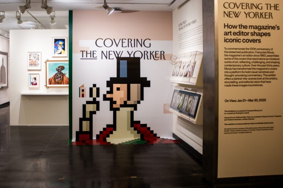
The exhibition offers multiple points of entry. A digital wall, Malika Favre’s poster-sized images on the staircase, Christoph Niemann’s work that bridges wall and floor, a vitrine displaying original printing plates, and four variations on Eustace Tilley—all of which help ease visitors into the show. Then, the core of the show begins: the pairing of Bruce McCall’s paintings with Ed Sorel’s drawings allows viewers to focus on each artist’s distinct voice. Having Ed Sorel, now 95, at the opening was particularly meaningful. His 30-year-old drawing of New York as the Tower of Babel even includes L’Alliance in the image—a serendipitous connection that made the venue feel predestined.
It was fun to watch the attendees and listen to their comments. Most were familiar with what they saw. Others were unpacking the meaning of the art. What is your hope for the exhibition?
I am proud of having given so many different artists in that room their first break—almost everyone in the show—and opening up those august gates. But what I’m truly proud of is the range of their approaches. My mission as art editor has been to assemble a diverse roster of artists, each working at the height of their powers, rather than establishing a predictable “New Yorker style.” I think that has been my greatest accomplishment.
When I was assigning covers for The New York Times Book Review, I’d limit the size of the original art. I was surprised to see how large Kadir Nelson paints, and just as breathtaking is Chris Ware’s blue pencil sketch art. How did you feel about seeing the entire show of originals and printed covers before your very eyes?
I’ll put it in the words of New Yorker artist Mark Ulriksen, who said it well: “I was blown away by how small McCall worked with all his glorious lettering and different fonts he painted. I loved seeing how large Kadir works, how Maira [Kalman] has loose borders, how Ana Juan uses acrylic and colored pencil and that [Ian] Falconer used charcoal. It was also cool to see the line drawings for the digital artists and it was only when we went again the next day that I saw the videos of Christoph [Neimann] and Hockney.”
The post The Daily Heller: ‘New Yorker’ Covers, Illuminated appeared first on PRINT Magazine.