A logo is much more than being a stunning visual. It’s the nucleus of all your branding campaigns. The objective of a logo is to capture your brand’s personality and reflect it visually. You can get it designed by a logo designer or use a logo maker tool to create a good logo design on your own. Don’t worry about how it would look. The tool lets you design a meaningful, professional, and aesthetically good logo without the help of an expert.
In this blog, we will discuss on how to make a good logo with dos and don’ts. So keep scrolling and reading.
How to make a good logo – tips and tricks:
Use conceptual or abstract symbols
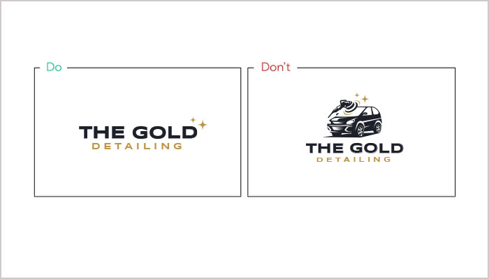
A symbol or icon has a crucial role to play in logo design. You may think, what’s an icon then? Well, it’s a tiny symbol that captures your brand’s personality and reflects its spirit. Many brands still believe that the icon should portray what your brand is all about or what products it provides. But that misconception is broken now.
Now, you can select conceptual or abstract icons to signify your company. You can take inspiration from big brands’ logos like Nike’s Swoosh, Domino’s icon, and Apple’s icon. These big brands have conceptual symbols in their logos to showcase their products or services.
Strategically use the space
There are many businesses that don’t depend just on icons to signify their brand personality. Instead, they explore each part of their logo for aesthetics. For example, using the logo maker lets you make a logo with a tagline, add your brand name, and do a lot more.
Whether your company has a tagline or not, pay attention to the strategic use of space. You can break a logo into two sections while keeping everything at its normal size.
Experiment with letter case
A good logo design may sometimes appear in lowercase or uppercase. It depends on the core messaging you want to convey. While a text logo in uppercase showcases authority, a lowercase appearance makes the brand more approachable.
When you get the balance between the two, the logo becomes a meaningful brandmark. Settle with a case that best defines your brand.
Select handwritten logo fonts
When it comes to logo design trends, impressive typography remains a favorite. Handwritten logo fonts are ideal for adding a unique feel to connect with the audience.
The handwritten font can be used for tagline or slogan part in the logo design. Avoid using caps for handwritten typography as it appears unnatural. If you don’t have a tagline, you can write your business name in a handwritten font to include it in your logo.
Make your tagline shorter than your business name
If you want your logo to appear good, ensure your tagline doesn’t go beyond your logo. Keep it short to highlight your logo. Choose a tagline that’s 25-30 characters long. Likewise, settle for a thinner tagline font if your business name is in a bold font.
Align your brand name and tagline
Having visual balance is one of the tips for making a logo. The tagline should be aligned with the brand name for natural visual harmony. This will reflect the visual hierarchy of your logo to the target audience.
Make your logo readable
Readability matters the most when you design a logo. No matter where you put up your logo, ensure its text is legible. The thumb rule is to check the logo across various platforms and see whether the text is readable. If the logo is hard to read, then you need to do the adjustment to make it readable.
Ensure your logo design is scalable
A good logo is the one that’s easily scalable. No matter whether you have to use it on a big billboard or as a tiny mark on a smartphone, it should adapt to every change easily. Both text and icon should scale down and scale up according to the use.
Remember, there is no one size fits all formula for logo design. So, choose a logo in vector format that you can adapt to different sizes. Check out this guide to logo sizes for website, social media and print materials.
Choose a background that offers enough contrast
One of the most preferred tips for making a logo is to choosing a contrasting background. Choose a darker background if the logo text is light, for example, black for white text. It may seem normal, but it’s effective and strategic.
Ensure picking the right colors or it may ruin your logo design. Explore color psychology and refer to color wheel for the best color combinations for your business logo.
Make your icon as big as your text
To make a good logo, adjust the size of your icon as per the company name used in it. If you keep your icon smaller than the text, then it will negatively impact your logo design.
Make your logo design timeless
Those who favor the best logo tips know how timelessness makes a logo popular all around. So, keep your logo as timeless as possible and stay away from transitory trends. Since your logo will be everywhere, so it’s essential to take your time, brainstorm, and then create a logo.
So, these are the dos and don’ts to make a good logo. Consider these tips to ensure your logo is professional and memorable. Simplicity is key to making it your company’s face.
Conclusion
Your logo is the core of your business and marketing efforts. It signifies your mission, vision, and brand story. Consider all the logo design tips mentioned earlier with dos and don’ts to ensure an attractive and meaningful logo. Use a DIY tool to create it on your own, or seek professional help. You can even hire a designer and share your ideas to design a logo. Be sure to understand your brand inside out and describe it for them.