Google has dialled up the fun in its updated design language, Material 3 Expressive, after user testing found that people have an appetite for “wild and way-too-playful” interfaces, Google Design vice-president Vanessa Cho told Dezeen.
Released earlier this month, Material 3 Expressive is the fourth update to Google’s Material Design system and aims to inspire emotion through an expanded use of colour, shape and animation.
Material Design both defines the personalisation options on Android and Wear OS and forms an open-source toolkit for developers working on their own app designs.
Material 3 Expressive aims to inspire emotion through design
The update marks an evolution of 2021’s Material Design 3, sometimes called Material You, which also emphasised personalisation and expressiveness. Cho explained that while that system had been positively received, three years of further development showed the design team that they could go bolder.
“In one of our studies, we asked participants to evaluate what we considered the outer limits — totally wild and way-too-playful designs,” she said. “We were surprised when those were the participants’ preferred screens.”
The Google design team expanded on these results with a period of intensive research, conducting a total of 46 studies with over 18,000 participants.
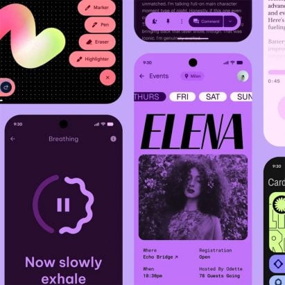
Research showed users prefer playful designs
According to Cho, it drove the team to double down on emotion-driven user-experience design, “like when an unexpected use of shape calls attention to an important button or the way a specific typeface can underscore the adventurous vibe of a photo album”.
The goal was to create designs that testers would rate universally high on emotion-based metrics such as whether they were “energetic”, “playful”, “friendly” and had a “positive vibe”.
To get there, they made changes such as adding a new physics-informed motion system for interactions and transitions that makes buttons and elements appear to naturally spring into place.
The design team also built an expanded shape library with built-in morphing animations and increased the choice of typography and colour palettes. Finally, they recommend a more dynamic use of all of these things than has hitherto been standard.
“The intent isn’t to make every interaction playful and emotive – for example, you might not want a super-playful UI for paying a parking ticket – but rather to expand the range of what a UX can express,” said Cho.
The results are not just more enjoyable interfaces, says Cho, but ones that are easier to use. Tests with eye-tracking glasses showed that participants were able to spot key interface elements, such as the email send button, up to four times faster in M3 Expressive versus Material 3, suggesting that their attention was being steered to the right part of the screen.
A bigger and more prominently positioned send button is easier to spot
“The time it takes to tap on key actions also significantly decreased,” Cho said. “Even more significantly, M3 Expressive designs erased the usability age gap researchers typically see, with older participants spotting key UI elements just as quickly as younger ones.”
After several years where outré trends such as anti-design, web brutalism and a Y2K revival have shaped the digital landscape, some have suggested that M3 Expressive signals a nail in the coffin for clean minimalism.
After all, when Material Design first launched in 2014, it coincided with the end of textured and three-dimensional icons and buttons and the normalisation of flat design, but since then, every update has focused on adding more personality.
The design language applies to apps on the Wear OS
Cho, however, sees it not as a battle between minimalism and maximalism but rather a progression that has been based on people’s familiarity with digital interfaces.
“When Material Design launched, the need was very different,” she said. “UX design was a wild riot of patterns and ideas. We had to reduce it to the fundamentals.”
Material Design builds on long-established rules from print design to establish “some ground rules” for the digital world, Cho continued.
M3 Expressive is more dynamic than its predecessors
“We needed that era of simplification and utility to figure out what UX could do and to help people figure out how to use it,” she said.
“Now, UX patterns are well established, digital interactions are second nature, and our devices are seen less as productivity tools and more as extensions of ourselves. Our interfaces can express more dimensions of human experience.”
M3 Expressive is not the only graphic design update Google has made this month. It also unveiled its new logo, adopting a gradient rather than block colours in its upper-case G. At Milan design week earlier this year, it presented an immersive installation made from mist and lasers.
The images are courtesy of Google.
The post Google ushers in age of “expressive” interfaces with Material Design update appeared first on Dezeen.