British designer John Pawson has created Whitescale, a colour palette that features only white hues, including marble, milk and salt, that was showcased during 3 Days of Design.
Copenhagen-based colour and surface collective Bleo, which worked with Pawson on the project, described Whitescale as “a meticulously calibrated gradient of whites”, with colours based on vegetable and mineral colour references.
The collection was informed by minerals. Photo by Cajsa Carlson
Pawson, who is known for his minimalist architecture, took more than a year to develop the 14 paint colours for Bleo. He sees the monochrome hues as a way of helping people experience space differently.
“Using white as a material allows us to experience space aside from objects,” Pawson said. “An experience of light, mass, proportion – the most elemental aspects of a space and site.”
Silver birch and cashmere were among the inspirations. Photo by Cajsa Carlson
Designing a collection of only-white hues was Pawson’s idea when he was approached by Bleo to create a range.
“[Pawson’s team] said ‘we would love to do it, but we can only do light colours’,” Bleo founder Anne Grønskov told Dezeen.
“And they were like, why not then do the perfect whites? For the team in London, it was important that it was physical and we brainstormed a lot of the different references.”
The resulting collection currently features 14 different colours, ranging from the palest white – Salt – to darker hues including Cashmere, Portland and China Clay.
“Right now, they’re developing the 15th colour, which is more ashy and greyish,” Grønskov said.
“There were some colours where it took forever to get the right tone – it was so difficult, also because the light is changing. For Pawson’s team, it was super important that [the colours] referenced the real world.”
Whitescale was showcased in Dinesen’s John Pawson showroom apartment
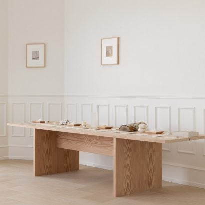
The Whitescale collection was showcased during 3 Days of Design in flooring manufacturer Dinesen’s Pawson-designed showroom apartment, which features the pared-back furniture that the designer created for the brand last year.
Here, they were displayed on a wooden table next to the materials that inspired the colours. Despite looking similar from a distance, Grønskov said they are noticeably different up close.
“When you actually go closer to them and you see the reference next to it, you see how big the difference actually is – a white is never just a white,” she said.
The palette was an attempt at finding the “perfect white”
The brand is currently also working on a collection of tiles by Pawson in the white hues, which is set to potentially launch this autumn, as well as a few more white colours.
The tiles will come in nine different finishes, including ultra matte, high gloss and minerals.
Last year, Pawson designed a cashmere collection that drew on some of his architectural designs, and in April, we understood him to have ditched his minimalist aesthetic for a foray into maximalism.
The photography is courtesy of Bleo unless otherwise stated.
The post John Pawson develops paint collection of 14 “perfect white” hues for Bleo appeared first on Dezeen.