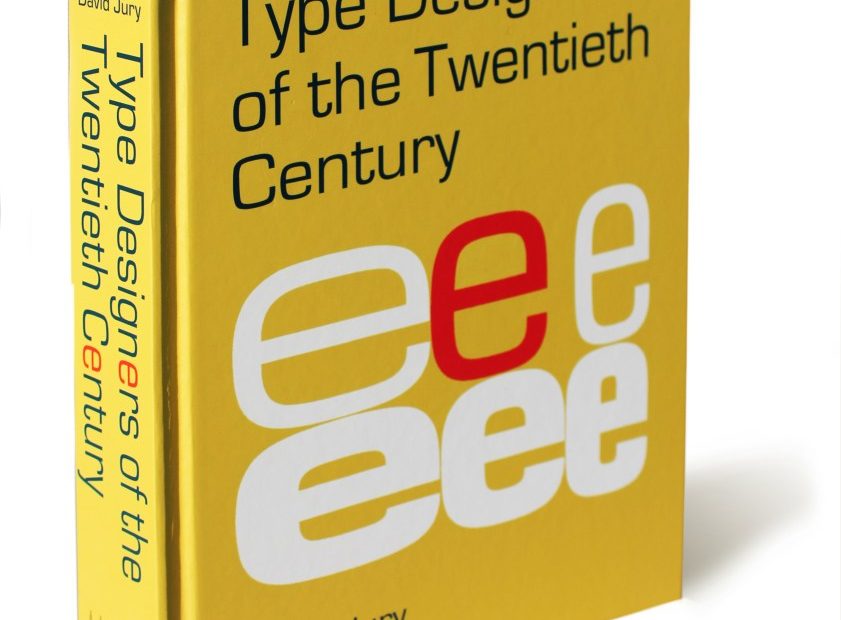
David Jury is one of the UK’s most prolific type historians/practitioners. He covers the gamut of typographic evolution. Two years ago, his book Mid-Century Type provided students with a concise overview of the slippery slope of functional commercial versus artistic experimental type production—and his new volume, Type Designers of the Twentieth Century, is a welcome addition to the growing library of type origin stories.
In the book, he profiles 37 essential type designers representing evolving technologies, styles and tastes. Highlighting their practices, output and place on the graphic design timeline, this cannon of the past century touches most of the bases. Included are the historical legends Frederic Goudy and Edward Johnston, Stanley Morison and Roger Excoffon, Hermann Zapf and Adrian Frutiger, and contemporary innovators Neville Brody, Carol Twombly, Tobias Frere-Jones and more.
Jury and I recently discussed the importance of these illuminating investigations into the legacies of such type designers, many of whom live on through their namesake faces.
What was your intent in writing about 20th-century type designers?
The appearance of a letterform printed on the surface of a sheet of paper was for most of the 20th century the conclusion of a long and often convoluted process, with tensions between art, craft, technology and commerce rarely allowed to be far from the designer’s mind. My intention in writing this book was to provide an account of the elaborate and sometimes volatile process by which type was made; the ever-changing purposes for which it was designed; the identities and working processes of its creators and manufacturers; and, crucially, the changing occupations and expectations of those to whom it was sold—from printer to designer and, finally, to the general public.
The designers you discuss are all worthy, so what was your criteria for selection?
Choosing just 37 from the many hundreds of type designers who have made a significant contribution to type and typographic design during the 20th century was a tawdry business. I initially had 45, but the word count and corresponding number of pages had grown too large. Nevertheless, the book was still twice what the publisher had originally planned. All credit to Bodleian Library Publishing for allowing the project to grow so radically.
The final 37 were determined by the need to explain what it meant to be a type designer during that turbulent century—careers, working relationships, achievements, and occasional failures. Prodigiousness was not a consideration. A few designers included in this book created just one typeface, others a hundred or more, but in every case, their type has played an integral role in the culture it was designed to reveal.
Do you believe there is a dearth of knowledge among students studying type design in the UK?
Courses that deal exclusively in type are relatively rare and generally taught at MA level or above. However, the age of students on such course is generally considerably older than other MA courses. (I taught Typographic Enquiry on the MA Type Design course at Cambridge School of Art for several years.) The maturity of the students seemed appropriate to me—it is surely essential for a type designer to have had ample experience of designing with type before attempting to design type.
When talking to some of the type designers in the book, I was surprised by the number of times they described the antagonism received from lecturers for wanting to design type, their argument being that the “classics” (take your choice) are sacrosanct. I have a simpler explanation—they were fearful and knew nothing whatsoever about the subject. Such ignorance remains prevalent today, despite digital technology having made the process more accessible and less complex. However, it remains a demanding activity. Perhaps more than anything, I hope my book helps to dispel the sense of mystery that still haunts the designing of type.
If there are form-changers in the type world, who would you single out in your book as the prime contributor?
Judging by the book’s index, the typefaces that reverberated most during the 20th century are Paul Renner’s Futura and Max Miedinger and Eduard Hoffmann’s Neue Haas Grotesk, later renamed Helvetica. But the typeface that has had the biggest and longest-lasting impact seems to be Edward Johnston’s Underground Alphabet from 1916. Both Jeremy Tankard and Tobias Frere-Jones—the two youngest and final type designers discussed in the book—name him as an essential influence.
It is no surprise that all three of these typefaces are sans serif. While the books we read continue to use serif faces—and rightly so—it is the sans serif that captured the spirit of the 20th century. To these three I would add a little-known fourth—and the one I enjoyed researching and writing about most: Harold Curwen’s magnificent Curwen Sans Titling. It was designed some four years before Johnston’s Underground Alphabet, and yet Curwen’s Sans transcends Johnson’s—who also happened to be Curwen’s tutor. The fact that it was not released until 1928 (after Erbar, Futura, Gill Sans and Kabel) meant that its innovative achievement has gone largely unrecognized. But Curwen’s Sans does not only offer a beautiful set of monoline capitals (the ‘W’ is breathtaking), it also demonstrates how difficult it is to design a lowercase along the same precise principles established with his capitals. Coming sometime after the first set of caps had already been cast, Curwen’s monoline lowercase was nothing short of a disaster. Such elemental misjudgments provide the best possible demonstration of just how difficult it is to get the theory and practice to work in unison.
What kind of temperament must one have to be an original type designer?
This is a fascinating question. Throughout the book, contrasting temperaments and seemingly inevitable arguments crop up regularly, almost always between the designer and the maker.
It is not unusual for the identity of the creator of a typeface to be obscured by the convoluted way it came into existence. Who should receive the credit as “designer”—the person who commissions and instructs, or the person who interprets and cuts the actual letters? This was a recurring issue, especially in the first half of the book.
A great deal of the work done by punchcutters remains unidentified. Edward Prince in London and Charles Malin in Paris were fortunate in their association with the private presses, whose adherence to the values of the Arts and Crafts movement being a cooperative activity meant that they received generous credit for their work. However, those working in the bowels of a major type foundry are rarely, if ever, even mentioned.
Prince was described as: “Never ebullient or extrovert, but rather shy and humble, [he] represented craftsmanship at its highest and most spiritual level.” It would be fair to say that while some type designers shared the spiritual resolve characterized by Prince, there were many more who sought the spotlight and adulation.
Digital technology has eliminated the need for design, craft and manufacture to be separate activities—the design of a typeface has now become the work of a single person. So to answer your question about temperament, I would say that a type designer needs to have, first and foremost, a determined sense of public service, while designing a typeface that expresses something of its time and, most important, its purpose. Well, that would be a start, anyway.
Is it too early to pinpoint the great designers of the 21st century?
Yes.
The post The Daily Heller: Designing Type in a Volatile Era appeared first on PRINT Magazine.