Developing the look and feel for a global nightlife brand sounds like a dream job. Creating visuals that reflect the magical vibes of a dance floor in Ibiza, or the eclectic nature of the characters you might bump shoulders with at a club in Montréal, would make almost any designer lick their chops. This is the exact task London-based creative studio Studio Moross was given when record label and nightlife phenomenon Glitterbox approached them for a brand refresh. And Studio Moross did not disappoint.
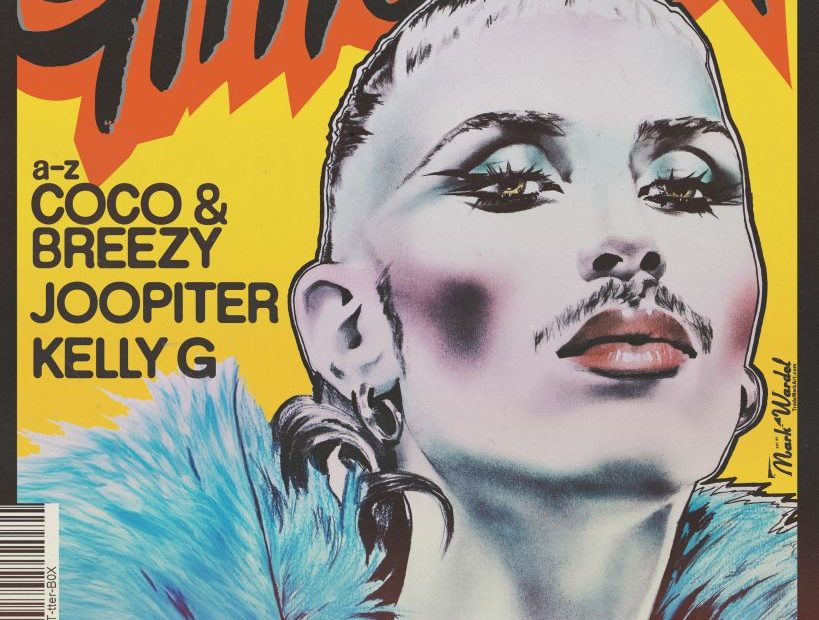
The project had two pillars: a visual refresh for Glitterbox’s 2025 season, and a separate campaign for their productions in Ibiza at Hï Ibiza that started in May and ran through October. For the global brand refresh, the goal was to elevate Glitterbox’s visual and strategic identity while remaining true to its core DNA. Central to this mission was working closely with illustrator Mark Wardel, who’s been a longtime Glitterbox collaborator, and whose work has become visually synonymous with the brand’s identity.
The crux of the brand refresh involved creating five distinct muses that each represent facets of the Glitterbox Universe. Studio Moross chose the Serial font family by Dum Dum Studio for the system’s typography, enjoying its playful, lo-fi characteristics, with blurred, distressed, and distorted weights that mirror the varied personalities of the dance floor muses. Each variation of the font aligns with one of these muses.
Meanwhile, the Ibiza campaign is an explosion of punchy pink graphics that uses aspects developed for the global refresh.
To learn a bit more about each of these projects, I reached out to Studio Moross’ creative director, Aries Moross, with a few questions. Their responses are below, edited lightly for clarity and length.
What was the brief Glitterbox came to you with for this campaign? What were their main goals?
The brief from Glitterbox was clear: to keep their recognizable visual style, but sharpen it overall. They wanted a new, harder look for Ibiza that stood out from all the other parties on the island. As a departure from past campaigns, they wanted this visual reset to be a more distilled version of themselves— we discussed a campaign built on a tight, stripped-back set of branding guidelines, like a single color and typeface.
On the global brand side of things, they needed a direction and a structure to last them the whole year, so we wanted to build them a set of tools for their in-house team so that they could roll out new creative as needed.
Can you elaborate on your development process for the campaign concept? How did you land on the idea of creating muses, and how did you then come up with those five specific muses?
The overarching theme for the campaign was “Made for the Dancefloor,” so with Glitterbox’s dancers and performers at the heart of the brand, we thought it would be exciting to use them as the pillars for the campaign. We created mini-brands inspired by the individual styles, aesthetics, and moods of the types of people you might find yourself next to on the dance floor. We proposed about eight or nine ideas, and narrowed them down to a final five for the campaign.
The dancers were incredible; the shoot was just frame after frame of perfect images.
The Pink Punk is inspired by Xeroxed punk visuals and is characterized by Glitterbox brand ambassador and dancer Lucy Fizz.
The Waacker was built specifically for the incredibly talented waacker Bagsy, whose personal style informed the brand.
The IT GIRL, performed by Linford, was a “Manhattan 90s It Girl” with a twist.
Playa Del Pole was built around the concept of a Venice Beach babe, who was perfectly embodied by pole performer Jao.
The Lovers was inspired by Treasure Alexia. The concept was originally going to be two people, but we decided to play with the idea of twins, and duplicated Treasure so there were two of her.
The dancers were incredible; the shoot was just frame after frame of perfect images.
What was the main visual inspiration for this refresh? What influences did you draw upon for the retro yet fresh look?
Glitterbox also shares our love for maximalist aesthetics, but if you create every flyer with the same large pool of references, they all end up looking the same. So instead, we decided to create visual buckets that paired with those muses to create some rhythm within the campaign throughout the year. We developed brand guides that gave the in-house team a scope and creative direction in which to develop their own ideas and to keep the brand moving.
Glitterbox’s creative references often refer back to visually rich and playful brands of the 80s and 90s like Fiorucci. Fiorucci developed a huge archive of colorful design during its heyday, and it shares a love of illustrative imagery, grit, grain, and texture.
I know it was important for this project to elevate Glitterbox’s visual and strategic identity, while also remaining true to its roots. How did you strike this balance?
We wanted to ensure we continued to work with Mark Wardel, who has driven the brand aesthetic since its inception; he was involved in the entire process. We kept his iconic logotype, which is a visual anchor, using it as a masthead on almost every piece of collateral. After we shot stills of all the muses, we processed the images and video content quite heavily, and many of the treatments were informed by the look and feel of the imagery from Glitterbox’s archive.
What detail or aspect of this project are you proudest of?
Once we pulled together the case study for our website, it was clear how much fun we had on this project. Personally, I don’t get to spend as much time designing these days, but I was very involved in this project. Studio Moross designer Johnny Brennan and I worked to deliver all the assets for the static brand. It was really fun, and the client had a lot of trust in our process. I spent a few nights working out of hours, enjoying putting together the brand guides, which is not something I do much anymore. It made me feel like I was back at the start of my career, engrossed in designing flyers in my university bedroom.
It’s been so nice to see the project roll out across social media, and even more amazing to see the OOH touchpoints in and around Ibiza. The LED banners outside the venue flood the streets with pink light, and it really feels like you are inside the campaign, both in and outside of the club.
The post Glitterbox’s Brand Refresh Summons the Dancefloor Muses appeared first on PRINT Magazine.