Universal Design Studio and Map Project Office have overhauled the New Balance flagship store on London‘s Oxford Street, casting it in ten different shades of the sportswear brand’s signature grey.
The redesign forms part of a new interior design strategy developed for New Balance‘s global stores by interiors firm Universal Design Studio and its sister industrial design practice Map Project Office (MAP).
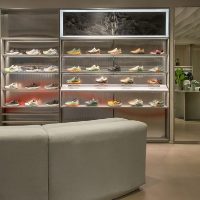
New Balance has revamped its Oxford Street flagship
This design language seeks to establish New Balance as “the most boutique athletic brand in the world” by bridging the gap between craft and sport.
“With this partnership, we seek to elevate athleticwear into boutique territory, intentionally blurring the lines between fashion, lifestyle and performance, creating a design language that feels deeply considered, aspirational and crafted,” the design team explained.
Universal Design Studio and Map Project Office used 10 shades of grey throughout the interior
New Balance’s signature grey, punctuated by subtle red accents, was used in nearly ten different variations throughout the London store, whether in the form of stained timbers, reflective metals, semi-translucent resins or textured paints.
“The studios strove to make the New Balance grey ownable by expressing the diversity of grey in both tonality, from warm to cool, and from rich and deep, to light and delicate,” the design team explained.
“This has been contrasted with gloss surfaces and sheer textures, a reflective quality capturing motion. Purity and strength comes through thin, refined metal profiles, layered with soft, diffused reds that lead you to brand moments.”
The Fit For Performance zones highlight products for athletes
The updated spatial strategy will see each store divided into zones that showcase the brand’s different collections alongside areas dedicated to specific local releases.
When entering the three-storey London store, the first thing customers encounter is a versatile display area called the Stage, fitted out with products and decor selected to reflect the city’s ever-changing calendar of sporting and cultural events, from marathons to high-profile concerts.
“The stores will act as platforms to connect people through the joy of movement and the emotion of sport, while promoting a modern gaze on craft through an uncompromising attention to detail,” the design team said.
Reflective surfaces capture the idea of perpetual motion
To differentiate New Balance’s lifestyle and performance products, Universal Design Studio devised two clear identities for their dedicated areas within the stores.
The Fit For Performance zone, targeted at elite and everyday athletes, features reflective materials to capture the idea of perpetual motion.
The Fit For You zones highlight lifestyle products
In the London store, anodised aluminium displays, sculptural seating elements and linear ceiling baffles give these spaces a sense of dynamic movement.
The aluminium perimeter displays feature fluted mirrored surfaces with a red gradient back panel that reflects motion within the store.
The Fit For You zones seek to provide a more relaxed environment for browsing and engaging with the brand’s lifestyle products. Materials such as wood and leather contribute to the more domestic and crafted feel of these spaces.
The lifestyle-centred areas also feature bullnose profiles that soften the edges of tables, shelves and seating. Red-stained timber tables are used to highlight hero products, while the lighting scheme looks to enhance the more intimate feel.
Decorative lighting and cosy materials create a domestic atmosphere
The London shop includes a basement area called Made in UK that is entirely drenched in dark red. Designed to showcase past and present New Balance releases in the country, the space can also be used to host special celebrations and events.
Continuing the theme of perpetual motion, MAP designed flags to be used as a universal element in all of the brand’s stores.
The basement is drenched in dark red
Intended to evoke the banners and flags seen at sporting events, the designs feature graphics based on the running track markings at New Balance’s Boston headquarters.
The flags are handmade in New England by specialist fabricator Flag & Banner and incorporate a mechanism that allows them to flutter at different intensities during regular store hours and in-store events.
Red-tinged lighting was used to emphasise the changing rooms
London is the most recent destination to showcase the new design strategy following the opening of the Boston flagship, which features a vitrine displaying archival products and memorabilia from New Balance’s history.
Locally manufactured pieces are presented in a setting that references the design aesthetic of the 1970s – a period that saw the Boston area become a centre for a running boom spurred by its annual marathon race.
The same design language will be rolled out across all of New Balance’s global stores
Following the completion of the Boston and London stores, the new identity will be rolled out to global flagships opening in Tokyo later this year and in New York in 2026.
Other recent retail interiors from Universal Design Studio include a skincare store designed to resemble a laboratory and a boutique infused with Egyptian heritage and craft for jewellery designer Azza Fahmy.
The post New Balance revamps London store to show off “the diversity of grey” appeared first on Dezeen.