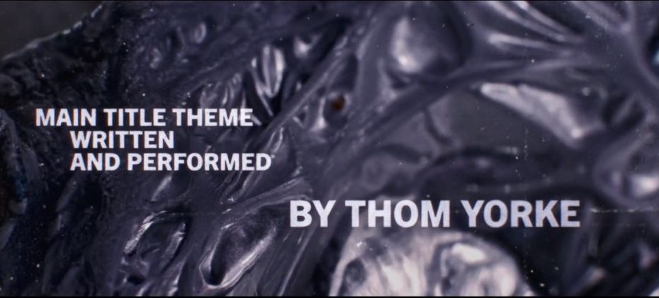
The newest drama from Apple TV+, Smoke, is an odyssey into the psyche of an arsonist in Southern California. The subject matter alone lends itself to a visually compelling opening title sequence, and the title pros over at Digital Kitchen delivered. They physically burned objects related to plot points and characters in the show for the sequence, and then reversed the footage so the items were revealed, much like an investigation. Set to an eerie original song from Radiohead’s Thom Yorke, the resulting title sequence is equal parts atmospheric and off-putting, gorgeous and grotesque.
After chatting with Digital Kitchen creative director Mason Nicoll and art director Rachel Brickel about their opening titles for Yellowjackets earlier this year, I was eager to learn about their process behind their latest title sequence. This time around, Nicoll and Brickel were joined by art director and designer Peter Pak, who also worked on the Smoke titles. Our conversation is below, edited lightly for clarity and length.
What did the Smoke team come to Digital Kitchen with in terms of a brief for these opening titles?
Mason Nicoll: When we got the call, there was no brief. But they actually had a bunch of episodes already cut. Sometimes you get to see the pilot, but it’s pretty rare you get to see over half the season (even though, now, those cuts have changed a bunch). But they were like, “Hey, watch this, and let us know what you think.” That’s how we approached it; it was really wide open.
The only thing coming from them creatively was the unreleased Thom Yorke track— they said, “We know it’s going to be cut against this.” Which was amazing, because a lot of times we’ll develop something, and it’s not until later in the process that either a piece of music comes in, or a composer sometimes scores to what we make.
We came back with a handful of ideas, one of which ended up as the main title.
Were you surprised that they went with the idea they chose?
MN: You never know! The idea they chose, which looks very close to the original boards, we thought was a bit of an outlier. We hadn’t worked with Dennis [Lehane] before, but we had worked with Dave [Diliberto] and Neil [A. Stelzner], and I think I have a good gauge of what they like. So when we pitched the idea that was ultimately picked, I thought, “Oh, they’ll love this one,” but I didn’t know about Dennis. Sometimes clients want more overt storytelling. We got the story in there, but in a more hidden way that gets unveiled.
We had four ideas, and sometimes you’re like, “These ones, we think they’re really going to like, right off the bat and connect with, and then these we’re not really sure.” They came back pretty quickly and were like, ”That’s the one!” Then we just jumped right into it.
It’s much like how an arson investigator would view it, trying to piece together what these objects mean and what they are.
Mason Nicholls, creative director
You mentioned the track from Thom Yorke was the only thing you were given as a jumping-off point. How does knowing the song ahead of time affect your process in creating the titles?
MN: I’d say probably one and a half of the ideas weren’t really thinking about the song. Sometimes you have to ask, “What else would we do if we didn’t know what the music would be?” But I’d say more than half of our ideas were speaking to the song.
Like a lot of Thom Yorke’s music, there’s this odd tempo to the song that you think you know, but then it kind of upends itself. So I always imagined that there was this very procedural, slower build. Once we got into it, we tried to figure out how to inject a bit more surprise not only through the editorial, but in the way things moved.
How did the specific idea they chose for the titles develop?
MN: Ana [Criado], who is a designer we work with a lot, came up with the idea. The beauty of these objects when they’re completely burnt is that they all start to look the same; they’re just this little charcoal brick. Ana was like, “Wouldn’t it be amazing if you can’t tell the difference between these at the start, but then over the course of a minute, a minute plus, they start to un-burn?“ It’s much like how an arson investigator would view it, trying to piece together what these objects mean and what they are.
Once the concept was selected, how did you figure out how to practically shoot these burning objects in a way that achieved your desired effect? Can you get into the technical side?
Rachel Brickel: We put together a list of what we wanted to burn in collaboration with the client. Then I started doing some tests to see two different things: How is it burning? Does it look right? And, How are we going to do this? Doing it in a way where we get the shots that we want, but in a safe way.
So the way it started was doing things on a much smaller scale, in a tin foil pan. We started testing different types of materials to see how they burned and which ones behaved in a way that was more interesting visually, from a macro standpoint. Then, Mason put together this motion test to make sure that we were capturing the energy of the Thom Yorke song. As I was doing these fire tests, I was also cutting together a motion test of what I was shooting to make sure that it felt like the right energy to match the direction. So the whole time we were putting it together as we went.
The challenge throughout was trying to show the least amount of fire possible.
Rachel Brickel, art director and cinematographer
For the shoot itself, we had an actual fire stage; we all wore respirators and had special fire effects pyro specialists there to make sure everything was safe. The stage had a special vent that helped release the smoke and everything; it’s built for these types of shoots.
Were there certain objects that you wanted to include, but when you did your burn tests, they didn’t look how you wanted them to, so they didn’t make the cut?
RB: We’d always find a solution if something wasn’t working. For example, one of the items was a scrunchie, so I ran a test between cotton and nylon. Seeing it, one looked terrible, and the other looked really cool. The most important thing was the narrative and making sure everything looked right. But since everything looked very abstract, we got away with a lot; if things weren’t working, we could fill it with things that were.
MN: There were three or four objects that seemed kind of important at the beginning, that we ended up not including. We were trying to figure out objects that were immediately recognizable when they were revealed. A quick, Oh, I understand what this is, but I don’t understand why you’re showing me this group of objects. The lamp was one. We shot this lamp, and it never made it in; it was just unwieldy. Also, Taron Egerton’s hat. When he burns things, he wears sunglasses and a specific hat, but the hat never looked quite right. There were some cool shots—some macro stuff that we included—but we were always judging those shots against what looked great when it was finally revealed as an object.
Can you speak to your decision to shoot the burning objects rather than using visual effects? What did physically burning the objects provide visually that a digital reproduction couldn’t?
RB: There’s definitely nothing like the real thing. There’s a quote from the show where they say, “Fire is an organism”— it’s nature. We can try to recreate it [digitally], but it’s really hard to recreate nature. The best, most effective way is to actually capture it. There are so many beautiful properties of these items, the way they would transform, and you really can’t predict or imagine what that would look like. That’s part of what made this title cool: we’re showing something that’s not normally observed.
MN: Dennis was also looking at classic 60s and 70s film procedurals, so because he was leaning into this classic way of telling a detective arsonist story, it just made us think we definitely want to shoot it, it just makes sense.
All of that happenstance that Rachel mentioned, you can achieve some of that with heavy-duty 3D simulations, but you’re always orchestrating it more than you want to.
Peter Pak: When you create those simulations and effects, you create an object to burn a certain way. But in real life, objects burn in a variety of different ways. By doing it in real life, it opens up to surprises or happy accidents, where you might suddenly get a certain color flame that you never would have expected and predicted.
Even if you were to do it digitally, you would need to reference an object being burned in real life anyway. Trying to copy that reference, it just ends up being a poor imitation versus the real thing.
In real life, objects burn in a variety of different ways; it opens up to surprises or happy accidents, where you might suddenly get a certain color flame that you never would have expected and predicted.
Peter Pak, art director and designer
Was there an overarching challenge you faced in trying to execute your vision?
RB: The challenge throughout was trying to show the least amount of fire possible. What helped us with that was when we were experimenting with what tool starts the fire, we landed on butane and propane torches because they were very, very hot. And sometimes, when they reach that level of heat, the heat is invisible, so we got things to burn without having them catch fire. We were chasing that temperature. But then we were also shooting on a surface, so the surface couldn’t catch fire either. So we were trying to light the object without anything else around it catching fire.
PP: The story isn’t necessarily about the fires or the flames themselves; it’s more about how they transformed and affected these objects. The flames are pretty themselves, but we were after the textures of the transformation happening.
I understand not wanting to do the obvious of showing too much fire in the titles for a show about an arsonist, but you also don’t want to overcorrect and try too hard to eliminate fire altogether. Plus, the perspective of the fire in these titles is so different from any that most people have ever seen; I almost forgot I was watching things on fire altogether because I was lost in the beauty of the transformation Peter is referring to.
MN: That’s good! We set up these rules for ourselves, and then, at a certain point, you either feel like you should break them, or you try even harder not to break them. Early on, we thought to do it without fire, but we just kept trying and trying and realized it would be impossible to keep it practical and not see any fire. We had to give in.
Do each of you have a favorite moment, burning object, or a frame in the titles?
RB: One is the potato chip bag. There’s a point where the foil paper bubbles in a way that it becomes gunk, and it felt so alive. It was the last thing that was shot, too, so I was like, “Wait, what? What’s going on here?” I didn’t expect it at all; it was unlike anything else that we shot. Another thing that was really cool was the badge. I liked how the metal changed color, but then the leather underneath it unraveled and then grew.
PP: For me, it was the logo animation, because whereas most of the other objects were shot practically and then enhanced or adjusted later on, the logo animation was more bespoke. It wasn’t just one type layer that we burned, we experimented with a mix of practical and digital effects to create it. We used multiple takes from Rachel burning different types of materials. There were little qualities that I liked, like a letter’s corner might warp here, while there might be a little smudge there. Digitally, I recreated it so that we could get a lot of the micro-cracks happening. For me, especially working on the more digital side, it was fun bringing all of these different elements together to create something very intentional. We were open to creative surprises, but I liked going through and being able to direct where and how things should move, how things should warp, when and how things should scale and cut.
MN: For me, it’s anything plastic. There’s the VHS, then there’s the Greg Kinnear card, which is part of the plastic bag one of the arsonists always buys milk in. The plastic always had that kind of odd interruption to a lot of the movement, especially in reverse, and especially because we sped up a lot of the footage to give it a bit of that frenetic, almost time-lapse quality.
Peter, it’s interesting to hear you talk about controlling the look of the burning digitally for the title card design, in contrast to leaning into the unexpected, organic nature of burning for the other aspects of the title sequence. Were there any other moments you used digital techniques for a desired effect?
PP: If a flame or a piece of dust became too distracting, we would need to remove it or manipulate it digitally. If we wanted a certain detail to be the focus, we grabbed another detail from another take and overlayed it on top, so that we see more of that detail. Because it was shot practically, we captured the organic, camera lens blur, but digitally, we could also control it so that viewers focus on the spots we wanted them to.
MN: Another big digital part was in the edit. Justin [West] did the base edit, who was the same editor who worked on Yellowjackets, but Peter worked on the camera moves. We knew we didn’t want to go too crazy, but there are a lot of nice moments. One of my favorites is in the badge section. We kept these very linear moves in mind, but always wanted to make it feel like there were maybe more moves cut somewhere, and we’re just editing them down so you see the tail-end of one, or it feels like it skips into another move.
PP: A lot of the camera motion was done in post. It was inspired by the documentation style of forensic photography. Like those old microfiche readers, where the cameras are a bit jerky, that inspired some of the motion. We also added some overlays that allude to an investigation, such as case file numbers or a blurred ruler in the background. We put them in there to frame the objects and not distract from them.
MN: We don’t want to just throw visuals in there and have it be window dressing, but the production designers had wrapped at a certain point, so they were all gone. Some of what Peter layered is a little bit more generic because we were restricted, but there are some nice Easter eggs in there, like numbers that hold more meaning. That’s something we love to do.
Smoke opening title sequence credits:
Client: Apple TV+
Main Title Concepted, Designed, and Produced by Digital Kitchen
Executive Creative Director: Mason Nicoll
Art Director & Cinematographer: Rachel Brickel
Art Director & Designer: Peter Pak
Motion Artist: Simon Chan
Designer: Ana Criado
Editor: Justin West
Senior Producer: Matthew Lynch
Managing Director: Ally Malloy
Music by: Thom Yorke
The post The ‘Smoke’ Opening Titles Un-burn Objects to Reflect the Mind of an Arsonist appeared first on PRINT Magazine.