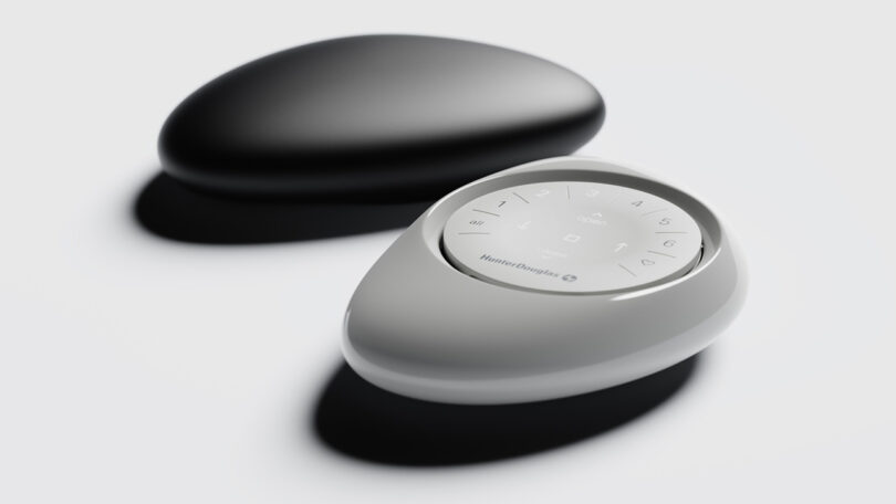
When it comes to remote controls, one could say their ubiquity and necessity have trained us to accept “good enough.” Remote controls are mostly remembered for their often perplexing layout of buttons and their proclivity to disappear when most needed. Functionality aside, what remotes generally lack are any perceptible depth of attention about how such a device physically feels beyond the button press, let alone any semblance of physical elegance. None of this can be said about the Hunter Douglas PowerView Pebble Remote, a small yet key component in the brand’s automated and motorized window cover system realized in an ergonomic biomimetic shape that we dare say feels and looks nearly as satisfying as our favorite tide worn beach stone.
Just like a favorite stone found along a shoreline or riverside, the remote’s rounded edges and soft curves offer a satisfying feel formed to naturally fit in the palm. The remote’s ability to be operated using just one hand regardless of hand size or handedness, alongside an intuitive layout of controls makes for an exemplary universal design.
The Pebble is amongst one of the smallest components of the Hunter Douglas PowerView motorization system, with the pebble remote giving users control of up to six different window groups within the home.
The genesis of the Pebble Remote Control’s design began with a real stone plucked from the shoreline by San Francisco industrial design studio Bould Design’s founder, Fred Bould. Tasked to imbue an unusual degree of ergonomic care as a key component of the Hunter Douglas automated window shade system, he would use this stone to contour a handheld device that instinctually felt natural.
Transcending mere aesthetics, the Pebble represents a deliberate effort to create a device offering a tactile user experience while also inspiring the object to be left openly between use. Bould would go onto completely redesign the original 2016 circular design for a tactile, continuous silicone button surface remote, strengthening the stone analogy.
We spoke to Bould Design founder Fred Bould about the long evolving development of the Pebble remote.
The PowerView Pebble Remote Control has been recognized with numerous design awards, underscoring its excellence in industrial design. It was recently awarded a 2023 Red Dot Award, celebrated for its innovative design and functionality.
How did the integration of a silicone button surface differ from the original design?
Whereas the 2016 remote had separate discrete button keycaps, the current updated version has a smooth sculpted contour with the switches embedded underneath. The button icons are laser etched into the top surface and allow them to be backlit. Silicone is an excellent light diffusing material.
Could you tell us about the original “pebble” that was used as a template for the remote?
Yes! I was on vacation in Kauai when I found a lava rock on the south shore. It had a rough surface as you would expect of a lava rock but the asymmetric organic shape felt good in the hand. The Pebble remote is a slightly scaled down, softer version of that shoreline find.
How much work was done to make the Pebble Remote universally ergonomic, comfortable for smaller or larger hands, left and right handed users?
Although it is asymmetric, the Pebble is comfortable for both lefties and righties. The key metric is that all buttons need to fall within the sweep of the users thumb, that was easy to achieve within the circular remote.
The Pebble Remote’s form is echoed in the similarly formed Hunter Douglas Powerview Gateway hub design.
Bould Design also worked with Hunter Douglas on the development of their Duette shades. Were the remote, hub, and shades all designed concurrently to complement one another, or was the brief requiring a more universal catalog-wide approach?
The Pebble remote was our first project with Hunter Douglas and the Duette program was the second. The two projects were similar and different at the same time. The Pebble remote would be a frequently handled user touch point and meant to be a focal point or provocative objet. The Duette was well established as a product line and we made two moves to make it an even better product.
What improvements were made?
The first move was to shape the head and bottom rails to be more harmonious with the honeycomb profile helping the shades present as a more unified aesthetic in an architectural context. The second move was to re-design the lift handle and other touch points to be be more congruous with the material as well while also feeling really pleasant to the touch.
While only one element of an entire Hunter Douglas’ automation ecosystem, the PowerView Pebble Remote embodies the notion while a good design may look right, a great design can literally feel so.
