With revamped messaging, vibrant visuals, and a future-facing attitude, Brandon’s refreshed identity signals a shift from traditional agency to integrated growth partner.
Brandon has unveiled a rebrand designed to bring its ambition into sharper focus, dropping “The Brandon Agency” in favour of a punchier moniker. The South Carolina-based firm’s new identity seeks to capture its transformation into an integrated, insight-led growth engine.
The company has set this up as a complete repositioning, not just a visual refresh. CEO Scott Brandon says: “We build brands that don’t just show up, we shake things up. We challenge. We push. We break things on purpose.”
Founded in 1959 and led by Scott since 2001, Brandon has long been recognised for its results-driven mindset; however, in recent years, the agency has evolved well beyond performance metrics. Now offering a full spectrum of services spanning strategy, creative, content, media, PR and performance, Brandon partners with ambitious brands looking for more than a safe pair of hands.
“This rebrand wasn’t just cosmetic,” explains Scott. “It was a complete repositioning of who we are and how we show up in the world. Our creative ambition and the kind of work we deliver have changed. We needed a brand identity that matched that momentum.”
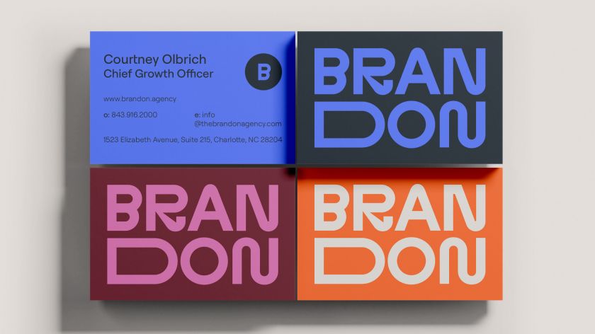
Visually, the new identity leans into a clean, confident design. Sharp typography, vibrant colours and kinetic layouts reflect a sense of movement and drive. The goal wasn’t to appear flashy or aggressive but rather to be focused and assertive. It walks the line between left-brain strategy and right-brain creativity – a balance that defines the agency’s positioning.
Notably, the team has also intentionally dropped the polished, jargon-heavy voice that often defines agency speak. In its place is a tone that’s clear, provocative, and unafraid to push boundaries. “We let go of being overly polished and leaned into being bold, strategic, and a little disruptive,” says Scott. “That energy lives in every part of the system.”
The phrase “built for what’s next” often surfaces in Brandon’s messaging. That future-facing mindset influenced both the tone and visual system, pushing the team to take creative risks. From the stretched logo to the elastic layout grids, the identity is designed to feel dynamic and energetic, almost like it’s in motion.
It’s important to note that it’s not all about provocation, though. Underneath the punchy visuals and direct voice is a deliberate attempt to strip things back and refocus on outcomes. “We built our new brand the same way we build client campaigns: with intention, integration, and a relentless focus on impact.”
The new website and collateral reflect this integrated approach. Messaging leads with clarity, making a clear promise: working with Brandon means momentum. The visual system reinforces this with bold contrasts and confident use of space. The brand does more than just talk a good game by demonstrating how every piece of communication is crafted.
Brandon’s legacy also plays a quiet but consistent role. While the name is now sleeker and the design more contemporary, the agency’s long-standing values haven’t been left behind.
“This rebrand wasn’t about erasing our past; it was about building on it with purpose,” Scott explains. “The name may be shorter, the look more modern, but the commitment to outcomes-driven marketing remains exactly the same.”
The rebrand was a collaborative effort across strategy, creative, and leadership teams, with input from an external partner to keep things sharp. That alignment is clear in the result: a brand that looks and sounds cohesive at every level.
For clients and prospects, the agency hopes the brand delivers a gut-level reaction: these are the people who get it. “We want prospective clients to feel energised and a little challenged,” says Scott. “This isn’t just another agency. This is a partner that thinks fast, moves smart and isn’t afraid to push them beyond the expected.”
In a market where many agencies still hedge their bets or default to familiar formulas, Brandon’s rebrand stands out. Not because it reinvents the wheel but because it knows exactly when to break it.
The result is a brand identity that does what good branding should: it reflects who the agency is now and gives shape to where it’s headed next.