There was a time when speed was the strategy.
For digital media, especially in sports, velocity became synonymous with relevance. Publish first. Optimize later. Feed the algorithm. In that environment, design often followed function; templated, disposable, built to keep pace with an endless scroll. Identity, if it existed at all, was secondary to distribution.
But what happens when a media brand outgrows the conditions it was built for?
That question sits at the center of the recent redesign of EssentiallySports, led by designer Martin Grasser, who designed Twitter’s (RIP, as it’s now X) iconic blue bird icon. On paper, the numbers tell one story: a top ten U.S. sports publisher, 500 million annual page views, 30 million monthly readers, and a growing ecosystem spanning newsletters, social, live events, and creator partnerships. But scale alone doesn’t necessitate reinvention. Plenty of media companies grow while maintaining fragmented, platform-first identities.
What’s different here is the recognition that speed, once the engine of growth, can become a liability if it outpaces coherence.
EssentiallySports began, like many modern media success stories, as a scrappy, social-first operation. Three college students, a $100 website, and a relentless publishing cadence built for Facebook feeds and Google Discover. The brand that emerged from that phase was functional by design: optimized for throughput rather than longevity. With a focus that it didn’t need to last, it needed to work.
Today, it needs to do both.
Grasser’s redesign doesn’t reject speed; it reframes it. Instead of designing for platforms, the system is designed to move across them. At its core are three deceptively simple principles: headline-as-brand, the pulse of sports through team color, and a modular system that adapts without fragmenting. More than stylistic, these choices are structural. They position identity not as a static mark, but as a living system anchored in editorial voice.
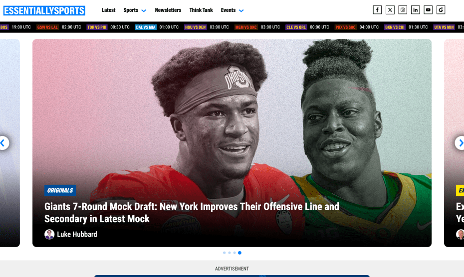
The most radical move is also the most understated: treating the headline as the primary visual identity.
In a media landscape saturated with logos, badges, and visual noise, this decision shifts emphasis back to what made EssentiallySports valuable in the first place — its point of view. The headline becomes the front door, the signal, the brand itself. It’s a return to editorial authority in an era where many outlets have ceded that ground to distribution mechanics.
This is the moment where the redesign reveals its larger thesis: longevity is not the opposite of speed. It’s what makes speed sustainable.
Too often, media brands treat identity as something to refresh every few years, as a cosmetic update to keep pace with changing platforms. But the more channels a brand occupies, the more dangerous that approach becomes. Fragmentation isn’t only a design problem; it’s a trust problem. Audiences don’t experience brands in isolated touchpoints; they experience them as systems. When those systems lack cohesion, the brand dissolves into endless content.
Grasser’s approach resists that dissolution. By building a block-based system that can stretch across homepage, newsletter, social, video, and live environments, the redesign creates a consistent grammar rather than a fixed aesthetic. It’s flexible without being formless, a critical distinction in an industry that often confuses dynamism with inconsistency.
There’s also a quieter tension running through the work: restraint.
Sports media is notoriously loud. It thrives on urgency, spectacle, and visual intensity. The instinct, then, is to design louder so as to match the energy of the content. Instead, this system pulls back. It creates space for hierarchy, for rhythm, for clarity. In doing so, it challenges an assumption that has long defined digital media: that attention must be captured through escalation.
But attention, like speed, is not infinite. And escalation, over time, erodes distinction.
What EssentiallySports is betting on is something more durable: that clarity can cut through noise more effectively than volume. That a cohesive system can build recognition faster than a series of disconnected moments. And that, in a media environment defined by constant acceleration, the brands that last will be the ones that know when not to move.
This is not a nostalgic return to slower media cycles. It’s a recalibration of priorities.
Because the future of media isn’t just about how fast you can publish. It’s about how clearly you can be recognized while doing it.
The post EssentiallySports and the Design Case for Longevity appeared first on PRINT Magazine.