Fabriano has been part of the Fedrigoni Group since 2002 and recently worked with Pentagram to update its visual presence. Without disrupting the brand’s already beloved legacy, Pentagram leaned into the brand’s authenticity by creating a new monogram that could be used across all applications. Furthermore, a monochromatic approach was used to allow space for neutrality and consistency. The result of the new look is high-end and refined yet still showcases the brand’s legacy in a refreshed way.

Fabriano is a name that will be instantly familiar with anyone who has used paper in a creative way—its beautifully crafted papers are described as ‘an ideal, supportive travel companion for the journey of artistic self-expression’.
Named after the town of its manufacture, Fabriano paper has been at the heart of Italy’s papermaking since the 13th century. The town’s location in Italy’s Marche region meant that it was ideally located for the port of Acona, and Fabriano’s skilled artisans led to the town becoming a renowned centre for modern papermaking.
Part of the Fedrigoni Group since 2002, as well as its celebrated art materials and stationery, Fabriano produces high-quality paper for the home and office. Harry Pearce and team carried out a full rebrand of Fedrigoni in early 2021, and following on from this it was asked to look at Fabriano’s brand identity. While already very well known in Italy and throughout Europe, Fabriano was looking to strengthen its presence further afield in both Asia and the US.
It was important for the new identity to be respectful of Fabriano’s amazing legacy whilst expressing its character, and creating a dynamic, modern, flexible, coherent and above all authentic brand.
Several different versions of Fabriano’s much-loved logotype were found to be in use. The design team refined the original to create a robust new marque that still retained all of its distinctive character and is designed to work for both digital and physical applications and across all different platforms and sizes.
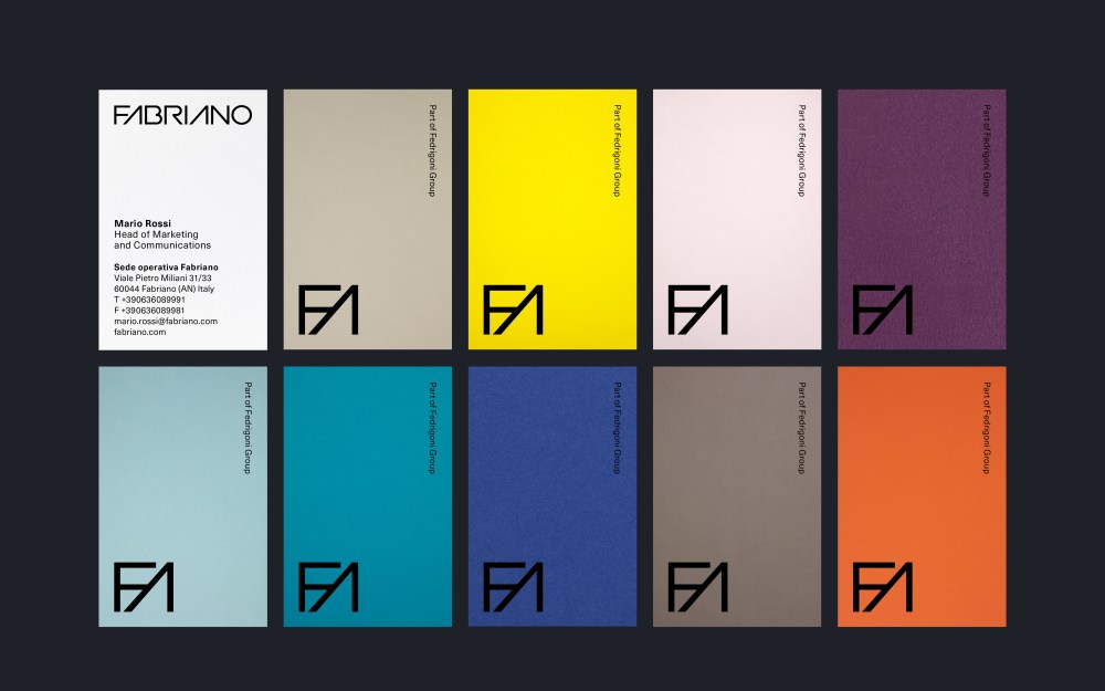
In addition, a geometric monogram was created from the first two letters of the logotype, giving another option when space is limited. The Fabriano monogram works perfectly as a social media icon, but can also be used at scale for use on promotional material. The monogram has also been made into a series of repeat geometric patterns.
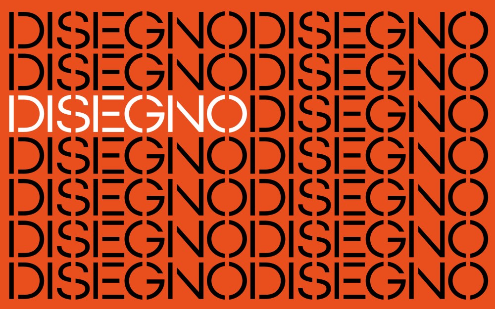
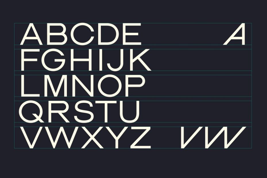
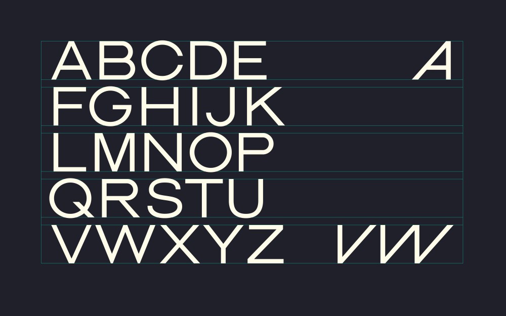
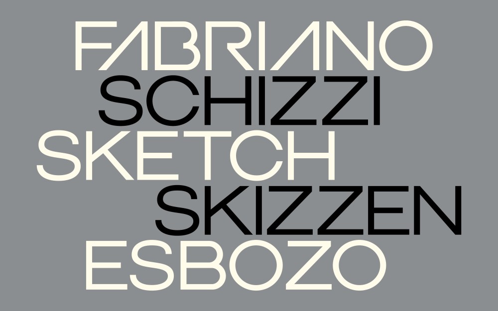
The design team looked to Fabriano’s rich history for inspiration and created a custom typeface based directly on the forms of the new logotype. Mixing craft and heritage with modernity and innovation, the elegant new sans serif typeface allows for a wide range of typographic expression. Adding to the forward-looking feel, the modernist sans serif Swiss Neue Haas Unica is used as a supporting typeface throughout.
A monochrome approach was adopted for the logotype and monogram, to allow both to remain neutral and consistent within the world of colour they occupy. A set of graphic icons was also developed to represent the attributes of each paper (such as chlorine-free, mould resistant and 100% recyclable), as well as for the various artists’ tools (including different brushes and nibs) which best suit each type of paper.
With Fabriano, Pentagram has taken the much-loved brand and modernised it without compromising on its enviable heritage. It has built a robust and contemporary brand, enhancing its reputation and ensuring that Fabriano stays relevant in the worlds of fine art and creative expression.
