Every time we’re making a main title, we’re kind of making poetry for the show.
Rachel Brickel, art director at Digital Kitchen
The highly anticipated new season of the hit TV series Yellowjackets premieres on Showtime today, just in time for your Valentine’s Day pleasure. What’s more romantic than a high school soccer team crash-landing in the Canadian wilderness and then eating each other to stay alive? Love is a battlefield, after all!
The show returning for its third season isn’t the only thing that has fans buzzing with anticipation— the Yellowjackets faithful also eagerly await the next version of the show’s heralded opening title sequence.
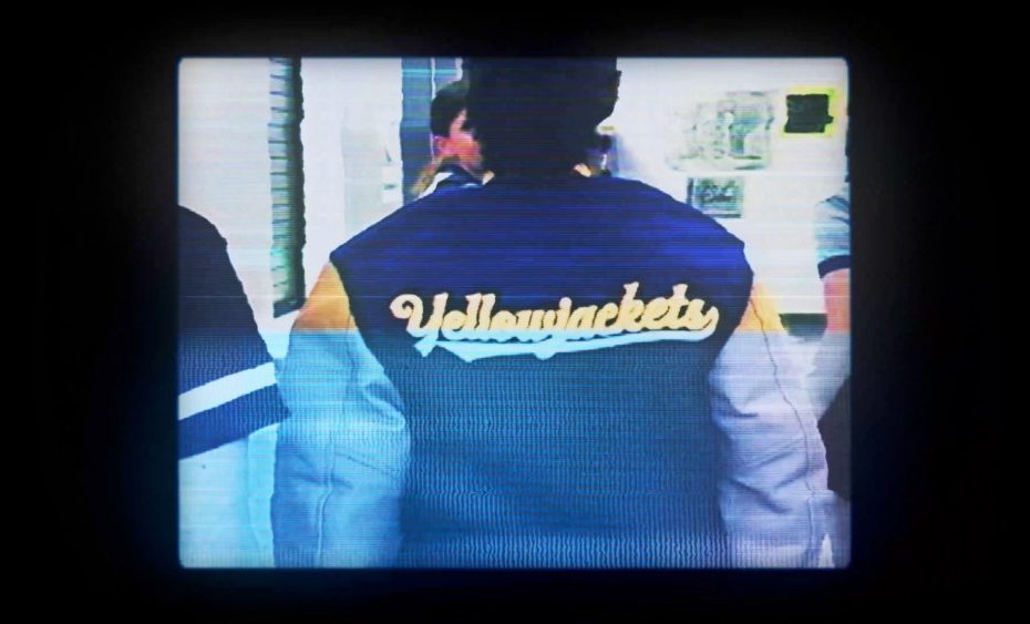
Season one opening titles.
Created by the LA-based title design studio Digital Kitchen with Executive Creative Director Mason Nicoll and Art Director Rachel Brickel at the helm, the Yellowjackets opening titles critically set the tone for the thriller. The titles are composed of home-video style visuals distorted with a 90s grunge aesthetic and set to an original song entitled “No Return” by Craig Werden and Anna Waronker.
Season two opening titles.
I had the pleasure of speaking with Nicoll and Brickel directly about these titles, to learn more about the development of the concept, the technical side of achieving such an authentic 90s look for the footage, and marrying their visuals with the music. Our conversation is transcribed below, edited lightly for clarity and length.
In your expert opinion, what do the best opening titles accomplish?
RB: A good main title is always something that works well with the music, and you really feel an energy with it. The thing that got me into main titles and motion graphics is when you put good music with graphics that really emphasize that push and pull, it creates a very physical force. It creates goosebumps when you watch it, you want to watch it again, it’s something that energizes the viewer and gets them excited every time.
MN: I’m going to echo that and name the music too. Which is funny because a lot of times we don’t have anything to do with that. But if the audio isn’t on, something that is always interesting to me is when opening titles are a perfect setup for the show, but maybe out of left field in terms of what people might expect aesthetically or tonally. Like if a show is set in a certain time period, but the style of the title isn’t necessarily pulling from archival, it’s something totally different, or it’s a specific medium that might fit the time period but it’s not expected. I think that’s really interesting visually.
I’m thinking about what I would skip or not skip if I didn’t have the sound on. If it’s a great song and has a hook, I’m not going to skip it anyway, even if the title is not the most interesting. So, is it something unexpected, but still perfectly fits the show?
RD: I feel like every time we’re making a main title, we’re kind of making poetry for the show; it’s artistic poetry. We really get abstract and we’re trying to pull emotion into these visuals. I like orchestrating together and collaborating with the client to make something like that.
I’m thinking about what I would skip or not skip if I didn’t have the sound on.
What’s your typical process like for ideating, developing, and creating a title sequence? What was that process like for the Yellowjackets titles specifically?
MN: It can be different, but we always want to come in with a certain number of concepts, which are sometimes based on nothing. A showrunner might say, “We don’t have any ideas! Read these scripts and let us know what you think.” Or they might have a cut. Then, sometimes, it’s the other way around, where they already have a specific idea that’s based on one photo or maybe just a description.
Concept art for the original opening sequence idea.
Yellowjackets was more similar to the latter. They came to us with an idea, but they also wanted to hear what we would do. So we came in with four ideas, with one of them being their original idea, but interestingly enough, that original idea wasn’t what ended up on air. It was through that process of playing around and doing animatics with music, that everybody realized that the first idea wasn’t fitting in with the tone of the show. We quickly realized that they were leaning into these great 90s songs to piggyback the two timelines but also give that vibe since there’s so much 90s nostalgia in the show. So we did a quick pivot and leaned into that, and came up with a new idea, which was pretty close to what ended up on air.
Season one opening titles original cut.
What else were you intent on getting across about the show through these titles?
MN: The idea was that these were the Yellowjackets that you don’t see on the show, partly because, scheduling-wise, it was too hard to shoot with the lead actors.
The title kind of took on a life of its own once we started playing with bringing in more easter eggs, more of that haunting nature when the forest, from a vibe standpoint and as well as just imagery-wise, starts to bleed into the video signal.
What did your team do on the technical side to bring the Yellowjackets titles to life, in terms of capturing the footage and then making it look glitchy and corrupted?
RD: When working digitally, you have all these layers, and for this one, you can almost think of it as a ton of analog layers, because we had so many different processes that were layered on top of each other to create these things. Basically, we got a bunch of look-alike actors to be the actors in the show, and we shot with actual 90s camcorder cameras. We ran around town, going to old places where we grew up, or different places that represented high school and the life of a high schooler. We shot that and then we ran it through a CRT, and then that got manipulated by using these panels that would take signals and have them basically bash into each other into the CRT.
The great thing about a CRT is it’ll take a dirty signal and it won’t tell you the signal isn’t readable. So it would take a very messed-up image, and we could actually control and dial in different corrupted footage. From there, we took that into After Effects to cut it up even further, and then sliced it together and added things on top and created an even more glitched-out image.
There came a point where we basically broke the project because we had corrupted the footage so much to create the effects.
For some of those shots, I put glass prisms and things like that in front of the camera. So we distorted it with glass and also had a bunch of color lights flashing. So we used these analog, physical elements to distort, then used a CRT to distort, then used digital to distort. Some shots we even shot after the fact, then we glitched them again with more practical elements. There’s just so much layering that we did to destroy the footage. I think there came a point where we basically broke the project because we had corrupted the footage so much to create the effects. I should also mention all of the show footage was processed through these methods too; it went through the CRT and things like that.
It’s not surprising to hear you were using actual 90s technology by way of the camcorders and the CRT considering how authentic to the time period and aesthetic the titles feel. Viewers are quick to identify what’s an imitation versus the real deal; that authenticity is so critical in gaining viewers’ trust and sucking them into the world of the show right off the bat.
RD: With Mason’s direction, he told me to pretend I was one of the high schoolers when I was shooting it. I wasn’t actually trying to keep the camera still; the idea was that I was actually with them, and partying with them. I think that really helped add to the authenticity of it.
The opening titles and the show itself tap into the wider trend toward more tactile and raw retro aesthetics, seemingly as a direct reaction to (and rejection of) our hi-res, AI-centric modern age. It’s not just those who grew up in the 90s who are thirsting for the grounded look and feel of that era either; Gen Z seems to be gravitating toward the warmth and humanity behind that style as well.
MN: It was 2021 when season one came out so that aesthetic was definitely out there, but I guess much more on the fringes. It was something that we saw out there when we pitched the idea, so we knew between the 90s timeline of the show and this idea, it would be perfect.
By the time we got to season two, there were things like Adidas campaigns and Nike campaigns where they were actually going out and shooting on the same camcorders, so it’s definitely a thing that’s become much more well-known, as you said. Gen Z is really into things like analog cassette tapes and old videos. I actually ran into some Gen Z kids at a car show recently, and they were filming the cars on an old mini DV from the 90s. They’re like, No, I’m not taking out my iPhone. I’m going to do it this way.
As both of you have mentioned, the music is such a critical aspect of any opening title sequence, and that’s no exception for Yellowjackets. Can you shed some light on the process behind incorporating your visuals with the original song created for these titles? I know that Craig Werden and Anna Waronker wrote and recorded “No Return” for the show– how did you collaborate to marry your work with theirs?
MN: The showrunners, Ashley, Bart, and Jonathan, had a clear idea of the music for season one, and Portishead was thrown out there. We did some edits, and everyone realized it was too slow and was leaning into the dark, foreboding nature of the show but not the fun, hectic teenage antics that helped lead into season one.
We knew that the show’s composers, Craig and Anna, were going to do a song— Craig is a member of the band Shudder to Think, which is kind of perfect because he’s from that same time period. So we were editing in the meantime to a different 90s track that was a lot faster and in your face, so we knew, kinetically, we wanted something that was almost too fast for the audience, that you’d have to watch again and again to pick up on stuff.
That’s when we got the first version of the song from Craig and Anna, and it was pretty close. It was a little slower than the final one, but it had all the stuff that’s in the final. Then they came back with a version that was a little faster, and it ended up syncing up pretty well.
How has the reception of the opening titles from the Yellowjackets faithful felt? It must be incredibly rewarding to get such positive feedback from viewers.
MN: With any of these titles, you don’t really know how it’s going to play to the audience. Being so close to it, it was exciting after the first couple episodes to see that people were really into the song. It’s always great if you can have a song that people don’t get tired of. It’s also a testament when someone like Alannis Morissette does a version of it and they drop that on one of the episodes.
Do you each have a favorite moment, detail, or easter egg in the titles?
MN: One that comes to mind for me is the shot of Jackie. For part of the sequence, we went through B-roll footage that didn’t end up in the show, and that was just a great shot where she breaks character and looks at the camera. So we were playing with that, and it was in there early enough, and then it was still in there for season two which brought up a lot of great fan theories. Those didn’t pan out for season two, but we’ll see for season three. I think that’s one of my favorites because, at least for the onset, it’s not going to leave. And it’s always fun when something like that pulls out the craziest theories. Like maybe adult Misty is actually Jackie, that was a big one. Viewers were like, Well, why is that still in there? But sometimes it’s in there just because it’s a great shot.
RB: I was always really into the guy with the mask and the iconic symbols that kept being worked in there and these flash frames. It’s like, is there something more going on here? It’s creating a big mystery within the title.
I also really like showing the characters losing their sanity throughout. Every season we’re pulling them apart even further as we start to reveal the layers of what’s going on and what they had to do to survive. It’s fun to see as you get to know the characters more in the show how that relates to the titles.
It speaks to the quality of what you have created with the title sequence that fans are viewing it as such a critical part of the show—they’re devising theories about the plot and characters based on moments in the title sequence.
RB: We definitely didn’t expect a response like that, but we were all really excited by it. It was like, oh, my God, there are all of these breakdowns on YouTube with people really getting into it to try and figure out everything. It was really humbling to see that.
MN: We don’t ever really know what’s going to happen in the newest season. We had the most clarity on season one, but for each new season, we kind of look at it as a fan would. We get these random clips, and then we have to figure out if it’s best to disguise this specific clip versus this one. It’s this ongoing relationship with the showrunners with them telling us, Yeah, that works, No, that one should be more hidden, or Can you make that one into two frames? That way it becomes one of those things that someone needs to go frame by frame to potentially pull out a clue. They have a good gauge on what the audience is going to respond to in a sequence or something that’s going to be too much of a red herring.
The post Going BTS With Digital Kitchen on the ‘Yellowjackets’ Opening Titles appeared first on PRINT Magazine.