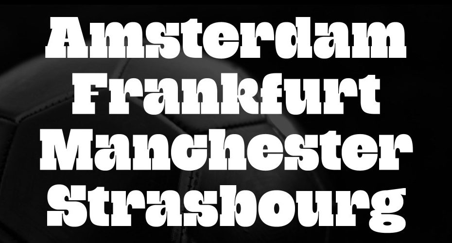
Grantig gets its inspiration from cantankerous cowboys and confident slab letters.
Stuttgart-based designer Julien Fincker spent many hours watching and admiring classic Westerns as a child. He loved the slow camera pans over the desert landscapes, and the characters’ names splayed across the screen in bold slab-serif. One stands out in his memory: Sergio Leone’s Once Upon a Time in the West, with Henry Fonda, Charles Bronson, and Jason Robards. Fincker fondly remembers close-up shots of the scowling actors with Ennio Morricone’s atmospheric music swirling in the background.
In case you’re wondering, Grantig is German for grumpy.
Even if his inspiration came from the classics, Fincker didn’t want to draw an “old” typeface. From the beginning, he kept today’s aesthetics and flexibility needs at the forefront of his process. He added deep ink traps, fine details, and modern rounded curves to escape its “old Western mustiness,” as Fincker calls it.
Grantig is a small family of three styles; its expressive nature makes it particularly suitable for font-emphasized headlines, packaging, logos, and advertising.
Why just one style? He thought about drawing a more extensive family. However, he disliked the compromises for the thin and bold variations. Instead, he created an italic styleset for both directions for more variance.
Julien Fincker is a multidisciplinary creative, focusing on type in all dimensions, from designing fonts to woodcutting and printing in his workshop.
Learn more and give Grantig a test drive at julienfincker.com.
Between now and December 11th, you can get Grantig for 60% off at Myfonts.