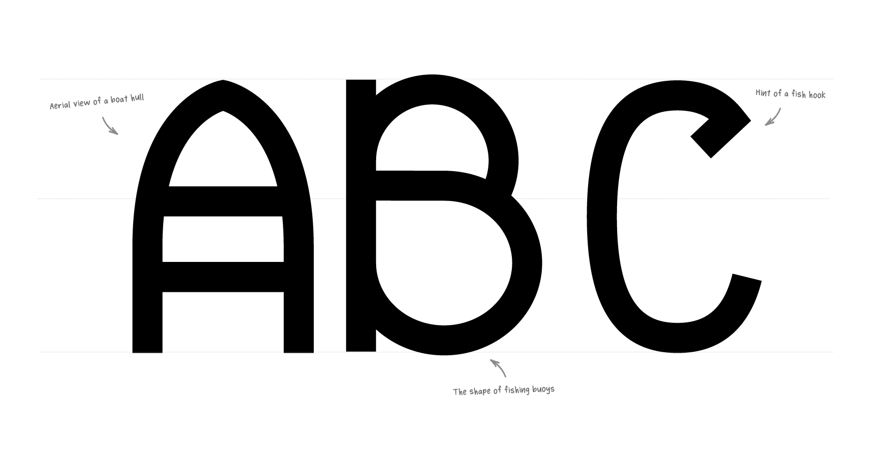
Located on the harbour-front in Stornoway, Scotland, Harbour Kitchen prides itself in its fresh selection of seafood. Designer Pearse O’Halloran was tasked with creating an identity that told the story of their culinary pride in a contemporary context.
“We created a suite of brand assets and we were delighted to work with local printmaker Alice Macmillan on the main visual elements. The project includes a custom display typeface based on Hebridean culture.”


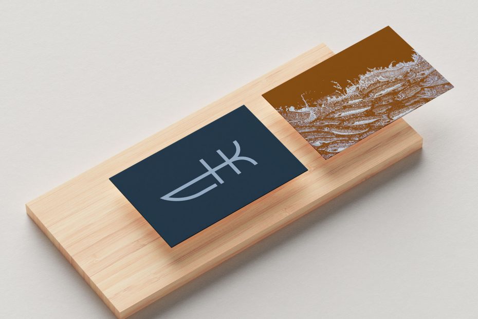
You’ll undoubtedly be surprised to note that the HK monogram is the star of the project for me.
The intricate linocut work in Alice’s portfolio is lovely, too. And, a bit off-topic, I enjoyed reading a 2019 blog post of hers about moving back to the Hebrides after a decade in South England. “…I’d come home and slump on the sofa like an irritable cabbage…”
The level of detail in Alice’s linocut (below). Splendid.


Reminded me of another fish kitchen logo I enjoyed.
More from Pearse and Alice:
www.loomgraphics.work
www.alicemacprints.co.uk
