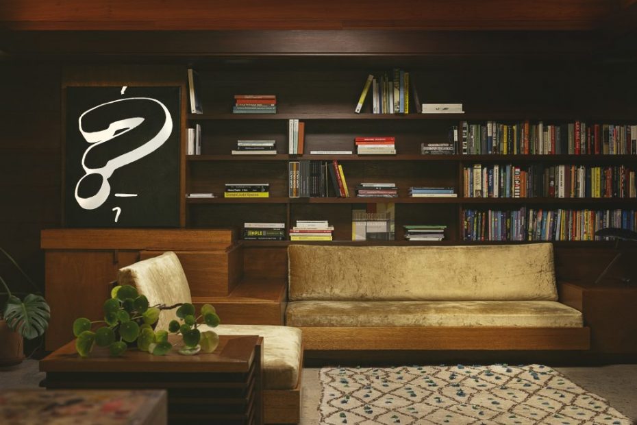
New routines don’t come easy to working designers. Yet, House Industries and Autotype have carved one out, dropping a new collection of limited edition fine art canvases, serigraphs, housewares, and apparel spotlighting the art of the letterform and paying tribute to a rich archive of typography. Their collaboration brings type enthusiasts refined materialism without compromise.
House Industries, founded by Andy Cruz, has a rich 30-year hand lettering practice that has visualized legendary brands like Hermès, Porsche, Lego, The Eames Office, Heath Ceramics, The New Yorker, and Jimmy Kimmel. Derek Galkin founded Autotype to celebrate designers and give them the freedom to operate outside of their daily craft; past collaborations include designers Pam Shamshiri and Jonathan Ward of Icon. Galkin notes, “It’s our way to express our love of design. Often, creatives get stuck in their means of what their expertise is.”
Andy and I grew up in the world of skateboarding. Our identity as youths in youth culture was defined by what posters we hung on the wall or the t-shirt we wore. Now that we are grown up and immersed in the world of graphic design, how does that evolve and how do we celebrate that today?
Derek Galkin, founder of Autotype
Working as friends for over 20 years, Galkin calls their partnership an “inspiration injection.” The two met pre-social media in the early 2000s, during the House 33 project in London. “Andy and I grew up in the world of skateboarding,” says Galkin, continuing, “Our identity as youths in youth culture was defined by what posters we hung on the wall or the t-shirt we wore. Now that we are grown up and immersed in the world of graphic design, how does that evolve and how do we celebrate that today?”
With a shared love for Los Angeles architecture, Neutra type, and the expansive Photo-Lettering, Inc. archive purchased by House Industries in 2003, the collection features a selection of House’s favorite typographic specimens and graphic inspirations translated into everyday objects, remixing inspiration into new hits.
“We’re fans first,” says Cruz, adding, “If you’re a fan, you don’t want to bum anyone out.”
More than a cool project inspired by cool letterforms, the collaboration comes from the heart and honors a typography archive that is often overlooked in the syllabus of design history. Founded in 1936 by Edward Ronthaler and Harold Horman, Photo-Lettering, Inc. (known as PLINC) was a prolific type foundry once housed at 216 East 45th Street, within what was then New York City’s typesetting district. Today, all 1,500 cubic feet of graphic film reside at House Industries’ Baltimore studio. As Cruz put it, the library charts “The golden era of type as it moved from metal to the film reproduction process.”
Left: Rondthaler, Edward, Life With Letters…as they turned photogenic, Hastings House, 1981. | Right: One Line Manual of Styles visual index, Photo-Lettering, Inc, 1971.
As a major collection of mid-twentieth-century type design, the archive contains film negatives and positives of most of the 10,000 alphabets, decorative motifs, and logos produced in the company’s 55 years by the foremost gifted type designers and lettering artists of the time, including Peter Max, Bob Alonso, Vincent Pacella, Vic Carus and ringleader Ed Benguiat.
Cruz explains, “From WWII up until the Mac, they were the spot to get type from. Once you had your font drawn, they perfected the high-speed turnaround of stepping and repeating these films to set type for designers and creative directors.”
The scrappy process and quick hustle of Photo-Lettering, Inc. embraced commercial lettering artists working in and around Manhattan, including women type designers. The archive continues in this spirit of accessibility as a personal reference for House Industries which has slowly digitized the archive since acquiring it, and also as a source for other type designers and creative directors. Kate Moss tapped the archive for her work with TopShop, sourcing and re-engineering an old Harper’s Bazaar font, as one example.
Making type accessible is one part of the equation for Autotype and House. The other part is enthusiastically telling untold stories of typography’s history, through a lens of personal significance. The Neutraface A to Z eye chart, for instance, showcases the geometric sans serif font collection designed by House, inspired by the work of mid-century master architect, Richard Neutra. The collection of items and objects offers entry to a world of type, hopefully generating more fans. Stirred by a shared love for visual design that began with unvarnished influences in skateboarding culture, the pair have produced a product experience that is a genuine, not-so-scrappy tribute to the art of type.
Autotype and House Industries invite individuals to embrace the art of typography through their collection, available exclusively on Autotype and the Los Angeles location of Heath Ceramics beginning April 11th for one month. Notably, 5% percent of sales will be dedicated to supporting the Letterform Archive, a nonprofit design institution.
