User experience (UX) plays a pivotal role in shaping the success of businesses in this digital landscape. According to a study by Forrester Research, 80% of consumers switch to a competitor if they have a poor user experience.
With online shopping becoming the norm for consumers worldwide, optimizing the user experience on e-commerce platforms can lead to substantial gains in sales and revenue. When creating a website for e-commerce, you need to keep user experience in mind before anything else.
This article explains the significance and some elements of UX design to incorporate into your website for boosting e-commerce conversions.
What is UX Design?
UX Design is a multidisciplinary approach that focuses on creating meaningful and enjoyable interactions between users and products or services.
It encompasses the process of understanding users’ needs, desires, and behaviors to design intuitive and user-friendly experiences. For businesses, the role of UX in e-commerce conversions is integral. The design elements are important for the following reasons:
- User-centered approach.
- Easy and intuitive interactions.
- Improves product usability and efficiency.
- Reduces user frustration and errors.
- Boosts customer retention and loyalty.
- Drives business growth and competitiveness.
UX designers utilize various methodologies, including research, prototyping, and testing, to optimize the usability, accessibility, and satisfaction of a digital or physical product.

Image Source: dribbble.com
The Importance of UX Design for E-Commerce Businesses
User Experience (UX) design is a critical aspect of creating digital products and services that cater to the needs, expectations, and preferences of users.
It involves designing interfaces and interactions that are intuitive, seamless, and enjoyable, thereby enhancing user satisfaction and engagement. The importance of UX design can be better understood through various factors:
• Customer Satisfaction
UX design ensures that users can easily accomplish their goals on a website or app without frustration.
According to WebEx, having a good mobile UX increases the likelihood of 74% of visitors returning to your site. A positive user experience fosters customer satisfaction, leading to higher loyalty and an increased likelihood of repeat business.
• Brand Loyalty
A well-crafted UX instills confidence in users, making them more likely to trust the brand. A study by NNGroup revealed that 94% of negative website feedback is related to design issues, emphasizing how poor UX can erode trust and damage a brand’s reputation. When it comes to branding, UX elements also help build loyalty among the audience.
You can create a visual hierarchy and start with the placement of a professional logo design that catches the eye of the visitor immediately.
• Conversion Rate
UX design elements, such as clear call-to-action buttons, easy navigation, and intuitive layouts, can significantly boost conversion rates.
According to Forrester, a well-executed design can boost the conversion rate from 200% to 400% of a website.
08 Important UX Elements to Incorporate into Your Design
Incorporating user experience (UX) elements into your website can significantly boost conversion rates by providing visitors with a seamless and enjoyable browsing experience. Here are 8 essential UX elements to consider:
1. Intuitive Navigation
Navigating through your online store should be a breeze for visitors. 60% of users abandon a website due to poor navigation.
Clear and intuitive navigation is a crucial UX element that ensures users can easily find their way around your design or website. Implementing such navigation requires thoughtful planning and attention to user needs. Emotional design in UX also works well as it helps users make decisions quickly. Make sure to add the following key features in your UX design for clear and intuitive navigation:
- Navigation Bar — A prominent horizontal or vertical bar at the top or side of the page that contains links to key sections or pages on the website.
- Menu Items — The individual links or buttons within the navigation bar that direct users to different sections or pages of the website.
- Drop-down Menus — Sub-menus that appear when users hover or click on a main menu item, providing access to additional content or options.
- Breadcrumbs — A hierarchical trail of links that shows users their current location within the website’s structure, helping them easily navigate back to previous levels.
- Hamburger Menu — An icon consisting of three horizontal lines that, when clicked, reveal a hidden menu containing navigation options. Often used in mobile or responsive designs to save space.
- Search Bar — A field where users can input keywords or phrases to search for specific content or products.
- Call-to-Action (CTA) Buttons — Buttons with clear and actionable labels that prompt users to take a specific action, such as “Sign Up,” “Buy Now,” or “Learn More.”
- Icons — Visual representations of actions or content that assist in quickly recognizing navigation options, especially when used in conjunction with text labels.
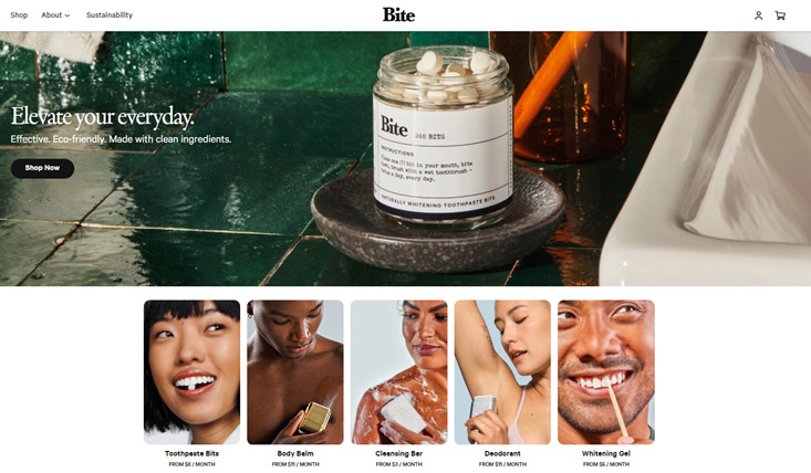
Image Source: bitetoothpastebits.com
By cohesively combining these elements, you can create a clear and user-friendly navigation system that enhances the overall user experience and enables seamless content discovery.
2. Responsive Design
With the proliferation of mobile devices, responsive design is essential. A Statista report states that over 60 percent of the global internet population uses a mobile device mobile, accounting for 54.8% of website traffic globally. So, incorporating responsive design can not be compromised.
A responsive design ensures that the user experience remains consistent across different devices and screen sizes. Responsive Design ensures that your design adapts and provides a seamless user experience across desktops, laptops, tablets, and smartphones.
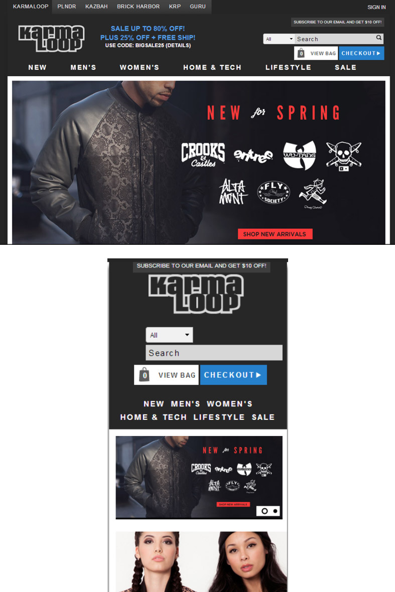
Image Source: karmaloop.com
3. Fast Loading Speed
Fast loading speed is a crucial UX element that significantly impacts user satisfaction and overall website performance. As internet users have become more accustomed to quick and seamless experiences, a slow-loading website can lead to frustration, increased bounce rates, and a negative perception of the brand or service.
As concluded by Kissmetrics, a user is most likely to bounce back from a site if it takes more than three seconds to load. So, when a user visits a website, they expect it to load quickly (within 5 seconds). Speedy loading keeps users interested and encourages them to return to the website in the future. Repeat visits are crucial for businesses seeking to build a loyal customer base. To attract higher traffic and conversions, you can consider usingUI and UX tools to revive your e-commerce business.
Here are some tips to improve the speed of your web or app design:
- Large images can significantly slow down a website. Use compressed and appropriately sized images without compromising quality.
- Leverage browser caching to store static resources on the user’s device, reducing the need to download them repeatedly.
- Reduce the number of elements on each page, including scripts, stylesheets, and external resources.
- Minify and compress CSS, HTML, and JavaScript files to reduce their size and load faster.
- Regularly test website performance using tools like PageSpeed Insights or Lighthouse to identify areas for improvement.
- Choose a reliable and fast hosting provider to ensure your website’s server response times are optimal.

Image Source: zulu.longines.com
By considering fast loading speed as a critical UX element in your design, you can create a positive user experience that fosters engagement, improves retention, and ultimately drives better business outcomes.
4. Product Description
The primary purpose of a product description is to inform users about the features, benefits, and characteristics of the product. This information helps users understand what the product does, how it can solve their problems, and whether it aligns with their needs and expectations.
Clear and concise product descriptions can prevent confusion and reduce the likelihood of users making incorrect assumptions about the product.
When users have a clear understanding of what a product offers, they can set realistic expectations. This leads to higher user satisfaction as they are less likely to be disappointed or feel misled after making a purchase.
Optimizing product descriptions with relevant keywords can improve search engine rankings, making it easier for potential customers to find your products. An increased online presence will attract more users to your site, contributing to a better user experience.
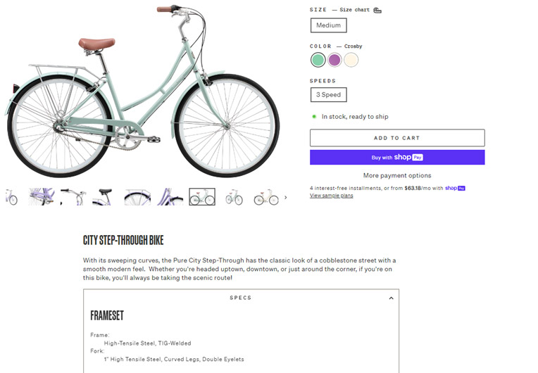
Image Source: purecycles.com
5. Simple Checkout Process
A simple checkout process is crucial in UX design because it directly impacts the user’s overall experience and significantly influences their decision to complete a purchase on an e-commerce website or any other platform involving transactions. It also helps with search engine optimization and improves the ranking of the website.
A streamlined checkout process minimizes the number of steps and interactions required to complete a purchase. When there are fewer obstacles and distractions, users are more likely to stay engaged and complete the transaction.
- Minimize the Steps: Keep the number of steps in the checkout process to a minimum. Ideally, aim for a single-page checkout if possible.
- Clear CTAs: Use contrasting colors and large font sizes to attract attention to the CTA.
- Progress Indicators: If you have multiple steps in the checkout process, provide clear progress indicators to show users where they are in the process.
- Guest Checkout Option: Allow users to check out as guests without requiring them to create an account.
- Autocomplete and Autofill: Use browser autofill capabilities to prepopulate fields like shipping and billing addresses, making the checkout process even faster for users.
A simple checkout process is crucial for UX design because it reduces friction, increases conversions, and saves time.
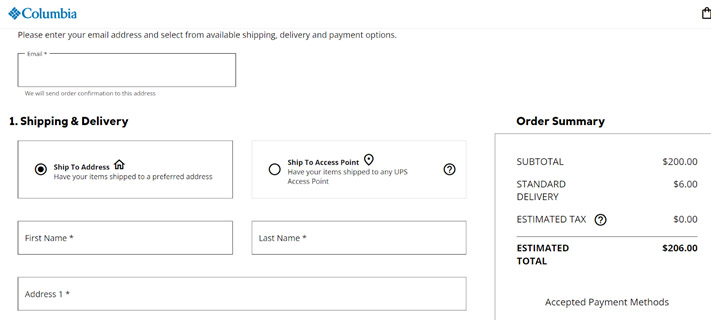
Image Source: columbia.com
6. Social Proofs and Testimonials
Human beings are social creatures and are often influenced by the actions and opinions of others. When users see that others have had a positive experience with a product or service, they are more likely to feel confident in making a similar choice.
Social proof, such as reviews, ratings, and testimonials, helps establish trust and credibility for a product, service, or website.
Testimonials can evoke an emotional response from users. When they read about someone else’s positive experience, they might identify with the emotions expressed, which can lead to a stronger emotional connection with the brand or product. Here are some ways you can showcase social proofs and testimonials as UX design:
- Reach out to your satisfied customers or users and request their feedback and testimonials.
- Use real names, photos, or social media handles to add authenticity.
- If possible, focus on testimonials that demonstrate quantifiable results or improvements achieved by users. For example, you can add “Lost 10 pounds in 2 months” for a fitness product website. Specific numbers make the testimonials more compelling.
- Strategically place testimonials on relevant pages, particularly near call-to-action buttons, checkout pages, or subscription forms.
- In addition to simple testimonials, consider creating more detailed case studies that delve deeper into how your product or service positively impacted a user’s life or business.
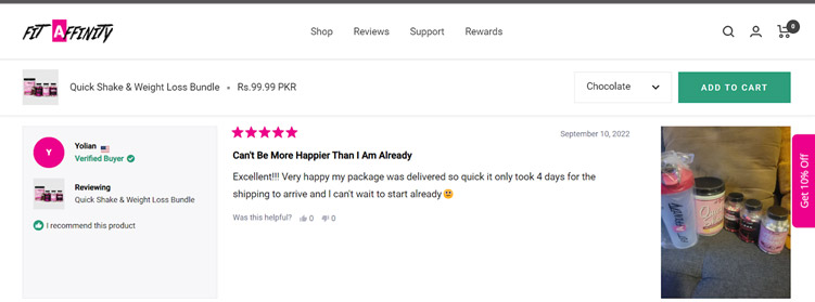
Image Source: fitaffinity.com
Don’t forget to constantly test the placement, format, and content of testimonials to assess their effectiveness. Use analytics to measure the impact of social proof on conversion rates and make data-driven improvements.
7. Add Personalization
Personalized experiences make users feel more connected and engaged with the product or service. When users encounter content that aligns with their interests and preferences, they are more likely to stay longer, interact more, and return for future visits.
Personalization enables designers to deliver content, recommendations, and features that are relevant to each user’s context and situation. This relevance reduces information overload and allows users to find what they are looking for more quickly and easily. In the long run, this could also be a crucial factor in your e-commerce branding strategy.
Here are some key steps to achieve effective personalization in UX design:
• Step # 01 — User Research and Profiling
Understand your target audience by conducting thorough user research. Gather data on user demographics, behavior patterns, preferences, and pain points.
• Step # 02 — Collect Behavioral Data
Integrate data collection mechanisms into your platform to track user interactions, behavior, and preferences. Use various tools such as cookies, user accounts, surveys, or analytics to gather relevant information.
• Step # 03 — Customize Content and Recommendation
Based on the user data collected, personalize the content and recommendations presented to each user. For example, you can offer product recommendations, articles, or relevant services based on their past behavior, purchase history, or location.
• Step # 04 — Personalized User Journey
Adapt the user journey to cater to individual preferences and goals. Customized onboarding experiences for new users or offer shortcuts for returning users who frequently perform specific actions.
• Step # 05 — Personalized Alerts
Implement personalized notifications and alerts to keep users informed about updates, new features, or relevant content.
• Step # 06 — A/B Testing
Continuously test different personalized elements to evaluate their effectiveness. A/B testing allows you to compare variations and refine the personalization strategy based on user feedback and performance metrics.
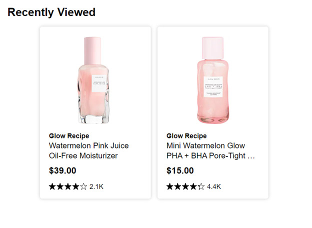
Image Source: sephora.com
8. Error Handling
Error handling in UX design refers to the process of anticipating, identifying, and providing appropriate solutions for user errors and mistakes within a digital product or service.
It is an important element in UX design because it directly impacts the user’s overall experience and can significantly influence their satisfaction, trust, and perception of the product or service.
Conduct usability testing to observe how users interact with the system and encounter errors. Use the insights gained from testing to iteratively improve error handling and enhance the overall user experience.
Final Words
Incorporating these UX elements is a strategic move for businesses seeking to succeed in the digital world.
Prioritizing user needs, expectations, and preferences can help companies create delightful experiences that drive customer satisfaction, foster loyalty, increase conversions, and gain a competitive advantage in the highly competitive digital landscape.
