What kind of typeface are you?
This is the pressing question begged by comic Elle Cordova’s hysterically perceptive font impression videos, which took Design Internet by storm at the beginning of the year. Cordova released a series of videos on her Instagram in which she put on the personas of some of our industry’s most well-known and frequently used typefaces as they hang out with each other, from Times New Roman to Courier to Impact. In her first skit, she cleverly implies a flirtation between the noted sans serifs Arial and Helvetica, and even drops a “Grotesk” knee-slapper. Papyrus makes a goofy cameo in each, along with Dingbats, Calibri, and others.
The PRINT team couldn’t get enough of these videos, and we wanted to get in on the fun! We decided to reflect on the typefaces we most identify with in terms of personality and aura, and each chose one we thought captured our essence the best. Our selections are below!
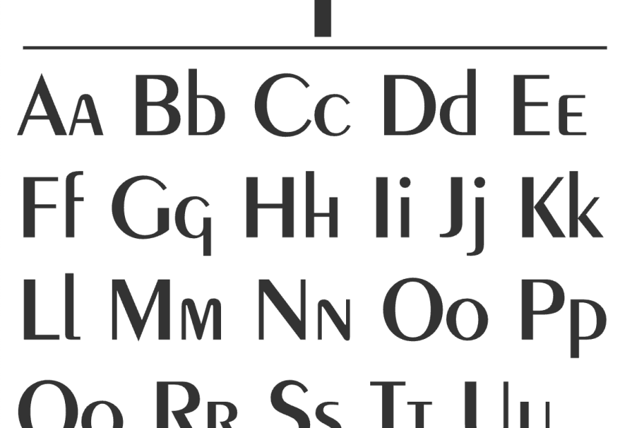
Debbie Millman is Peignot.
I have a silly favorite typeface; it is Peignot. It was the headline font I used in college at the student newspaper, which is where I first learned about design. AND (as importantly) it was the centerpiece of the opening of one of the greatest sitcoms of all time, The Mary Tyler Moore Show. According to the Museum of Broadcasting, the show was a revolutionary breakthrough, and featured Mary Richards as the first never-married, independent career woman as the central character. As Mary Richards, a single woman in her thirties, Moore presented a character different from other single TV women of the time. She was not widowed or divorced or seeking a man to support her.
Steven Heller is Bestial Bold.
Bestial Bold designed by Seymour Chwast fits me to a cap T. In fact, to a S-T-E-V-E-N. The A represents the young bold, swaggering hippie. The B suggests a post-hippie maturity (and weight gain); the C is the self-doubting introverted beast in me.
Kim Tidwell is Carose.
I’m a sucker for clear, open typefaces with a little something left of center (like me). And ampersands. Carose has a lovely one that propels forward. As of late, I find myself growing out of my long-term relationship with Futura and seeking a little movement. Carose’s friendly, flowy horizontals and descenders make me feel like rolling the top down, throwing out the map, and setting off to some unknown destination.
Laura Des Enfants is Garamond +Times New Roman.
I’m so disappointed that I cannot be Helvetica, but I‘m just not that classically cool. I fall between Times New Roman and Garamond. I want to be completely Garamond (or Bodoni) who seems like someone who’s “been there, done that,” but is not completely jaded. Plus, it’s Garamond! I like anyone who can say “darling” and doesn’t sound completely ridiculous.
Deb Aldrich is Comic Sans.
Do you remember the game app, “Type: Rider”? It came out in 2013, and I used to play it at the start of every plane ride I was on. You had to move a colon punctuation mark through typeface chapters. The last chapter was Comic Sans— it was goofy, it was hard, it had a kitten in it. Need I say more?
I know it’s not appropriate in every occasion (sound familiar)? But, Comic Sans usually means well.
Amelia Nash is Black Mango.
Trying to find a font I most identify with turned out to be a bigger challenge than I anticipated. How do you pick ONE font from the oodles that exist? So like any other self-respecting Millennial, I turned to a Buzzfeed quiz to find out “Which Font Matches [My] Personality Perfectly”. After overthinking the questions and sweating over the best responses for me, Buzzfeed churned out Black Mango by Creative Media Lab. Mangoes happen to be my favorite fruit, so I took it as a sign. “Just like this font, you are a unique twist on a classic. You say just enough without saying too much. Just beautiful.”
I’ll take it. And as it turns out, I really do love this font.
Charlotte Beach is Motter Ombra.
I consider myself bubbly and spunky with a retro flair, just like the wonderful Motter Ombra (Othmar Motter, 1972). There are traces of class expressed through the letters’ over-sized and bulbous serifs, but quirkiness and fun ultimately win the day, which is a ratio I deeply identify with.
