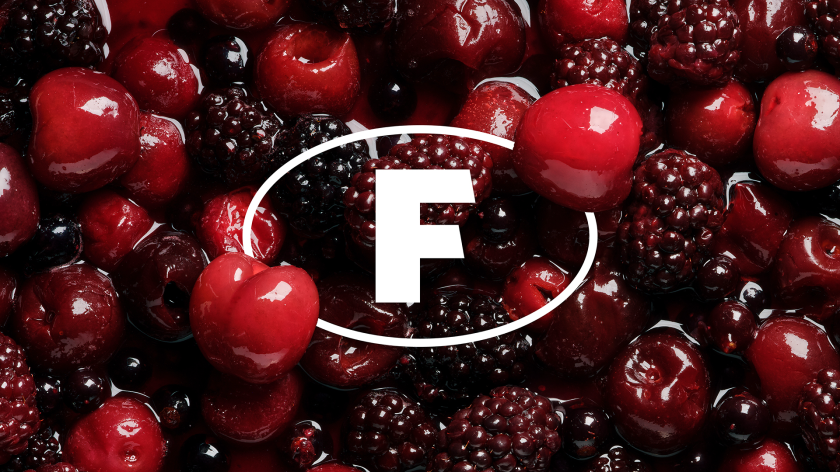
Featuring a transparent ‘F’ roundel integrated into macro food photography and typography inspired by Leeds’ historic market signage, the redesign strengthens Fullers Foods” market presence and future growth.
For over 150 years, Fullers Foods has been a cornerstone of the UK’s food supply chain, yet its brand identity no longer reflects its modern ambitions. Now, thanks to a rebrand by Leeds-based KISS Branding, the company has a confident new identity designed to balance heritage with innovation.
The project’s most notable aspect is that KISS took an unconventional approach to evolving the B2B brand. Unlike traditional corporate branding, which often emphasises functionality and restraint, the studio approached the project with a B2C mindset, infusing personality, emotion, and clarity into the Fullers’ identity.
The result is a brand transformation that is visually striking and highly strategic, supporting Fullers’ next phase of growth.
Designing a B2B brand with a consumer-led mindset
The project comes at a pivotal moment for Fullers, following a major merger and the company’s relocation to state-of-the-art facilities along the River Aire in Leeds. This shift presented the perfect opportunity to realign its identity with its future ambitions.
“Fullers had an identity that no longer reflected who they are today,” explains KISS co-founders Poonam Saini and Matt Kilb. “They’re an industry leader, yet their brand felt outdated.
“Our goal was to create an identity that truly represents their expertise, relationships, and integral role in the food supply chain.”
At the heart of the rebrand is the tagline “Full on Food. Full on Life.” – this positioning statement aims to capture Fullers’ relentless energy and passion for food. Developed through workshops with Fullers’ senior leadership team, the phrase emphasises the company’s role in both the industry and the broader lives of those it serves.
“We saw an opportunity to break away from the typical, corporate B2B branding approach – detached, functional, and often forgettable,” says Kilb. “Instead, we took a more emotive, consumer-led approach to create a stronger connection with Fullers’ customers.”
Fullers Foods’ old logo
Rooted in storytelling
The rebrand carefully balances legacy with a fresh, modern aesthetic, and KISS had a big decision to make regarding Fullers’ original ‘F’ roundel. While it was once considered for removal, the asset has been reimagined as a transparent, integrated symbol that seamlessly interacts with food photography, reinforcing the company’s deep connection to the food industry and its products.
“We brought food back to the heart of the brand—literally integrating it into the visuals,” says Saini. “The ‘F’ acts as both a badge of identity and a storytelling device. It represents Fullers, of course, but also reinforces the ‘Full on Food. Full on Life.’ ethos and, by entwining it with macro food imagery, we show how deeply embedded Fullers is in the industry.”
Its long legacy is also evident through the typography that draws inspiration from Fullers’ roots in Leeds’ historic markets. Subtle nods to handwritten signage and blackboard textures create a connection to the company’s origins as a fruit and vegetable market stall next to Marks’ Penny Bazaar.
“The heritage of the brand didn’t really come through in the previous identity unless it was explicitly mentioned,” notes Kilb. “Kevin Smith, Fullers’ CEO, loved the brand’s origin story, and we wanted to weave elements of that into the new design without making it feel nostalgic or dated.”
Colour, photography, and voice
A new colour palette moves away from the previous red and blue scheme, opting for deeper greens and warm neutrals, chosen to evoke freshness, quality, and authenticity. Meanwhile, photography plays a crucial role in the rebrand, with macro food imagery shot by Heidi Coppock-Beard and editorial-style team portraits by Will Stanley.
Saini says: “Food and people are inseparable in this industry; food enables people, and people enable food.
“Relationships are at the heart of food supply, making them just as important as the product itself.”
Beyond aesthetics, the rebrand brings practical benefits. A clearer brand narrative ensures Fullers can communicate its expertise more effectively, while a cohesive identity system streamlines implementation across digital, print, signage, and corporate communications.
“We rigorously stress-tested the identity across every touchpoint—screens, web, motion, print—to make sure it holds up in all formats,” explains Kilb. “We also advocated for an online brand portal so staff can easily access tools, guides, and templates, ensuring long-term consistency.”
“More Leeds. More Yorkshire”
The transformation has already garnered strong praise, with Fullers’ leadership calling it “a brand that finally feels like us.” CEO Kevin Smith notes the shift from generic corporate values to a brand identity deeply rooted in its Yorkshire origins.
“You could have googled our values and found the same as any food company in the country,” says Smith. “We wanted something real—rooted in where we’re from. More Leeds. More Yorkshire. We’ve landed on that now.”
He continues:,”It’s not just a new logo. It’s how we introduce ourselves to new manufacturing sites, andhow we talk to customers. With life and food side by side in our brand, we’ll always be able to tell our story—our passion for food, our people, and what we deliver every day.”
Through this project, KISS has proved that even legacy businesses can embrace change while staying true to their roots, and the B2B brands don’t have to stick to the corporate queues of old.