Seoul is a city of contrasts. Modern—even futuristic—architecture rubs shoulders with ancient Buddhist temples and royal palaces. Seoulites’ love of pop culture is visible everywhere, as is their reverence for the city’s history and heritage. Seoul’s high-tech subway system connects it all.
Seoul’s extensive transportation system is a key amenity for both residents and visitors, as the city welcomes over 12 million tourists every year. Seoul Metro’s public-facing information and wayfinding systems are currently undergoing their first full design update in 40 years.
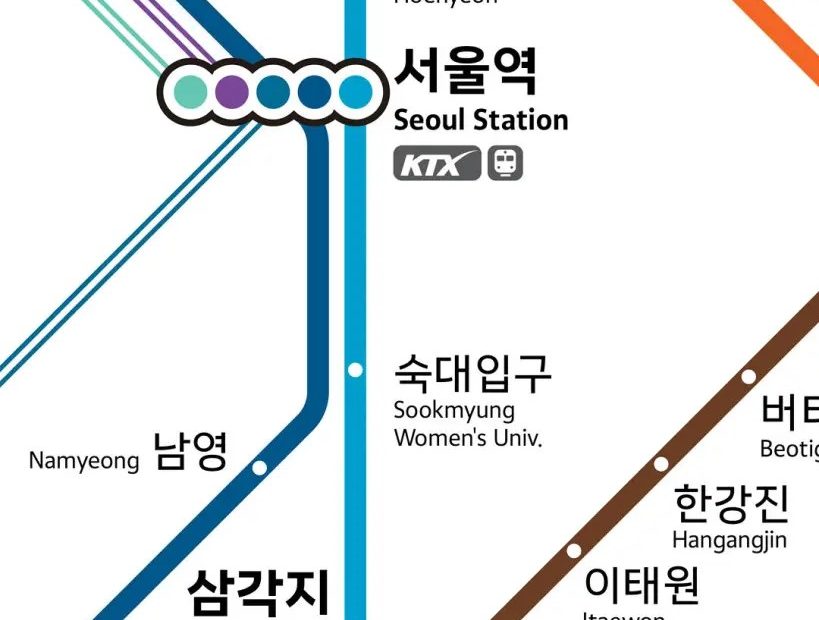
The city tapped July Type, a Netherlands-based foundry with expertise in Latin-based scripts, and a hometown foundry, Tlab, with mastery of Hangul, to create a new unified typeface. Seoul’s transportation system transports nearly two billion riders annually, so the project brief centered on legibility, clarity, and a welcoming, humanist tone. The new typeface needed to be versatile for extensive use across a variety of formats: across all buses, trains, and signage throughout the city (digital and print). It would also be the centerpiece of the new subway map.
As part of the research, the foundries looked at the enduring type systems of other influential global cities. Long-term usability was a key goal for the new typeface, with an emphasis on simplicity and clear communication. Seoul Arim came to life through this collaboration, a new unified type system unites Hangul and Latin letterforms in visual harmony.
It was paramount that the Latin and Hangul scripts display side by side seamlessly. For the design process, July Type worked from the initial Hangul character sketches created by Tlab’s design director, Yunjung Park, to build in visual harmony between the two scripts while retaining the legibility of the Latin characters. Open counters, low contrast, and moderate proportions of both the Latin and Hangul characters complement each other, creating a type system that reads as friendly, direct, and easy to understand.
“Designing a typeface for a city like Seoul was both a unique opportunity and a meaningful challenge,” said Dzulaj. “Our goal was to create a system that is not only functional and accessible, but one that will stand the test of time, quietly supporting the identity and infrastructure of this remarkable city for years to come.”
Seoul Arim will be rolled out across the entire transportation network in 2026 and has already begun appearing on some LED doors (as pictured below). Read more about the project here.
The post Latin and Hangul Find Visual Harmony in Seoul Metro’s New Type System appeared first on PRINT Magazine.