American crisp brand Lay’s has updated its classic red and yellow logo with sunbeams to celebrate the almost 100-year-old brand’s agricultural heritage.
Created by the in-house design team of Lay’s parent company, PepsiCo, the new logo is a subtle update from the crisp giant’s last rebrand in 2019.
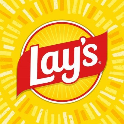
The updated logo maintains the brand’s recognisable yellow, sun-like circle emblazoned with a red ribbon and the word Lay’s, but finished in flatter shapes with a new typeface.
Lay’s has updated its classic red and yellow logo with sunbeams
The logo’s main difference is the inclusion of “Lay’s Rays” – sunbeams protruding from the ribbon, designed to represent “the potato’s journey from farm to chip”.
“Nearly 42 per cent of consumers don’t realise that Lay’s potato chips have always been made with real, farm-grown potatoes,” said the crisp brand.
“The new visual direction celebrates the potato with a fresh, energetic style that highlights the famous chips’ ingredients and harnesses the power of the sun,” it added.
The redesign is a subtle shift from the previous logo
Refined with flatter, slightly curvier letters, the updated typeface was angled upwards for “an element of upliftment”, according to Lay’s.
The project also included updates to the brand’s packaging. Lay’s has altered the colour palette of its crisp packets with hues informed by Lay’s recipes, such as savoury red, pickle green and hickory brown.
The packets also feature potatoes and other core ingredients positioned against wood grain slats, chosen in reference to farm crates and picnic tables.
Lay’s has also updated its food photography, prioritising close-up visuals of potatoes “to highlight the golden colour, crisp texture and seasoning of each chip”.
“This redesign, the brand’s biggest in nearly a century, is a love letter to our origins,” said Lay’s senior director of design Carl Gerhards.
Lay’s has also updated its crisp packets
The logos of global brands are constantly evolving to be both subtly and dramatically different to their predecessors.
Recent rebrands featured on Dezeen include a “juicy” but minimal refresh for British squash brand Ribena and the much-debated Cracker Barrel logo, which was eventually scrapped by the American restaurant chain after fans aired their grievances online.
The images are courtesy of Lay’s.
The post Lay’s rebrand roots identity in “real, farm-grown potatoes” appeared first on Dezeen.