We all love a good sandwich, and Italian subs are next level. When a neighborhood sandwich shop manages to feel both timeless and fresh, it’s rarely by accident. For Massi’s—a just-opened Italian spot in Astoria, Queens—the recipe mixes scratch-made food, family pride, and a design system crafted with equal conviction.
The shop, known for its house-baked semolina sourdough and beef tallow fries, takes a no-shortcuts approach to cooking. So when it came to branding, creative agency Saint-Urbain applied the same takes to build a playful identity that would resonate with your nonna and your cool Gen-Z cousin.
Named after the chef’s young son, Massimo (“Massi”), the restaurant set out to create something that felt familiar yet distinctive. The brief was simple: evoke the warmth of vintage Italian bakeries while capturing the spirit of a beloved neighborhood institution. “They weren’t prescriptive,” says Alex Ostroff, founder and creative director of Saint-Urbain.
They trusted us to build something that felt like family—something that would feel right next to white tile and the smell of fresh bread.
Alex Ostroff, Saint-Urbain
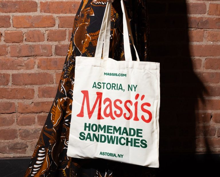
The identity began with a custom wordmark, inspired by 1960s Italian deli signage. Red, rounded, and full of personality, it’s built from Vocal Type‘s VTC Carrie and VTC Marsha—typefaces that balance nostalgia with freshness, more bakery than corporate brand.
But the real breakthrough came during moodboarding, when the team drew inspiration from Scopa, a traditional Italian card game. Its vibrant red logos and yellow illustrations tapped into shared memory and gave the system its emotional center.
From there, Saint-Urbain developed a suite of custom illustrations based on Scopa’s suits and characters: whimsical warriors, leaves, coins, horses, and mustachioed faces. Rendered with a touch of imperfection, the imagery spills across menus, uniforms, signage, paper goods, and even matchbooks.
Since opening, Massi’s has quickly found its place in Astoria’s food landscape. Families crowd the dining room, merchandise sells out, and customers snap photos of everything from fry bags to wall art. The brand’s layered identity makes every touchpoint feel intentional and lived-in—less like a restaurant launch, more like a tradition reborn. “Brands like this aren’t just about design systems,” says Ostroff. “They’re about building memories. That’s the dream.”
The post Massi’s Serves Old-School Italian Charm with a Fresh Identity by Saint-Urbain appeared first on PRINT Magazine.