The end result is something I keep in my office and just stare at all day. It turned out better than we could have ever hoped.
Dave Eggers
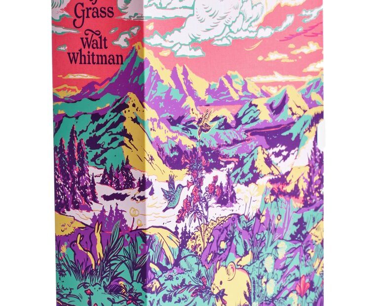
Beloved book peddler McSweeney’s has recently unveiled their latest triumph in book design, a deluxe edition of Walt Whitman’s Leaves of Grass, with type-driven cover art designed by Jessica Hische, and a vibrant slipcase illustrated by Angel Chang.
This edition has been years in the making, and it shows. From their thoughtful collaborations with Hische and Chang to an intimate partnership forged with the Walt Whitman Archive, the two-volume edition features 344 pages of Whitman’s original handwriting, cross-outs, substitutions, and notes to both himself and his publishers. Thus, the edition is not only a stunning object sure to dazzle on any bookshelf but also a critical window into Whitman’s process and relationship to this work.
McSweeney’s Art Director Sunra Thompson, Design Assistant Annie Dills, and Dave Eggers himself reflect on what they created together below.
Dave Eggers’s reflections on the deluxe edition of Leaves of Grass:
A few years ago, when my godson was graduating from high school, I wanted to get him a deluxe edition of Leaves of Grass. I looked around, though, and found nothing like what I hoped. I’d expected to find a lavish version of the book, but even finding a new hardcover was difficult.
So I started thinking McSweeney’s could put out its own edition, with reproductions of Whitman’s handwritten drafts included.
Sunra Thompson, Annie Dills, and I started working on Leaves of Grass, and immediately we found that the Walt Whitman Archive would be a necessary partner. They knew everything about every piece of paper Whitman had ever touched, so they became our close collaborators, and we did nothing without their approval. Annie became the project’s managing editor, cataloguing all the pages we wanted to include and working with the WW Archive to get it all right.
I asked Jessica Hische if she’d do our cover typography— something original but harkening a bit to Whitman’s time. As always, working with Sunra, she created something iconic and very much alive and new.
That was key— we wanted this edition to be alive. Not some dusty thing that made the poem seem old and archaic, but a vibrant and colorful edition that announced to a contemporary audience that Leaves of Grass was wild and timeless and just as relevant as ever.
That’s why we asked Angel Chang to make the case so bright and bursting with color. She and Sunra experimented with a bunch of different palettes—Angel really indulged us on this one—and in the end, we decided that the version with a pink foundation, in its utter abandon, was the most fitting.
The end result is something I keep in my office and just stare at all day. It turned out better than we could have ever hoped.
Why was Leaves of Grass selected as a work McSweeney’s wanted to reproduce in this way? What is it about Leaves of Grass and Walt Whitman that spoke to the McSweeney’s team?
AD: Walt Whitman published Leaves of Grass between six and nine times, making it more elaborate and beautiful each time. Dave Eggers, McSweeney’s founder, has always believed in books’ beauty not just in terms of their contents, but also their form, and it was his idea to bring this incredible and evergreen book to new life in 2025.
Whitman started his career as a bookmaker and was intimately involved in the design and production of his books. The first edition of Leaves of Grass was self-published, and he designed the binding, chose the typeface, laid out the pages, worked with an engraver on the cover, and even set some of the type himself— a process somewhat reminiscent of what we do at McSweeney’s now, with our dedication to every last detail of the production.
What was the development process like for the book design? What considerations were made in terms of the look and feel of its form?
ST: Our goal was to make the most luxurious-feeling edition of Leaves of Grass that we could, and part of that meant choosing the right materials. So we spent a lot of time testing different cover materials in a variety of colors. We did quite a few cover tests with the printer, for both the books and the slipcase. Color also became a very important part of the project— we wanted the set to feel as wild and surprising as the work itself, so we wanted the color combinations to feel unexpected, maybe even shocking.
What was the collaboration process like between the McSweeney’s team, Jessica Hische on the cover, and Angel Chang on the slipcase? Why were each of these artists tapped for this project?
ST: We’ve worked with Jessica Hische and Angel Chang on lots of projects over the years. Because of that, we mostly trusted them to do something beautiful. We knew from the beginning that we wanted the book covers to be typographic. We also had this idea to die-cut through the cover boards and to paste the die-cut board onto different material. So the lettering needed to be constructed like stencil letters, so that none of the counters dropped out. That was the only real constraint. Everything else was all Jessica Hische.
We wanted the slipcase to almost explode with beauty. Angel Chang has made a lot of beautiful covers with us, so she was a natural choice for this project. Angel also played a big part in the colors we used on the project: she pitched lots of different color combinations for the slipcase, many of which we tested.
The post McSweeney’s Unveils Their Deluxe Edition of Walt Whitman’s ‘Leaves of Grass’ appeared first on PRINT Magazine.