All images courtesy of Mother Design / Melissa Schriek
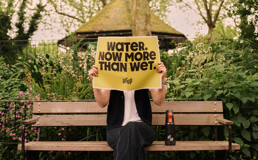
How do you strike the perfect balance between adulthood and inner child? Mother Design reveals its own inspired approach in a new identity for the popular beverage Air Up, marking the first rebrand since its launch in 2019.
There’s quite a unique selling point to Air Up’s products: it promises flavour through scent, which means that when you drink from an Air Up bottle, your brain perceives flavour when, in actual fact, you’re merely drinking water. It gives you all the natural flavours you crave without any nasty sugar or additives. Pretty clever, huh?
So, how does one design that into a fresh visual identity, particularly for a business facing rapid growth in an ever-competitive global market? Mother Design stepped in to develop a new brand that would elevate and change perceptions of Air Up entirely. It wanted to be positioned more as an aspirational lifestyle brand, particularly as it has bold ambitions to expand internationally into new markets.
And so the idea for the refreshed look was to play on the universal human tension between our two selves: our adult self, which leans into responsibility and control, and our inner child, which craves play and freedom. It’s an interesting concept that hopefully appeals to children and their parents looking to adopt healthy habits without sacrificing pleasure.
As you can imagine, the work is fun, bold, and bright, yet there is always a pared-back element in every design feature. The colour palette, for example, is a pleasant mix of vibrant yellows, purples, greens, pinks, browns, and blues—all taking direct inspiration from the flavours Air Up provides, from Lavender Lemonade to Cafe Latte. Yet its subtle gradients and orderly grid system help to add maturity here and there.
It’s accompanied by a custom typeface called Air Up Sans that looks just like the fun magnetic letters you might find on a typical fridge door. The type is bold and unmissable, yet its rounded features and bubbly nature help it feel friendly and approachable. Continuing to play on that adult/child tension, Air Up Sans is accompanied by a grown-up secondary typeface—one that feels more sensible and grounded.
A playful, joyful tone of voice is seen throughout any campaign or marketing lateral, and many aspects have been brought to life with fluid, expressive motion.
To go even further in visualising the concept of taste experienced through smell and the range of flavours available, Mother Design also used generative technology software. It harnessed 3D design tools such as Nomad Sculpt and Spline to create a visual language that might reflect Air Up’s unique sensory experience.
For the logo, Mother Design tweaked it to add clarity and boost its impact, explaining that it was “important to retain a familiar symbol that the audience has come to know and love while maintaining attribution amid a widely reimagined visual language”.
The new platform has been designed to roll out across all print and digital surfaces, including advertising, products, packaging, livery, and social and digital channels.
“It’s a celebration of the interplay between the responsibilities of adulthood and the boundless freedom of our inner child,” explains Creative Director Harry Edmonds. “By blending bold, expressive elements with a touch of whimsy, we’ve created a vibrant and engaging experience that speaks to both sides of our audience. Harnessing cutting-edge design tools and generative technology, we’ve pushed the boundaries to visually represent the concept of ‘taste experienced through scent’ in a tangible way.”
