Nave is a new typeface released by veteran type designer Jamie Clarke (Rig Shaded, Rig Sans, Brim Narrow, and others). Nave’s conventional exterior shape and structure support an organic and fluid interior, like the centuries-old churches that surround Clarke’s studio, inspiring its name. Nave is classic with plenty of unique character, perfect for designs seeking to breathe a little life into the familiar.
What’s interesting about Nave is that it took an incredible 11 years to design. Clarke began his career in digital, working in web design for two decades before his discontent pulled him towards his love of letters and hands-on craft. To kick off his change of career, Clarke enrolled in a summer type design intensive at Reading University, an experience he calls transformative. It was here that Clarke first started tugging on Nave’s threads.
Clarke says his initial inspiration for Nave came from a mark-making exercise with a pointed brush. “I was captivated by the fast, flicked outstrokes the tool could create and wondered if I could combine these fluid strokes with a more formal, upright structure. I imagined the combination would make the shapes both dynamic and approachable.”
But the final design eluded him. In his earliest sketches, Clarke leaned into the Roman upright shapes and away from cursive and handwritten styles. While Clarke realized a few letters according to his vision, he felt the shapes needed more flexibility to replicate across a cohesive typeface. After several failed attempts to unlock it, he put the designs in a drawer and created a different debut typeface. Clarke admits now, “The style I aimed for was elusive and well beyond my skill level at the time.”
Though Clarke set Nave aside, he never forgot it. “Each time I released a new type family, I would pick up Nave and have another go. I reached out to other type designers to ask for guidance but still couldn’t manipulate the character set to fit together in harmony while matching my vision.”
Futura Black specimen, Paul Renner; Wikimedia Commons
Seven type releases later, in 2022, Clarke started the design for Nave again, this time from scratch, working from his memory of the letterforms. He started seeing life in the results but still struggled with the uppercase. One day, while flicking through some specimen books, he found a sample of Futura Black. “Although this typeface had little in common with Nave’s final design, it revealed an approach I could use for Nave’s capitals,” Clarke says. “Paul Renner appeared to have created Futura Black from blocks, carving into them to reveal a stencil-like letterform. This focus on the negative shapes unlocked the design of the capitals and allowed me to complete Nave, aligning it with my original vision.”
Nave is finally the design it was always meant to be, and I hope that, through its purity, it will find longevity in the hands of designers.
If you’re a type designer stuck on a treadmill with a project that just won’t let you go, Jamie has some advice on what NOT to do:
Start with a subtle and tricky concept.
Skip writing a brief entirely.
Ask for help, but don’t articulate your goals.
Second-guess yourself at every turn.
Keep pushing forward with a design you despise.
Constantly distract yourself by working on other fonts.
It’s sage advice for any creative endeavor. Clarke insists that Nave couldn’t have happened without all the twists and turns, even if there might have been a more efficient process. But he concedes, “The lessons learned from my missteps were invaluable.”
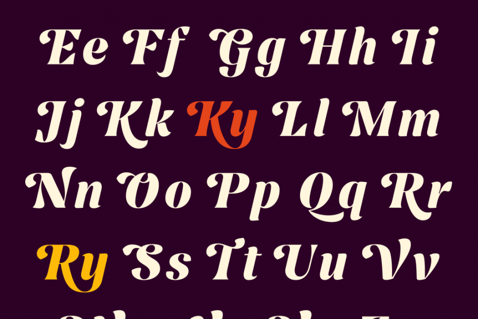
Nave is a versatile family which includes 14 styles, 227 languages, and 600+ characters. Explore the family and learn more about Jamie Clarke Type.
All imagery © Jamie Clarke Type except where otherwise noted.