Olivia King has been busy! The independent creative director and type designer based in Sydney released a new typeface this spring, Inclusive Sans. As a writer, I was naturally intrigued by King’s second piece of news: a collaboration with Penguin to create a custom typeface to unite the publishing house’s brand. Before we get into the latter, here’s a little bit about Inclusive Sans, which served as a launching point for the Penguin project.
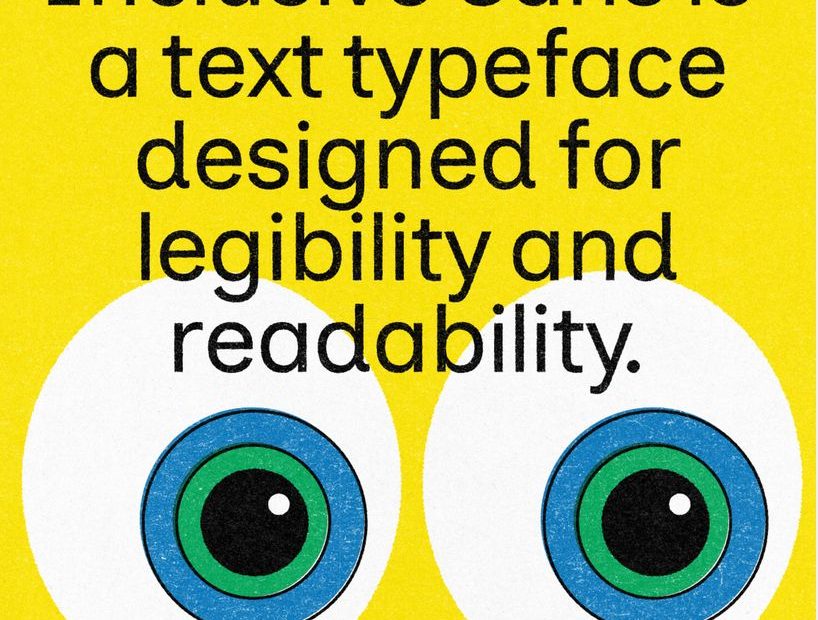
Inclusive Sans might evoke a neo-grotesque friendliness, but King looked past the minimalist uniformity to instead aim for the utmost legibility and readability. She developed the open-source typeface over three years, buoyed by her desire to expand the investigation into accessible type beyond contrast. Her goal: to “make accessibility the default rather than the exception.”
Inclusive Sans is the result of King’s deep research and ongoing user feedback, in which she emerged with a set of design criteria, including spacious counters, wider default letter spacing, more distinction between similar letterforms and between capitals and ascenders, among others. Adding to its inclusivity is support for over 500 languages, including Aboriginal and other Indigenous languages from the land she now calls home. Inclusive Sans is also available for free on Google Fonts.
Penguin approached King with a project to design a custom version of Inclusive Sans as part of an effort to standardize type across the Penguin universe. The partnership is perfectly aligned, considering that Penguin started as a publisher selling sixpenny paperbacks, making stories accessible for all.
The brief had two main goals: to bring consistency to the Penguin brand and help the 90-year-old publishing behemoth feel fresh and modern.
King brought the same research-driven spirit to the development of Penguin Inclusive Sans, with a trip to the Penguin archives in Bristol. And what an archive it his! Despite Penguin’s disparate brand look and feel, the company has a venerable typographic history, from Gill Sans to Groteque No. 9 to Avant Garde to Helvetica.
To reflect the bold, playful, and curious modern brand, King worked to imbue Inclusive Sans’ grotesque roots with humanist features. Experience its charm in the vertical terminals, the dot of the lowercase ‘i’ (a nod to the penguin mascot’s eye), the curves of the ‘Q’s tail, the arc of the ampersand’s leg, and the approachable roundness of the lowercase ‘a’ and ‘g.’ King also created a new display weight for greater dynamism in marketing and OOO.
In keeping with Inclusive Sans’ original goal of readability and legibility, King designed Penguin Inclusive Sans to be easy to read, from distinct letterforms to blocks of text. The character set includes four weights, in Roman and italic styles, with 500+ glyphs, supportive of 600+ languages. The family was intentionally narrow to ensure cohesiveness of the new system across print and digital, while also allowing for future scaling.
Read more about King’s process to bring Inclusive Sans to life.
Check out more of the story behind King’s collaboration with Penguin.
The Mockups: Present Your Work, by The Brand Identity Group Ltd.
The post Olivia King Designs a Bespoke Inclusive Sans for Penguin Publishing appeared first on PRINT Magazine.